Skip to content · ⁨Bỏ qua nội dung⁩

Statistics · ⁨Thống kê⁩

IGCSE Mathematics · ⁨Toán học IGCSE⁩ · Topic 9 · ⁨Chủ đề 9⁩

Video lesson for this topic · ⁨Bài học video cho chủ đề này⁩ Open the video page · ⁨Mở trang video⁩
8:09

Thống kê

Mỗi ngày thế giới thu thập những con số về bạn: khoảng cách bạn di chuyển, thời gian bạn ngủ, điểm bạn đạt được trong bài kiểm tra. Một danh sách dài các con số cho bạn biết hầu như…

English narration · English + 中文 subtitles burned in · ⁨Giọng đọc tiếng Anh · phụ đề tiếng Anh + 中文 được ghi trực tiếp⁩

English

This handout covers Topic 9, Statistics. Parts marked (Extended) are only tested on the Extended papers; everything else is for both levels.

Tiếng Việt

Tài liệu này bao gồm Chủ đề 9, Thống kê. Các phần được đánh dấu (Nâng cao) chỉ được kiểm tra trong các bài thi Nâng cao; mọi phần khác dành cho cả hai mức độ.

9.1 9.2

Collecting and showing data · ⁨Thu thập và trình bày dữ liệu⁩

Syllabus · ⁨Chương trình⁩
English
Subject content Notes and examples
Classify and tabulate statistical data. e.g. tally tables, two-way tables.
Tiếng Việt
Nội dung môn học Ghi chú và ví dụ
Phân loại và lập bảng dữ liệu thống kê. Ví dụ: bảng đánh dấu, bảng hai chiều.
English
Subject content Notes and examples
1 Read, interpret and draw inferences from tables and statistical diagrams.
2 Compare sets of data using tables, graphs and statistical measures. e.g. compare averages and ranges between two data sets.
3 Appreciate restrictions on drawing conclusions from given data.
Tiếng Việt
Nội dung môn học Ghi chú và ví dụ
1 Đọc, diễn giải và rút ra kết luận từ bảng biểu và sơ đồ thống kê.
2 So sánh các bộ dữ liệu sử dụng bảng, biểu đồ và các số liệu thống kê. Ví dụ: so sánh giá trị trung bình và khoảng biến thiên giữa hai bộ dữ liệu.
3 Nhận thức được những hạn chế trong việc rút ra kết luận từ dữ liệu đã cho.
English
Subject content Notes and examples
1 Read, interpret and draw inferences from tables and statistical diagrams.
2 Compare sets of data using tables, graphs and statistical measures. e.g. compare averages and measures of spread between two data sets.
3 Appreciate restrictions on drawing conclusions from given data.
Tiếng Việt
Nội dung môn học Ghi chú và ví dụ
1 Đọc, diễn giải và rút ra kết luận từ bảng biểu và sơ đồ thống kê.
2 So sánh các tập dữ liệu bằng bảng, đồ thị và các số liệu thống kê. Ví dụ: so sánh trung bình và độ phân tán giữa hai tập dữ liệu.
3 Nhận thức được những hạn chế trong việc rút ra kết luận từ dữ liệu đã cho.

Source: Cambridge International syllabus · ⁨Nguồn: Chương trình Cambridge International⁩

English

To organise statistical 统计 data 数据, use:

  • a tally table 计数表 — make a mark for each value, then count.
  • a two-way table 双向表 — sorts data by two features at once (for example, boys/girls against walk/bus).

When you read a diagram, only draw conclusions the data really supports.

Tiếng Việt
Một đám đông lớn những người
Dữ liệu được thu thập từ con người — một mẫu được抽取 từ một quần thể.

Để tổ chức dữ liệu thống kê, hãy sử dụng:

  • bảng đếm — đánh dấu cho mỗi giá trị, sau đó đếm số lượng.
  • bảng hai chiều — phân loại dữ liệu theo hai đặc điểm cùng lúc (ví dụ: nam/nữ so với đi bộ/xe buýt).

Khi đọc biểu đồ, chỉ đưa ra kết luận mà dữ liệu thực sự hỗ trợ.

Explore · ⁨Khám phá⁩

Data handling cycle · ⁨Chu kỳ xử lý dữ liệu⁩

Follow a statistical question from collection to display. · ⁨Theo dõi một câu hỏi thống kê từ quá trình thu thập đến khi trình bày.⁩

Vocabulary · ⁨Từ vựng⁩ Train · ⁨Luyện tập⁩
English Tiếng Việt
statistical/stəˈtɪstɪkl/ thống kê
data/ˈdeɪtə/ dữ liệu
tally table/ˈtælɪ ˈteɪbl/ bảng điểm
two-way table/tuː weɪ ˈteɪbl/ bảng hai chiều
9.3

Averages and range · ⁨Giá trị trung bình và khoảng biến thiên⁩

Syllabus · ⁨Chương trình⁩
English
Subject content Notes and examples
Calculate the mean, median, mode and range for individual data and distinguish between the purposes for which these are used. Data may be in a list or frequency table, but will not be grouped.
Tiếng Việt
Nội dung môn học Ghi chú và ví dụ
Tính trung bình cộng, trung vị, mốt và khoảng biến thiên cho dữ liệu riêng lẻ và phân biệt giữa các mục đích sử dụng khác nhau của chúng. Dữ liệu có thể ở dạng danh sách hoặc bảng tần số, nhưng sẽ không được nhóm.
English
Subject content Notes and examples
1 Calculate the mean, median, mode, quartiles, range and interquartile range for individual data and distinguish between the purposes for which these are used.
2 Calculate an estimate of the mean for grouped discrete or grouped continuous data.
3 Identify the modal class from a grouped frequency distribution.
Tiếng Việt
Nội dung môn học Ghi chú và ví dụ
1 Tính trung bình cộng, trung vị, mốt, tứ phân vị, khoảng biến thiên và khoảng tứ phân vị cho dữ liệu rời rạc riêng lẻ và phân biệt mục đích sử dụng của chúng.
2 Tính ước lượng trung bình cộng cho dữ liệu phân nhóm rời rạc hoặc dữ liệu phân nhóm liên tục.
3 Xác định lớp mốt từ bảng tần số phân nhóm.

Source: Cambridge International syllabus · ⁨Nguồn: Chương trình Cambridge International⁩

English

Three averages describe a typical value of the data, and the range shows how spread out it is. Each is used for a different purpose:

  • mean 平均数 $= \dfrac{\text{sum of all values}}{\text{how many values}}$.
  • median 中位数 $=$ the middle value when the data is put in order.
  • mode 众数 $=$ the value that appears most often.
  • range 极差 $=$ largest value $-$ smallest value (it shows how spread out the data is).

Worked example. Find the mean, median, mode and range of $4, 7, 7, 2, 5$.

Order the data: $2, 4, 5, 7, 7$.

$$\text{mean} = \frac{4 + 7 + 7 + 2 + 5}{5} = \frac{25}{5} = 5, \quad \text{median} = 5, \quad \text{mode} = 7, \quad \text{range} = 7 - 2 = 5.$$
Tiếng Việt

Ba loại giá trị trung bình mô tả một giá trị điển hình của dữ liệu, và khoảng biến thiên cho thấy mức độ phân tán của nó. Mỗi loại được sử dụng cho một mục đích khác nhau:

Dữ liệu 2, 3, 3, 5, 7: trung bình cộng = 4, trung vị = 3, mốt = 3, khoảng biến thiên = 5
Trung bình, trung vị, mốt và khoảng biến thiên của một tập dữ liệu nhỏ
  • trung bình cộng $= \dfrac{\text{sum of all values}}{\text{how many values}}$.
  • trung vị $=$ giá trị ở giữa khi dữ liệu được sắp xếp theo thứ tự.
  • mốt $=$ giá trị xuất hiện nhiều nhất.
  • khoảng biến thiên $=$ giá trị lớn nhất $-$ giá trị nhỏ nhất (nó cho thấy dữ liệu phân tán thế nào).

Ví dụ đã giải. Tìm trung bình cộng, trung vị, mốt và khoảng biến thiên của $4, 7, 7, 2, 5$.

Sắp xếp dữ liệu: $2, 4, 5, 7, 7$.

$$\text{mean} = \frac{4 + 7 + 7 + 2 + 5}{5} = \frac{25}{5} = 5, \quad \text{median} = 5, \quad \text{mode} = 7, \quad \text{range} = 7 - 2 = 5.$$
Explore · ⁨Khám phá⁩

Average choice lab · ⁨Phòng thí nghiệm lựa chọn giá trị trung bình⁩

Choose the average that fits the data situation. · ⁨Chọn giá trị trung bình phù hợp với tình huống dữ liệu.⁩

Vocabulary · ⁨Từ vựng⁩ Train · ⁨Luyện tập⁩
English Tiếng Việt
mean/miːn/ trung bình
median/ˈmiːdiːən/ trung vị
mode/məʊd/ mật độ
range/reɪndʒ/ tập giá trị
9.3

Averages from a frequency table · ⁨Giá trị trung bình từ bảng tần số⁩

Syllabus · ⁨Chương trình⁩
English
Subject content Notes and examples
Calculate the mean, median, mode and range for individual data and distinguish between the purposes for which these are used. Data may be in a list or frequency table, but will not be grouped.
Tiếng Việt
Nội dung môn học Ghi chú và ví dụ
Tính trung bình cộng, trung vị, mốt và khoảng biến thiên cho dữ liệu riêng lẻ và phân biệt giữa các mục đích sử dụng khác nhau của chúng. Dữ liệu có thể ở dạng danh sách hoặc bảng tần số, nhưng sẽ không được nhóm.
English
Subject content Notes and examples
1 Calculate the mean, median, mode, quartiles, range and interquartile range for individual data and distinguish between the purposes for which these are used.
2 Calculate an estimate of the mean for grouped discrete or grouped continuous data.
3 Identify the modal class from a grouped frequency distribution.
Tiếng Việt
Nội dung môn học Ghi chú và ví dụ
1 Tính trung bình cộng, trung vị, mốt, tứ phân vị, khoảng biến thiên và khoảng tứ phân vị cho dữ liệu rời rạc riêng lẻ và phân biệt mục đích sử dụng của chúng.
2 Tính ước lượng trung bình cộng cho dữ liệu phân nhóm rời rạc hoặc dữ liệu phân nhóm liên tục.
3 Xác định lớp mốt từ bảng tần số phân nhóm.

Source: Cambridge International syllabus · ⁨Nguồn: Chương trình Cambridge International⁩

English

When data is listed with its frequency 频数 (how many times each value occurs), the mean is

$$\text{mean} = \frac{\sum (\text{value} \times \text{frequency})}{\sum \text{frequency}}.$$

Worked example. Values $1, 2, 3$ occur with frequencies $4, 5, 1$. Find the mean.

$$\text{mean} = \frac{1(4) + 2(5) + 3(1)}{4 + 5 + 1} = \frac{17}{10} = 1.7.$$

Grouped data (Extended)

For grouped data 分组数据, you cannot find the exact mean, so estimate it using the midpoint of each group as the value. The modal class 众数组 is simply the group with the highest frequency.

Tiếng Việt

Khi dữ liệu được liệt kê kèm tần số (số lần mỗi giá trị xuất hiện), trung bình cộng là

$$\text{mean} = \frac{\sum (\text{value} \times \text{frequency})}{\sum \text{frequency}}.$$

Ví dụ đã giải. Các giá trị $1, 2, 3$ xuất hiện với tần số $4, 5, 1$. Tìm trung bình cộng.

$$\text{mean} = \frac{1(4) + 2(5) + 3(1)}{4 + 5 + 1} = \frac{17}{10} = 1.7.$$

Dữ liệu nhóm (Nâng cao)

Đối với dữ liệu phân nhóm, bạn không thể tìm được giá trị trung bình chính xác, nên hãy ước lượng nó bằng cách sử dụng trung điểm của mỗi nhóm làm giá trị. Nhóm mode đơn giản là nhóm có tần số cao nhất.

Vocabulary · ⁨Từ vựng⁩ Train · ⁨Luyện tập⁩
English Tiếng Việt
frequency/ˈfriːkwənsi/ tần số
grouped data/ɡruːpt ˈdeɪtə/ dữ liệu nhóm
modal class/ˈməʊdl klæs/ lớp mốt
9.3

Measures of spread (Extended) · ⁨Các Measures of spread (Extended)⁩

Syllabus · ⁨Chương trình⁩
English
Subject content Notes and examples
1 Calculate the mean, median, mode, quartiles, range and interquartile range for individual data and distinguish between the purposes for which these are used.
2 Calculate an estimate of the mean for grouped discrete or grouped continuous data.
3 Identify the modal class from a grouped frequency distribution.
Tiếng Việt
Nội dung môn học Ghi chú và ví dụ
1 Tính trung bình cộng, trung vị, mốt, tứ phân vị, khoảng biến thiên và khoảng tứ phân vị cho dữ liệu rời rạc riêng lẻ và phân biệt mục đích sử dụng của chúng.
2 Tính ước lượng trung bình cộng cho dữ liệu phân nhóm rời rạc hoặc dữ liệu phân nhóm liên tục.
3 Xác định lớp mốt từ bảng tần số phân nhóm.

Source: Cambridge International syllabus · ⁨Nguồn: Chương trình Cambridge International⁩

English

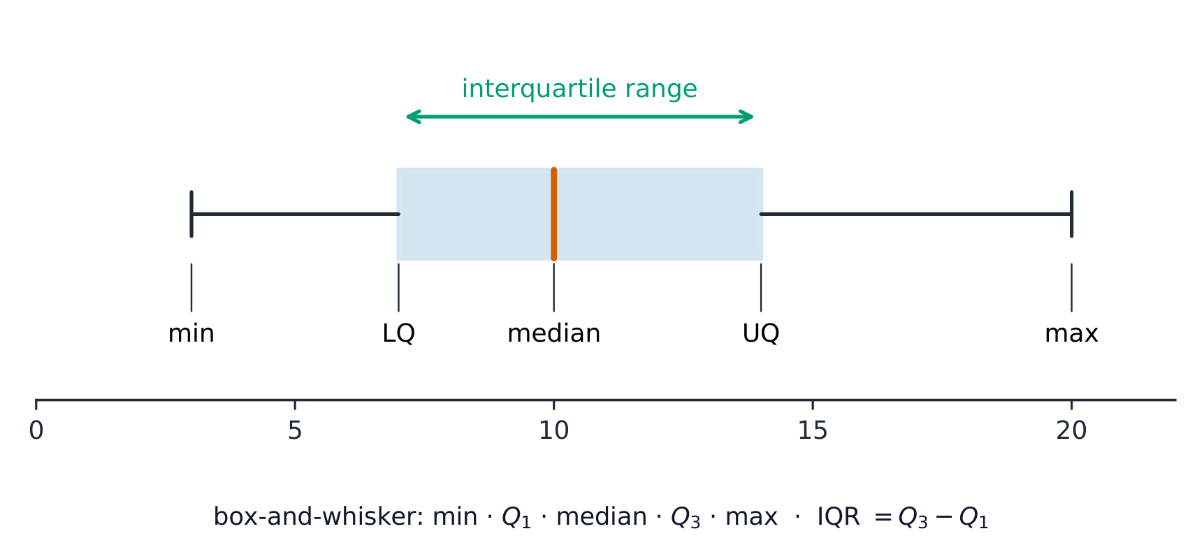
When data is in order, the quartiles 四分位数 cut it into four equal parts. The lower quartile (LQ) is one quarter of the way up; the upper quartile (UQ) is three quarters of the way up. The interquartile range 四分位距 measures the spread of the middle half:

$$\text{interquartile range} = \text{UQ} - \text{LQ}.$$

The interquartile range is useful because, unlike the range, it ignores extreme values.

Tiếng Việt

Khi dữ liệu đã được sắp xếp, các phân vị tứ phân chia nó thành bốn phần bằng nhau. Phân vị dưới (LQ) nằm ở một phần tư chiều cao; phân vị trên (UQ) nằm ở ba phần tư chiều cao. Phạm vi tứ phân đo sự phân tán của nửa giữa:

$$\text{interquartile range} = \text{UQ} - \text{LQ}.$$

Phạm vi tứ phân hữu ích vì, khác với phạm vi, nó bỏ qua các giá trị cực đoan.

A box-and-whisker plot showing the minimum, lower quartile, median, upper quartile and maximum, with the interquartile range marked across the box
A box-and-whisker plot shows the five-number summary; the box length is the interquartile range.
Explore · ⁨Khám phá⁩

Box-and-whisker plot · ⁨Biểu tượng hộp và râu⁩

Build a box plot from the five-number summary: the box is the middle 50% (the interquartile range) and the median's position shows the skew. · ⁨Xây dựng biểu tượng hộp từ tóm tắt năm số: phần hộp chứa 50% ở giữa (độ lệch tứ phân vị) và vị trí của số trung vị cho thấy độ lệch hướng.⁩

Vocabulary · ⁨Từ vựng⁩ Train · ⁨Luyện tập⁩
English Tiếng Việt
quartile/ˈkwɔːtaɪl/ tứ phân vị
interquartile range/ˌɪntəˈkwɔːtaɪl reɪndʒ/ khoảng tứ phân vị
9.4

Charts and diagrams

Syllabus · ⁨Chương trình⁩
English
Subject content Notes and examples
Draw and interpret: (a) bar charts (b) pie charts (c) pictograms (d) stem-and-leaf diagrams (e) simple frequency distributions. Includes composite (stacked) and dual (side-by-side) bar charts. Stem-and-leaf diagrams should have ordered data with a key.
Tiếng Việt
Nội dung môn học Ghi chú và ví dụ
Vẽ và giải thích: (a) biểu đồ cột (b) biểu đồ tròn (c) biểu tượng (d) sơ đồ thân lá (e) phân bố tần số đơn giản. Bao gồm biểu đồ cột tổng hợp (xếp chồng) và biểu đồ cột kép (đặt cạnh nhau). Sơ đồ thân lá phải có dữ liệu được sắp xếp và chú giải.

Source: Cambridge International syllabus · ⁨Nguồn: Chương trình Cambridge International⁩

English
Chart What it shows
bar chart 条形图 a bar for each category; height is the frequency
pie chart 饼图 a circle split into slices, each a fraction of $360^{\circ}$
pictogram 象形图 uses a symbol to stand for a number of items
stem-and-leaf diagram 茎叶图 keeps the digits of ordered data, with a key
frequency distribution 频数分布 a table of values and their frequencies

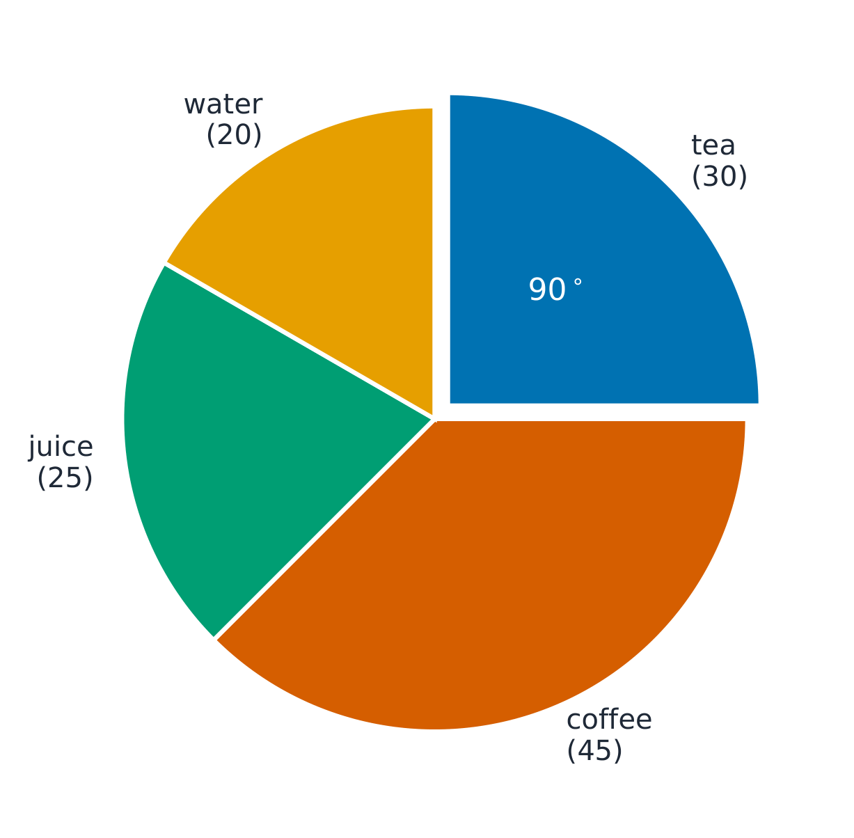
Worked example (pie chart). Out of $120$ people, $30$ chose tea. Find the angle of the tea slice.

$$\frac{30}{120} \times 360^{\circ} = 90^{\circ}.$$
Tiếng Việt
A Galton board forming a bell shape
A Galton board shows how data piles up into a distribution.
A pictogram where each circle stands for one item
Biểu tượng pictogram sử dụng một ký hiệu để đại diện cho một số lượng vật phẩm
A bar chart of favourite colours
Biểu đồ cột thể hiện tần số của mỗi nhóm
Chart What it shows
bar chart a bar for each category; height is the frequency
pie chart a circle split into slices, each a fraction of $360^{\circ}$
pictogram uses a symbol to stand for a number of items
stem-and-leaf diagram keeps the digits of ordered data, with a key
frequency distribution a table of values and their frequencies

Worked example (pie chart). Out of $120$ people, $30$ chose tea. Find the angle of the tea slice.

$$\frac{30}{120} \times 360^{\circ} = 90^{\circ}.$$
A pie chart of 120 drinks split into tea, coffee, juice and water, with the tea slice marked as a 90 degree quarter
Mỗi lát cắt là phân số của $360^\circ$; trà chiếm $\tfrac{30}{120}\times360^\circ=90^\circ$.
Explore · ⁨Khám phá⁩

Pie-chart angles · ⁨Góc của biểu đồ tròn⁩

Each slice's angle is its share of the whole turned into degrees — frequency ÷ total × 360 — and the slices always add to 360°. · ⁨Góc của mỗi lát cắt chính là tỷ lệ phần trăm của toàn bộ được chuyển sang độ — tần số ÷ tổng × 360 — và tổng các lát cắt luôn cộng lại bằng 360°.⁩

Explore · ⁨Khám phá⁩

Chart choice lab · ⁨Phòng thí nghiệm lựa chọn biểu đồ⁩

Choose the chart that fits the kind of data. · ⁨Chọn biểu đồ phù hợp với loại dữ liệu.⁩

Vocabulary · ⁨Từ vựng⁩ Train · ⁨Luyện tập⁩
English Tiếng Việt
bar chart/bɑː tʃɑːt/ biểu đồ cột
pie chart/paɪ tʃɑːt/ biểu đồ tròn
pictogram/ˈpɪktəɡræm/ biểu tượng hình ảnh
stem-and-leaf diagram/stem ænd liːf ˈdaɪəɡræm/ biểu đồ thân lá
frequency distribution/ˈfriːkwənsi ˌdɪstrɪˈbjuːʃn/ phân bố tần suất
9.5

Scatter diagrams and correlation

Syllabus · ⁨Chương trình⁩
English
Subject content Notes and examples
1 Draw and interpret scatter diagrams. Plotted points should be clearly marked, for example as small crosses (×).
2 Understand what is meant by positive, negative and zero correlation.
3 Draw by eye, interpret and use a straight line of best fit. A line of best fit: • should be a single ruled line drawn by inspection • should extend across the full data set • does not need to coincide exactly with any of the points but there should be a roughly even distribution of points either side of the line over its entire length.
Tiếng Việt
Nội dung môn học Ghi chú và ví dụ
1 Vẽ và giải thích sơ đồ scatter. Các điểm được vẽ nên được đánh dấu rõ ràng, ví dụ như dấu chéo nhỏ (×).
2 Hiểu ý nghĩa của tương quan dương, âm và bằng không.
3 Vẽ bằng mắt, giải thích và sử dụng đường hồi quy tuyến tính. Đường hồi quy: • nên là một đường kẻ duy nhất được vẽ bằng mắt • nên kéo dài qua toàn bộ tập dữ liệu • không cần đi qua chính xác bất kỳ điểm nào nhưng phải có sự phân bố khoảng đều của các điểm ở cả hai phía của đường trên toàn bộ chiều dài của nó.
English
Subject content Notes and examples
1 Draw and interpret scatter diagrams. Plotted points should be clearly marked, for example as small crosses (x).
2 Understand what is meant by positive, negative and zero correlation.
3 Draw by eye, interpret and use a straight line of best fit. A line of best fit: • should be a single ruled line drawn by inspection • should extend across the full data set • does not need to coincide exactly with any of the points but there should be a roughly even distribution of points either side of the line over its entire length.
Tiếng Việt
Nội dung môn học Ghi chú và ví dụ
1 Vẽ và giải thích sơ đồ phân tán. Các điểm biểu diễn phải được đánh dấu rõ ràng, ví dụ như dấu chéo nhỏ (x).
2 Hiểu ý nghĩa của tương quan dương, âm và bằng không.
3 Vẽ bằng mắt, giải thích và sử dụng đường hồi quy tuyến tính. Đường hồi quy: • nên là một đường kẻ duy nhất được vẽ bằng mắt • nên kéo dài qua toàn bộ tập dữ liệu • không cần đi qua chính xác bất kỳ điểm nào nhưng phải có sự phân bố khoảng đều của các điểm ở cả hai phía của đường trên toàn bộ chiều dài của nó.

Source: Cambridge International syllabus · ⁨Nguồn: Chương trình Cambridge International⁩

English

A scatter diagram 散点图 plots pairs of values as points to show whether two things are linked. The link is the correlation 相关性:

  • positive correlation 正相关 — as one goes up, the other goes up.
  • negative correlation 负相关 — as one goes up, the other goes down.
  • zero correlation 零相关 — no clear link.

If there is correlation, draw a line of best fit 最佳拟合线: one straight ruled line through the middle of the points, with about the same number of points on each side. Use it to predict values.

Tiếng Việt

Một scatter diagram biểu diễn các cặp giá trị dưới dạng điểm để cho thấy hai thứ có liên quan hay không. Mối liên hệ đó là correlation:

  • positive correlation — khi cái này tăng, cái kia cũng tăng.
  • negative correlation — khi cái này tăng, cái kia giảm.
  • zero correlation — không có mối liên hệ rõ ràng.
Three scatter diagrams: one with points rising together, one with points falling, and one with scattered points showing no trend
Positive correlation rises together; negative falls as the other rises; zero shows no clear link.

Nếu có correlation, hãy vẽ một line of best fit: một đường thẳng kẻ qua giữa các điểm, sao cho khoảng cách đều hoặc số lượng điểm xấp xỉ bằng nhau ở cả hai bên. Sử dụng nó để dự đoán các giá trị.

A scatter diagram of revision time against test score with a straight line of best fit drawn through the middle of the points
A line of best fit is one straight ruled line through the middle of the points; use it to predict.
Explore · ⁨Khám phá⁩

Scatter and correlation · ⁨Biểu đồ phân tán và tương quan⁩

Change the strength of the relationship and add a line of best fit to spot the trend. · ⁨Thay đổi độ mạnh của mối quan hệ và thêm đường hồi quy để nhận biết xu hướng.⁩

Vocabulary · ⁨Từ vựng⁩ Train · ⁨Luyện tập⁩
English Tiếng Việt
scatter diagram/ˈskætə ˈdaɪəɡræm/ biểu đồ scatter
correlation/ˌkɒrɪˈleɪʃn/ tương quan
positive correlation/ˈpɒzɪtɪv ˌkɒrɪˈleɪʃn/ tương quan dương
negative correlation/ˈneɡətɪv ˌkɒrɪˈleɪʃn/ tương quan âm
zero correlation/ˈzɪərəʊ ˌkɒrɪˈleɪʃn/ không có tương quan
line of best fit/laɪn ɒv best fɪt/ đường hồi quy tuyến tính
9.6

Cumulative frequency diagrams (Extended)

Syllabus · ⁨Chương trình⁩
English
Subject content Notes and examples
1 Draw and interpret cumulative frequency tables and diagrams. Plotted points on a cumulative frequency diagram should be clearly marked, for example as small crosses (x), and be joined with a smooth curve.
2 Estimate and interpret the median, percentiles, quartiles and interquartile range from cumulative frequency diagrams.
Tiếng Việt
Nội dung môn học Ghi chú và ví dụ
1 Vẽ và giải thích bảng và sơ đồ tần số lũyaccumulated. Các điểm biểu diễn trên sơ đồ tần số lũyaccumulated phải được đánh dấu rõ ràng, ví dụ như dấu chéo nhỏ (x), và nối với nhau bằng đường cong trơn.
2 Ước lượng và giải thích trung vị, percentiles, tứ phân vị và khoảng tứ phân vị từ sơ đồ tần số lũyaccumulated.

Source: Cambridge International syllabus · ⁨Nguồn: Chương trình Cambridge International⁩

English

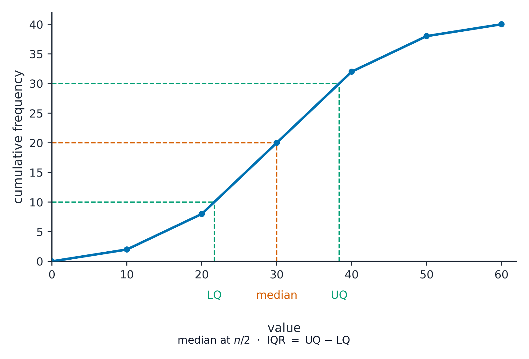
The cumulative frequency 累积频数 is a running total of the frequencies. Plot it against the upper end of each class and join the points with a smooth curve.

From the curve you can read the median (at half the total), the quartiles (at one quarter and three quarters), and any percentile 百分位数 (for example, the $90$th percentile is at $90\%$ of the total).

Tiếng Việt

Cumulative frequency là tổng lũy kế của các tần số. Vẽ nó lên trục tung theo cuối mỗi class và nối các điểm bằng một đường cong mượt mà.

Từ đường cong, bạn có thể đọc được median (ở một nửa tổng số), các quartiles (ở một phần tư và ba phần tư), và bất kỳ percentile nào (ví dụ, percentile thứ $90$ nằm ở $90\%$ của tổng số).

An S-shaped cumulative frequency curve with dashed lines reading off the lower quartile, median and upper quartile from the vertical axis down to the values
Read the median at half the total, and the quartiles at one quarter and three quarters: across to the curve, then down.
Explore · ⁨Khám phá⁩

Cumulative frequency route · ⁨Lộ trình tần số lũyaccumulated⁩

Follow raw data into a cumulative frequency curve and percentile reading. · ⁨Theo dõi dữ liệu thô vào đường cong tần số lũyaccumulated và đọc phần trăm vị trí.⁩

Vocabulary · ⁨Từ vựng⁩ Train · ⁨Luyện tập⁩
English Tiếng Việt
cumulative frequency/ˈkjuːmjʊlətɪv ˈfriːkwənsi/ tần số lũy tiến
percentile/pəˈsentaɪl/ phân vị
9.7

Histograms (Extended)

Syllabus · ⁨Chương trình⁩
English
Subject content Notes and examples
1 Draw and interpret histograms. On histograms, the vertical axis is labelled 'Frequency density'.
2 Calculate with frequency density. Frequency density is defined as $\text{frequency density} = \text{frequency} \div \text{class width}$.
Tiếng Việt
Nội dung môn học Ghi chú và ví dụ
1 Vẽ và giải thích histogram. Trên histogram, trục dọc được ghi nhãn 'Mật độ tần số'.
2 Tính toán với mật độ tần số. Mật độ tần số được định nghĩa là $\text{frequency density} = \text{frequency} \div \text{class width}$.

Source: Cambridge International syllabus · ⁨Nguồn: Chương trình Cambridge International⁩

English

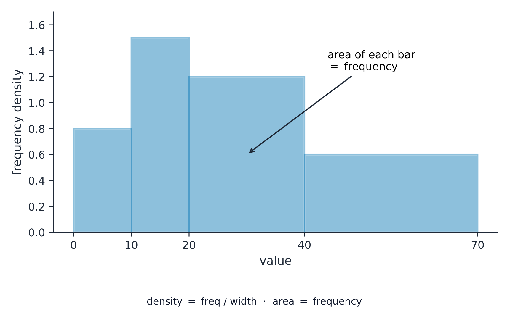
A histogram 直方图 looks like a bar chart, but the bars can have different widths and the area of each bar (not its height) shows the frequency. The vertical axis is the frequency density 频数密度:

$$\text{frequency density} = \frac{\text{frequency}}{\text{class width}}.$$

Worked example. A class has class width 组距 $10$ and frequency $25$. Find the frequency density.

$$\text{frequency density} = \frac{25}{10} = 2.5.$$
Tiếng Việt

Một histogram trông giống như bar chart, nhưng các thanh có thể có độ rộng khác nhau và diện tích của mỗi thanh (không phải chiều cao) biểu thị tần số. Trục dọc là frequency density:

$$\text{frequency density} = \frac{\text{frequency}}{\text{class width}}.$$
A histogram with bars of different widths where the vertical axis is frequency density, so the area of each bar gives its frequency
With unequal class widths the bar AREA (not its height) is the frequency, so the axis is frequency density.

Ví dụ minh họa. Một lớp có độ rộng lớp $10$ và tần số $25$. Tìm mật độ tần số.

$$\text{frequency density} = \frac{25}{10} = 2.5.$$
Explore · ⁨Khám phá⁩

Frequency-density histogram · ⁨Histogram mật độ tần số⁩

With unequal class widths the bar height is frequency density, so the area (not the height) represents the frequency. · ⁨Với chiều rộng lớp không bằng nhau, chiều cao cột là mật độ tần số, do đó diện tích (không phải chiều cao) đại diện cho tần số.⁩

Vocabulary · ⁨Từ vựng⁩ Train · ⁨Luyện tập⁩
English Tiếng Việt
histogram/ˈhɪstəɡræm/ biểu đồ tần số (histogram)
frequency density/ˈfriːkwənsi ˈdensɪti/ mật độ tần số
class width/klæs wɪtθ/ bảng khoảng
9.7

Exam tips · ⁨Mẹo làm bài thi⁩

English
  • Know the three averages: mean (add up ÷ how many), median (the middle value when in order), mode (the most common). The range is highest − lowest.
  • From a frequency table the mean is $\frac{\sum fx}{\sum f}$ — divide by the total frequency, not the number of rows.
  • On a scatter diagram, describe the correlation as positive, negative or none, and draw the line of best fit through the mean point.
  • For a histogram with unequal class widths, the height is the frequency density (frequency ÷ class width), not the frequency.
Tiếng Việt
  • Know the three averages: mean (tổng số lượng), median (giá trị giữa khi đã sắp xếp), mode (phổ biến nhất). Range là giá trị lớn nhất − giá trị nhỏ nhất.
  • From a frequency table the mean is $\frac{\sum fx}{\sum f}$ — divide by the total frequency, not the number of rows.
  • On a scatter diagram, describe the correlation as positive, negative or none, and draw the line of best fit through the mean point.
  • For a histogram with unequal class widths, the height is the frequency density (frequency ÷ class width), not the frequency.

Interactive lessons on this topic · ⁨Bài học tương tác về chủ đề này⁩

Work through it step by step, with instant-check exercises. · ⁨Làm theo từng bước, kèm theo bài tập kiểm tra ngay lập tức.⁩

Past Papers · ⁨Đề thi cũ⁩

More topics in IGCSE Mathematics · ⁨Toán học IGCSE⁩ · ⁨Nhiều chủ đề hơn trong IGCSE Mathematics · ⁨Toán học IGCSE⁩⁩

Log in or create account · ⁨Đăng nhập hoặc tạo tài khoản⁩

IGCSE, A-Level & AP