跳到主要内容

设计原则

AP 二维艺术与设计 · 第 2 主题

训练
本章视频课 打开视频页面
7:20

Principles of Design

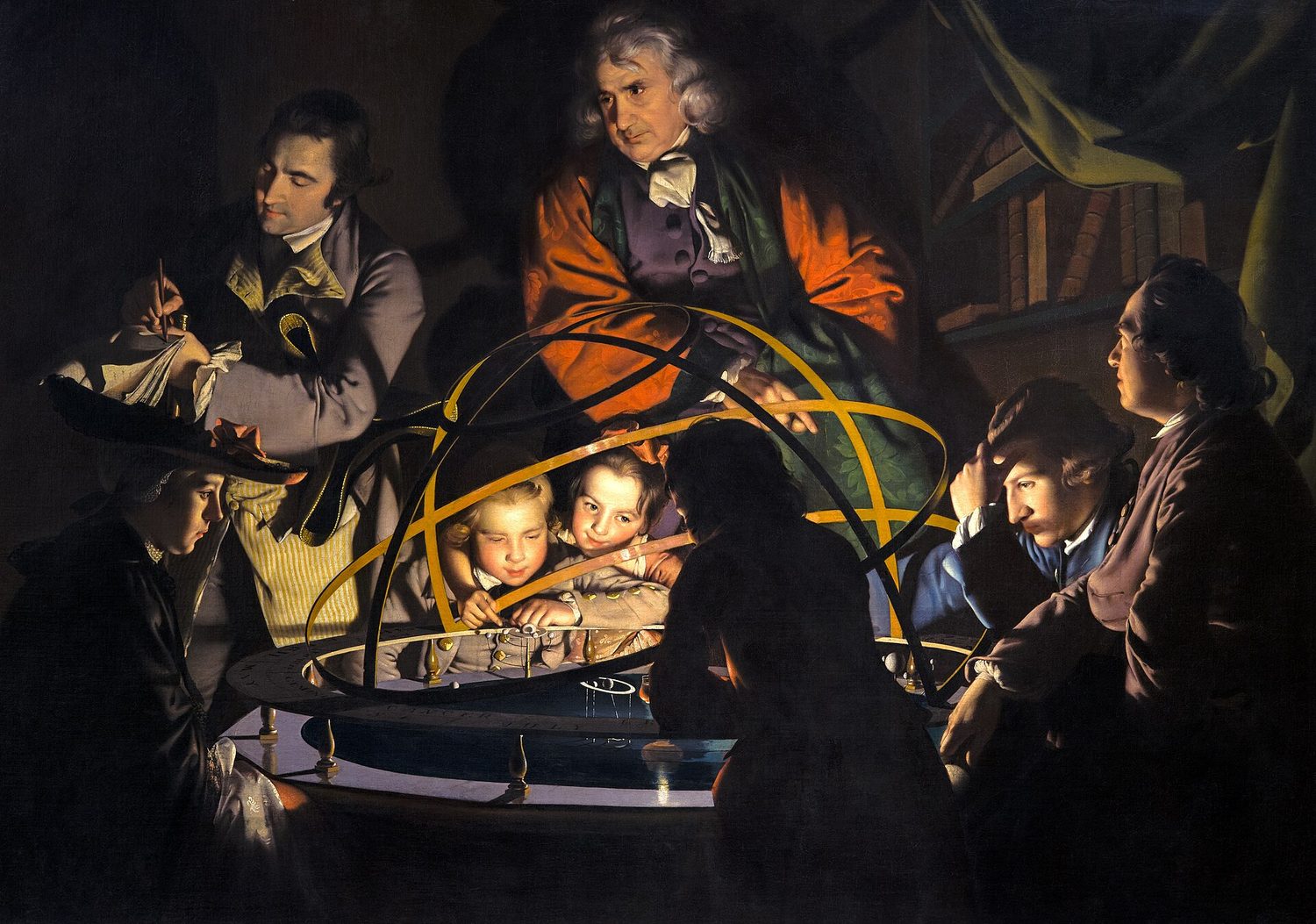
Look at this painting for three seconds. Where did your eye go first? Almost everyone looks at the same place — the two bright faces in the middle. That was…

英文讲解 · 内嵌中英文字幕

2.1

平衡

大纲

Focus: Balance is the visual distribution of weight in a composition so it feels stable.

  • Symmetrical (formal) balance mirrors both sides of a central axis — calm and orderly.
  • Asymmetrical (informal) balance uses different elements of equal visual weight — dynamic and lively.
  • Radial balance arranges elements around a central point.
  • Visual weight is affected by size, colour, value, texture, and position.
  • A large, dull shape can balance a small, bright one on the other side.
来源:美国大学理事会 AP 课程与考试说明

平衡:对称、非对称、放射

设计原则(principles of design)是排列艺术元素的"规则"。第一个是平衡(balance)——重量的视觉分布,以便一件作品感觉稳定。

三种平衡:对称、非对称和辐射
对称平衡镜像一条中心轴;非对称平衡权衡不同的元素;辐射平衡从一个中心辐射
  • 对称(正式)平衡(symmetrical (formal) balance)镜像一条中心轴的两侧——平静而有序。
  • 非对称(非正式)平衡(asymmetrical (informal) balance)使用相等视觉重量(visual weight)的不同元素——动态而活泼。
  • 辐射平衡(radial balance)围绕一个中心点排列元素。

视觉重量被大小、色彩、明度和位置影响:一个小的明亮形状能平衡一个大的暗淡的。

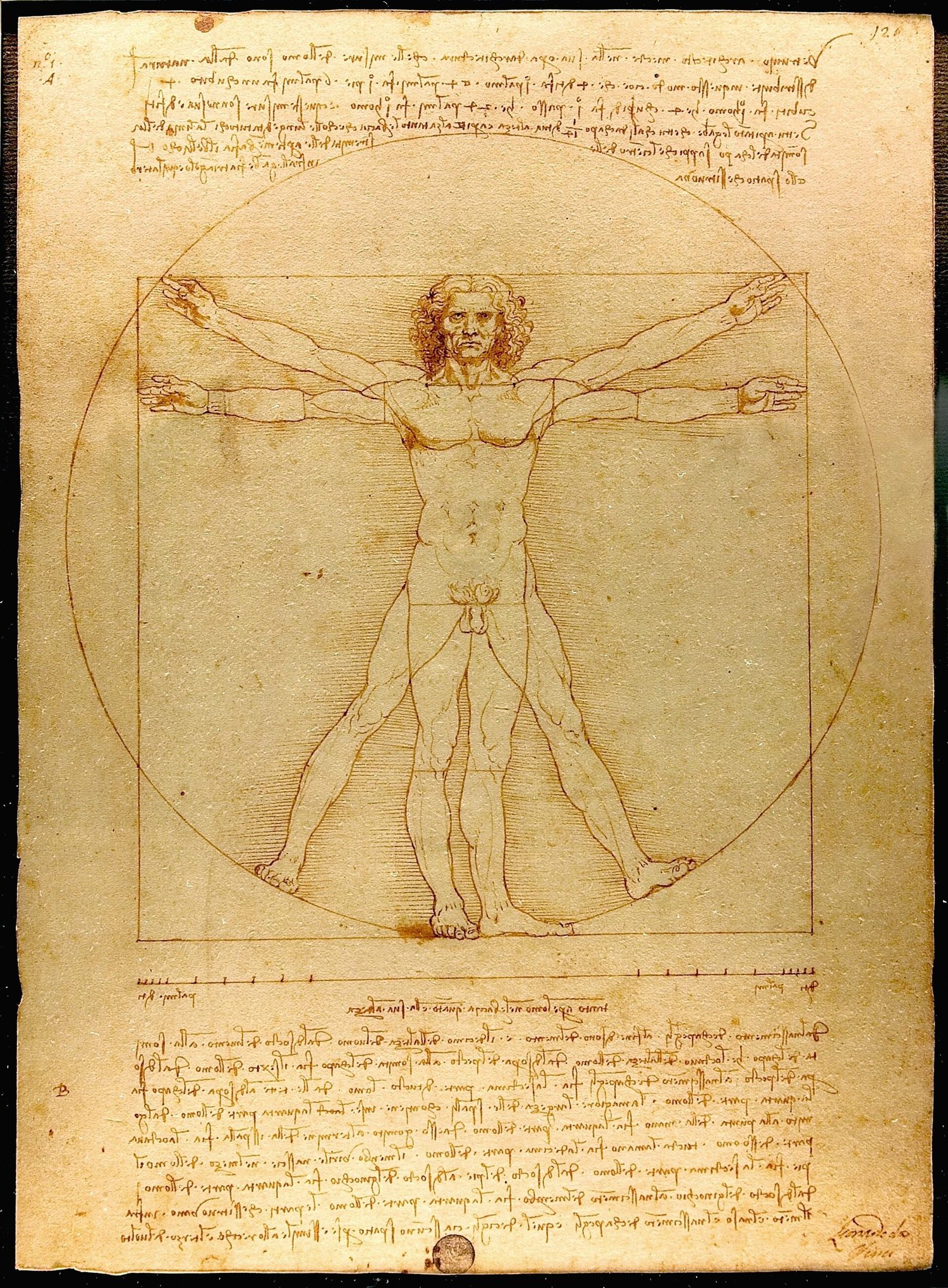
达·芬奇的钢笔素描:一个四肢伸展的人,同时嵌在一个圆形和一个正方形里
达·芬奇的《维特鲁威人》:这个人体以中央竖轴近乎完美地对称,而外围的圆又给它辐射平衡
Composition balances light, mass, and interest across the picture plane
探索

Which kind of balance?

Symmetrical balance mirrors a central axis; asymmetrical balance weighs different elements of equal visual weight; radial balance radiates from a centre.

词汇表 训练
英文 中文 拼音
principles of design/ˈprɪnsɪplz ɒv dɪˈzaɪn/ 设计原则 shè jì yuán zé
balance/ˈbæləns/ 平衡 píng héng
Symmetrical (formal) balance/sɪˈmetrɪkl ˈbæləns/ 对称平衡 duì chèn píng héng
Asymmetrical (informal) balance/ˌeɪsɪˈmetrɪkl ˈbæləns/ 非对称平衡 fēi duì chèn píng héng
visual weight/ˈvɪʒuːəl weɪt/ 视觉重量 shì jué zhòng liàng
Radial balance/ˈreɪdɪəl ˈbæləns/ 辐射平衡 fú shè píng héng
Composition/ˌkɒmpəˈzɪʃn/ 构图 gòu tú
picture plane/ˈpɪktʃə pleɪn/ 画面 huà miàn
练习卷 双页
2.2

强调与视觉焦点

大纲

Focus: Emphasis makes one part of a work stand out as the centre of interest (the focal point).

  • A focal point is where the eye is drawn first; emphasis creates it.
  • Emphasis is built through contrast — of size, colour, value, isolation, or placement.
  • Convergence (lines that point) and the rule of thirds help locate a strong focal point.
  • Subordination keeps other areas quieter so the focal point leads.
  • A work may have one dominant focal point and smaller secondary accents.

来源:美国大学理事会 AP 课程与考试说明

强调(emphasis)使一件作品的一个部分作为兴趣的中心——视觉焦点(focal point),眼睛最先被吸引的地方——脱颖而出。

  • 强调通过对比创造——大小、色彩、明度、隔离或位置的对比。
  • 引导线和三分法帮助放置一个强的视觉焦点。
  • 从属(subordination)使其他区域更安静,以便视觉焦点引领。
词汇表 训练
英文 中文 拼音
Emphasis/ˈemfəsɪs/ 强调 qiáng diào
focal point/ˈfəʊkl pɔɪnt/ 视觉焦点 shì jué jiāo diǎn
Subordination/ˌsʌbɔːdɪˈneɪʃn/ 从属 cóng shǔ
练习卷 双页
2.3

对比

大纲

Focus: Contrast is the difference between elements — it creates energy, variety, and readability.

  • Contrast can be of value (light/dark), colour (complementary), shape, texture, or size.
  • Strong contrast attracts attention and defines a focal point.
  • Low contrast unifies a work and can feel calm, subtle, or moody.
  • Contrast in direction (horizontal vs diagonal) adds movement.
  • In graphic design, value and size contrast create clear visual hierarchy.

来源:美国大学理事会 AP 课程与考试说明

对比(contrast)是元素之间的差别——它创造能量、多样性和可读性。

  • 对比能是明度(明/暗)、色彩(互补)、形状、肌理或大小的。
  • 强的对比吸引注意并定义一个视觉焦点;低的对比统一并平静。
  • 在设计中,明度和大小的对比创造清晰的视觉层次(visual hierarchy)。
词汇表 训练
英文 中文 拼音
Contrast/ˈkɒntræst/ 对比 duì bǐ
visual hierarchy/ˈvɪʒuːəl ˈhaɪərɑːki/ 视觉层次 shì jué céng cì
练习卷 双页
2.4

动感与节奏

大纲

Focus: Movement leads the viewer's eye through a work; rhythm is the repetition that creates a visual beat.

  • Movement is the path the eye takes, guided by line, edges, colour, and placement.
  • Rhythm is created by repeating elements with regular or varied spacing.
  • Types of rhythm: regular (even), flowing (curving), progressive (gradual change), and random.
  • Directional forces (leading lines, gazes, gestures) create implied motion.
  • Repetition with variation keeps rhythm interesting rather than monotonous.

来源:美国大学理事会 AP 课程与考试说明

动感(movement)引导观者的眼睛穿过一件作品;节奏(rhythm)是创造一个视觉"节拍"的重复。

  • 动感是眼睛所走的路径,由线条、边缘、色彩和位置引导。
  • 节奏类型:规则的(regular)(均匀)、流动的(flowing)(弯曲)、渐进(progressive)(逐渐变化),和随机的。
  • 带变化的重复保持节奏有趣而不是单调。
梵高的绘画:夜空中布满巨大旋转的光之漩涡,下方是宁静的村庄
梵高的《星月夜》:旋转的笔触带着视线扫过天空(动感),重复的卷曲给它一种翻滚的节奏
词汇表 训练
英文 中文 拼音
Movement/ˈmuːvmənt/ 动感 dòng gǎn
rhythm/ˈrɪðəm/ 节奏 jié zòu
progressive/prəˈɡresɪv/ 渐进 jiàn jìn
练习卷 双页
2.5

图案与重复

大纲

Focus: Repetition reuses an element; pattern is the repeated element arranged in a predictable way.

  • Repetition of shape, colour, or line builds unity and rhythm.
  • A pattern is a repeated motif — regular (grid, tessellation) or irregular.
  • Patterns can fill a shape, define a texture, or become the subject itself.
  • Motif is the single unit that repeats; changing scale or colour varies the pattern.
  • Too much repetition can feel monotonous; variation keeps it engaging.

来源:美国大学理事会 AP 课程与考试说明

重复(repetition)重用一个元素;一个图案(pattern)是以一种可预测的方式排列的重复元素。

  • 形状、色彩或线条的重复建立统一和节奏。
  • 一个图案是一个重复的母题(motif)——规则的(一个网格或镶嵌)或不规则的。
  • 太多重复感觉单调;改变尺度或色彩增加多样性。
一块印花布,蓝色的鸟在红色草莓和绿叶之间,同一母题在布上反复出现
威廉·莫里斯的《草莓小偷》:一个鸟与草莓的母题以规则的图案在整块布上反复出现
词汇表 训练
英文 中文 拼音
Repetition/ˌrepəˈtɪʃn/ 重复 chóng fù
pattern/ˈpætn/ 图案 tú àn
motif/məʊˈtiːf/ 母题 mǔ tí
练习卷 双页
2.6

比例与尺度

大纲

Focus: Proportion is the size relationship between parts; scale is the size of the work or an element relative to something else.

  • Proportion compares the sizes of parts within a work (e.g. head to body).
  • Scale compares an element to the whole, to the human body, or to the real world.
  • Hierarchical scale makes the most important element largest.
  • Exaggerated or distorted proportion can express emotion or draw attention.
  • The golden ratio and canon of proportions are historic guides to pleasing relationships.

来源:美国大学理事会 AP 课程与考试说明

比例(proportion)是各部分之间的大小关系;尺度(scale)是一个元素相对于别的东西的大小。

构图工具:三分法和等级比例
三分法把关键元素放在三分线上;等级比例使重要的元素最大
  • 比例比较一件作品内各部分的大小(头对身体)。
  • 等级比例(hierarchical scale)使最重要的元素最大。
  • 夸张或扭曲的比例能表达情绪或吸引注意。黄金比例(golden ratio)是一个悦目比例的历史向导。
词汇表 训练
英文 中文 拼音
Proportion/prəˈpɔːʃn/ 比例 bǐ lì
scale/skeɪl/ 尺度 chǐ dù
Hierarchical scale/haɪəˈrɑːkɪkl skeɪl/ 等级比例 děng jí bǐ lì
golden ratio/ˈɡəʊldn ˈreɪʃɪəʊ/ 黄金比例 huáng jīn bǐ lì
练习卷 双页
2.7

统一与变化

大纲

Focus: Unity holds a work together as a whole; variety adds interest so it is not dull. Good design balances the two.

  • Unity is a sense that all parts belong together (through repetition, proximity, and a limited palette).
  • Variety is difference that adds interest and prevents monotony.
  • Harmony comes from elements that are similar; tension from those that differ.
  • Proximity (grouping) and continuity (alignment) strengthen unity.
  • The best works achieve unity with variety — order that still surprises.

来源:美国大学理事会 AP 课程与考试说明

统一(unity)把一件作品作为一个整体维系在一起;变化(variety)增加趣味,以便它不乏味。好的设计平衡这两者。

  • 统一来自重复、邻近(proximity)(分组)、连续性(continuity)(把元素沿一条线或边缘对齐,使它们读作一组),和一个有限的调色板。
  • 变化是防止单调的差别。和谐(harmony)来自相似的元素。
  • 最好的作品实现统一变化——仍然令人惊讶的秩序。
词汇表 训练
英文 中文 拼音
Unity/ˈjuːnɪti/ 统一 tǒng yī
variety/vəˈraɪəti/ 变化 biàn huà
proximity/prɒkˈsɪmɪti/ 邻近 lín jìn
continuity/kɒntɪˈnjuːɪti/ 连续性 lián xù xìng
Harmony/ˈhɑːməni/ 和谐 hé xié
练习卷 双页
2.8

构图

大纲

Focus: Composition is how all the elements and principles are arranged within the picture plane.

  • The picture plane is the flat surface; its format (portrait, landscape, square) shapes the design.
  • The rule of thirds places key elements along thirds lines and their intersections.
  • Cropping decides what is included and what is cut, changing emphasis and tension.
  • Leading lines, framing, and balance guide the eye and hold the composition together.
  • A strong composition unifies the elements while creating a clear focal point.

来源:美国大学理事会 AP 课程与考试说明

构图(composition)是所有元素和原则如何在画面(picture plane)内排列。

  • 画幅(format)(竖幅、横幅、正方形)塑造设计。
  • 三分法(rule of thirds)把关键元素沿着三分线和它们的交点放置。
  • 裁剪(cropping)决定什么被包括和什么被切掉,改变强调和张力。
  • 一个强的构图统一元素,同时创造一个清晰的视觉焦点——这是 AP 作品集的二维技能被评判的依据。

Worked example(应用这个概念)。 要解释一幅构图中的平衡:"左边的大暗形状被右边三个小的明亮形状平衡——这是不对称平衡,它给作品两侧视觉重量,同时保持它动态而非静态。" 一个完整的答案要说出原理、指向作品中的具体证据,并且说明对观者的效果。

词汇表 训练
英文 中文 拼音
format/ˈfɔːmæt/ 画幅 huà fú
rule of thirds/ruːl ɒv θɜːdz/ 三分法 sān fēn fǎ
Cropping/ˈkrɒpɪŋ/ 裁剪 cái jiǎn
练习卷 双页
2.8

考试技巧

  • 对每件作品,陈述哪个原则组织它——平衡、强调、对比、动感或统一。
  • 通过视觉重量、不只是对称来论证平衡
  • 确保一个清晰的视觉焦点,并命名创造它的强调技法。
  • 瞄准统一带变化——命名统一的手法和趣味的来源。
  • 在动手之前用三分法和缩略草图规划构图

本主题的互动课程

逐步学习,并即时检测练习。

AP 二维艺术与设计的更多主题

登录或创建账号

IGCSE, A-Level & AP