跳到主要内容

艺术元素

AP 二维艺术与设计 · 第 1 主题

训练
本章视频课 打开视频页面
8:02

Elements of Art

Look at three famous pictures. A wave from Japan. A candle-lit room in England. A vase of sunflowers in France. Different countries, different centuries…

英文讲解 · 内嵌中英文字幕

1.1

线条

大纲

Focus: Line is the most basic element of art — a moving point that the eye follows across a surface.

  • A line is a mark with length and direction: straight, curved, angular, or freeform.
  • Lines vary in quality — thick or thin, smooth or rough, continuous or broken, dark or light.
  • Contour lines trace the edges of a form; gesture lines quickly capture movement and energy.
  • Implied lines are suggested, not drawn — by a row of objects, a pointing arm, or a gaze.
  • Direction carries feeling: horizontal reads as calm, vertical as strength, diagonal as action.
  • Artists use line to build shape, shade value (hatching, cross-hatching), imply texture, and lead the eye.
来源:美国大学理事会 AP 课程与考试说明

艺术元素(elements of art)是每个艺术家使用的视觉"构建块"。第一个是线条(line)——眼睛跟随的一个移动的点。

  • 一条线有长度和方向;它能是直的、弯曲的、有角的,或自由形式的。
  • 线有质量:粗或细、光滑或粗糙、连续或断续、深或浅。
  • 轮廓(contour)线勾勒一个形体的边缘;动态速写(gesture)线快速捕捉运动。
  • 隐含线(implied lines)不被画出而是被暗示——由一排物体或一个人的目光。
葛饰北斋的木版画:一道巨大卷曲的海浪即将拍下小船,远处是小小的富士山
葛饰北斋的《神奈川冲浪里》:大胆的曲线轮廓带着视线沿海浪移动,爪状的浪花线条制造出动感
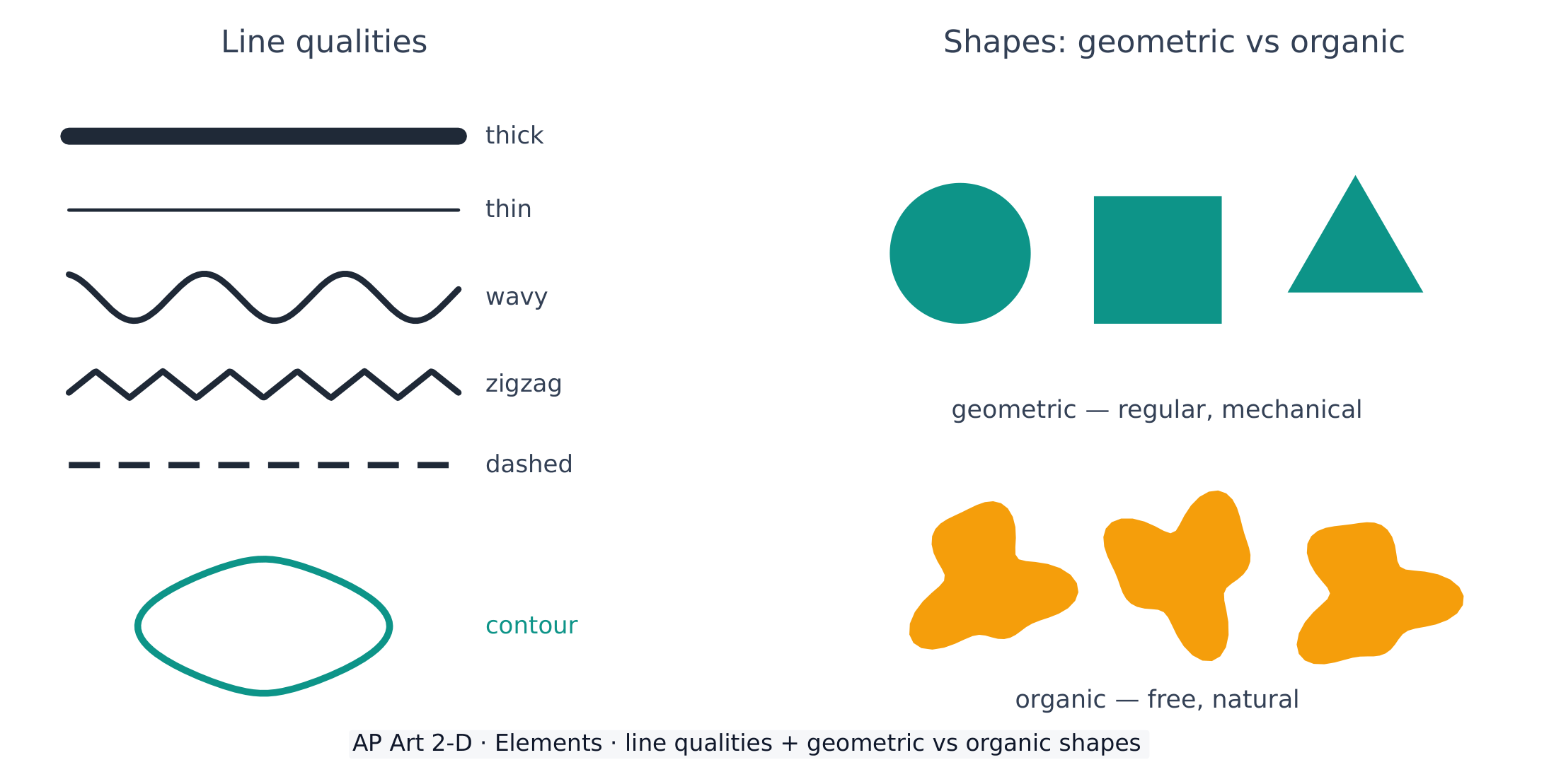
线条质量以及几何形状和有机形状之间的差别
线条在粗细和特征上变化;形状要么是几何的(规则)要么是有机的(自然)

方向携带感觉:水平线感觉平静、竖直线感觉强壮,而对角线感觉活跃。艺术家用线条来构建形状、渲染明度(排线法)、暗示肌理,并引导观者的眼睛。

词汇表 训练
英文 中文 拼音
elements of art/ˈelɪmənts ɒv ɑːt/ 艺术元素 yì shù yuán sù
line/laɪn/ 线条 xiàn tiáo
Contour/ˈkɒntʊə/ 轮廓 lún kuò
gesture/ˈdʒestʃə/ 动态速写 dòng tài sù xiě
Implied lines/ɪmˈplaɪd laɪnz/ 隐含线 yǐn hán xiàn
shape/ʃeɪp/ 形状 xíng zhuàng
练习卷 双页
1.2

形状与形体

大纲

Focus: Shape is a flat, enclosed area; form is the illusion of a three-dimensional object on a 2-D surface.

  • A shape is a two-dimensional area with a boundary; form appears three-dimensional (height, width, depth).
  • Geometric shapes (circle, square, triangle) are regular and mechanical; organic shapes are free and natural.
  • Positive shapes are the objects; negative shapes are the empty spaces around and between them.
  • Form is created on a flat surface through value (shading), overlapping, and perspective.
  • Recognising negative space helps an artist see and compose more accurately.

来源:美国大学理事会 AP 课程与考试说明

一个形状(shape)是一个平坦的、封闭的区域;一个形体(form)有三维(高度、宽度和深度)的错觉。

  • 几何(geometric)形状(圆、正方形、三角形)是规则的、机械的;有机(organic)形状是自由的、自然的。
  • 正形(positive shape)是物体;负形(negative shape)是物体周围和之间的空的空间——学会看它使绘画准确得多。
  • 形体在一个平坦的表面上用明度(shading,渲染)、重叠和透视创造。
词汇表 训练
英文 中文 拼音
form/fɔːm/ 形体 xíng tǐ
Geometric/ˌdʒiːəʊˈmetrɪk/ 几何 jǐ hé
organic/ɔːˈɡænɪk/ 有机 yǒu jī
Positive shape/ˈpɒzɪtɪv ʃeɪp/ 正形 zhèng xíng
negative shape/ˈneɡətɪv ʃeɪp/ 负形 fù xíng
练习卷 双页
1.3

明度

大纲

Focus: Value is the lightness or darkness of a colour or tone — the key to showing form and depth.

  • Value runs from white through greys to black; a value scale shows the gradual steps.
  • Highlight, midtone, core shadow, reflected light, and cast shadow describe light on a form.
  • Strong value contrast creates drama and a clear focal point; close values feel soft and calm.
  • Chiaroscuro is the bold use of light and dark to model three-dimensional form.
  • Squinting removes colour and helps an artist judge value relationships.

来源:美国大学理事会 AP 课程与考试说明

光影逻辑:光如何塑造形体
明暗色阶

明度(value)是一个色调的明或暗——展示三维形体的单个最强大的工具。

一个明度阶以均匀的步骤从白到黑运行
一个明度阶从白到黑均匀地阶梯;强的明度对比造成戏剧性和一个焦点
  • 一个明度阶(value scale)从白经过灰到黑。
  • 一个形体上的光有一个高光(highlight)、中间调(midtones)、一条明暗交界线(core shadow)、反光(reflected light),和一个投影(cast shadow)。
  • 明暗对照法(chiaroscuro)是对光和暗的大胆运用以塑造形体。眯眼去除色彩并帮助你判断明度。
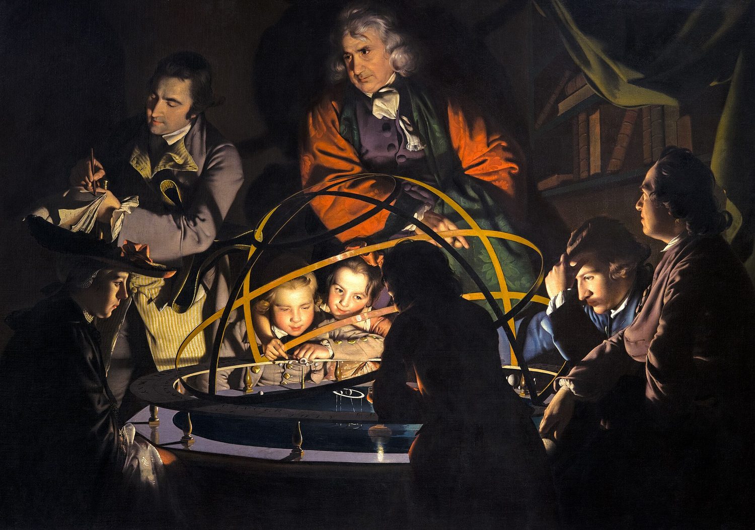
一幅烛光下的 18 世纪绘画,人们围着一个太阳系模型,他们的脸在黑暗的背景前发亮
约瑟夫·赖特的《一位哲学家讲解太阳系仪》:中央一处隐藏的光源制造出强烈的明度对比(明暗对照法),把每张脸从黑暗中提出来
词汇表 训练
英文 中文 拼音
Value/ˈvæljuː/ 明度 míng dù
value scale/ˈvæljuː skeɪl/ 明度阶 míng dù jiē
highlight/ˈhaɪlaɪt/ 高光 gāo guāng
midtones/ˈmɪdtəʊnz/ 中间调 zhōng jiān diào
core shadow/kɔː ˈʃædəʊ/ 明暗交界线 míng àn jiāo jiè xiàn
reflected light/rɪˈflektɪd laɪt/ 反光 fǎn guāng
cast shadow/kæst ˈʃædəʊ/ 投影 tóu yǐng
Chiaroscuro/ˌtʃaɪərəˈskjʊərəʊ/ 明暗对照法 míng àn duì zhào fǎ
练习卷 双页
1.4

色彩

大纲

Focus: Colour is light reflected from a surface; it has three properties and follows the logic of the colour wheel.

  • Colour has three properties: hue (its name), value (light/dark), and saturation/intensity (dull to vivid).
  • Primary colours (red, yellow, blue) mix to make secondary (orange, green, violet) and tertiary colours.
  • Colour schemes: complementary, analogous, monochromatic, triadic, warm, and cool.
  • Warm colours (red, orange, yellow) advance and energise; cool colours (blue, green, violet) recede and calm.
  • Adding white makes a tint, black makes a shade, grey makes a tone.
  • Complementary colours placed side by side intensify each other; mixed together they dull (neutralise).

来源:美国大学理事会 AP 课程与考试说明

色环与配色方案

色彩(colour)是从一个表面反射的光。它有三个属性并遵循色轮(colour wheel)的逻辑。

色轮:三原色、间色和复色,带暖和冷的两半
三原色混合成间色和复色;互补色彼此相对而坐
  • 色彩的三个属性:色相(hue)(它的名字)、明度(value)(明/暗),和饱和度(saturation)(暗淡到鲜艳)。
  • 三原色(primary)(红、黄、蓝)混合以制造间色(secondary)和复色。
  • 互补色(complementary)在色轮上相对而坐:并排放置时它们互相加强,但混合在一起时它们中和成一种暗淡的灰棕色。邻近色(analogous)彼此相邻而坐并调和。
  • 暖色(warm)(红、橙、黄)前进;冷色(cool)(蓝、绿、紫)后退。一个色调加白,一个暗调加黑。
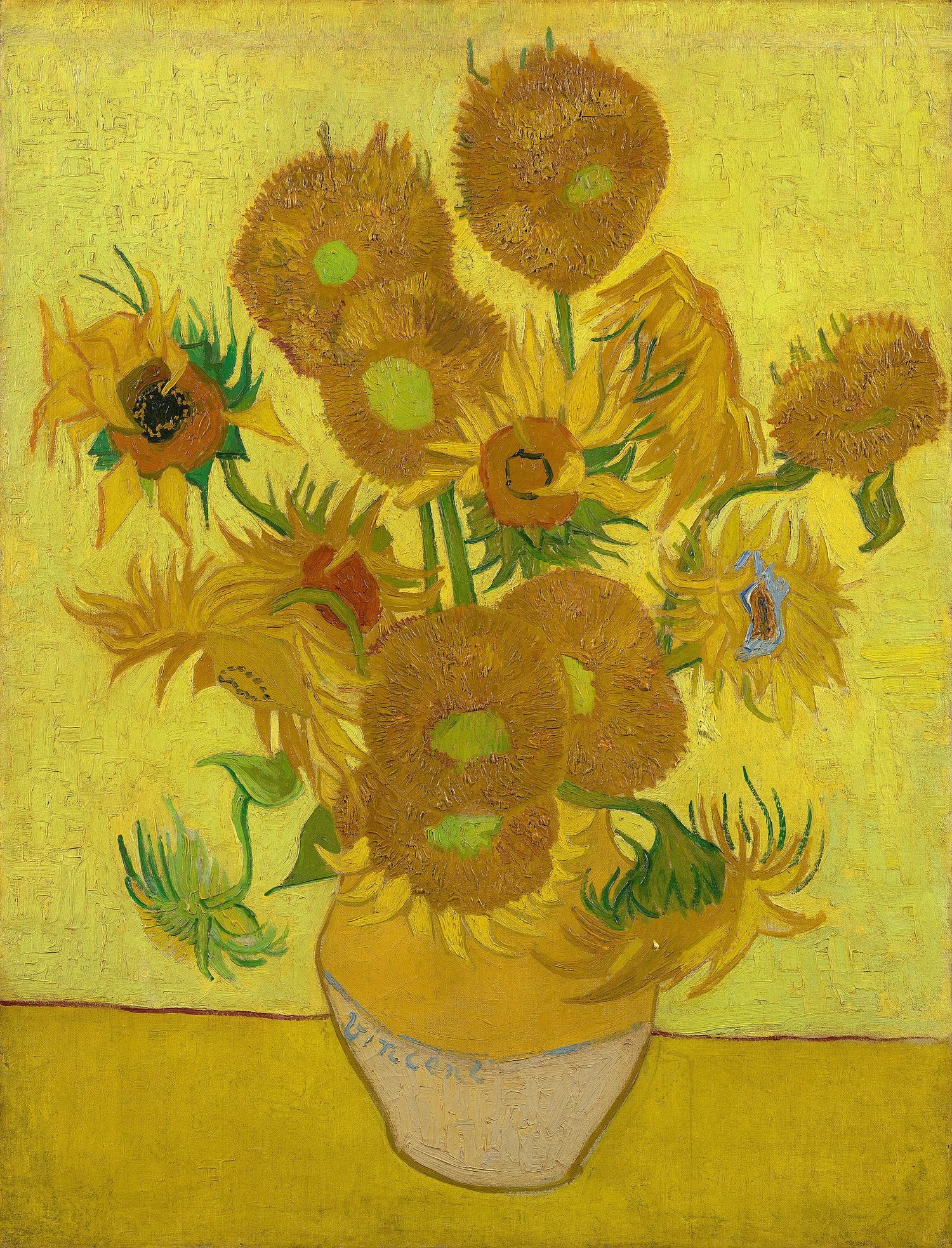
梵高的静物画,一瓶向日葵,几乎完全用黄色和金色的深浅画成
梵高的《向日葵》几乎完全由暖色的黄和橙构成——一种邻近色配色,显得明亮而统一
探索

Warm or cool colour?

Warm colours (red, orange, yellow) feel energetic and seem to advance; cool colours (blue, green, violet) feel calm and seem to recede.

词汇表 训练
英文 中文 拼音
Colour/ˈkʌlə/ 色彩 sè cǎi
colour wheel/ˈkʌlə wiːl/ 色轮 sè lún
hue/hjuː/ 色相 sè xiàng
saturation/ˌsætʃəˈreɪʃn/ 饱和度 bǎo hé dù
Primary/ˈpraɪməri/ 三原色 sān yuán sè
secondary/ˈsekəndəri/ 间色 jiàn sè
Complementary/ˌkɒmplɪˈmentəri/ 互补色 hù bǔ sè
neutralise/ˈnjuːtrəlaɪz/ 中和 zhōng hé
Analogous/əˈnæləɡəs/ 邻近色 lín jìn sè
Warm/wɔːm/ 暖色 nuǎn sè
cool/kuːl/ 冷色 lěng sè
练习卷 双页
1.5

肌理

大纲

Focus: Texture is the surface quality of a work — how it feels or how it appears to feel.

  • Actual (tactile) texture can be physically touched (thick paint, collage, rough paper).
  • Implied (visual) texture is the illusion of a surface, created with marks, value, and pattern.
  • Texture is built through mark-making: stippling, hatching, dry-brush, impasto, and frottage (rubbing).
  • Contrasting smooth and rough areas adds interest and can direct attention.
  • In photography and digital work, texture comes from light, focus, and surface detail.

来源:美国大学理事会 AP 课程与考试说明

肌理(texture)是一件作品的表面质量——它摸起来如何,或它看起来摸起来如何。

  • 实际(触觉)肌理(actual (tactile) texture)能被物理地触摸(厚的颜料、拼贴、粗糙的纸)。
  • 视觉肌理(implied (visual) texture)是一个表面的错觉,用标记、明度和图案制造。
  • 技法包括点画、排线、厚涂(impasto)(厚的颜料),和干笔。对比光滑和粗糙的区域增加趣味并能指引眼睛。
Woven denim close-up: texture is the surface quality you can see or feel — actual or implied
词汇表 训练
英文 中文 拼音
Texture/ˈtekstʃə/ 肌理 jī lǐ
Actual (tactile) texture/ˈæktʃuːəl ˈtekstʃə/ 实际肌理 shí jì jī lǐ
Implied (visual) texture/ɪmˈplaɪd ˈtekstʃə/ 视觉肌理 shì jué jī lǐ
impasto/ɪmˈpæstəʊ/ 厚涂 hòu tú
练习卷 双页
1.6

空间

大纲

Focus: Space is the area within, around, and between the parts of a work, including the illusion of depth.

  • Positive space is filled by the subject; negative space is the empty area around it.
  • Artists create the illusion of depth with overlapping, size, placement, and detail.
  • Linear perspective uses a horizon line and vanishing point(s) so parallel lines converge.
  • Atmospheric (aerial) perspective makes distant objects paler, bluer, and less detailed.
  • Foreground, middle ground, and background organise a scene from near to far.
  • The format and cropping of the picture plane shape how space is read.

来源:美国大学理事会 AP 课程与考试说明

空气透视
一点透视

空间(space)是一件作品各部分之内、周围和之间的区域,包括一个平坦表面上深度的错觉。

  • 正空间(positive space)被主体填充;负空间(negative space)是它周围空的区域。
  • 深度用重叠(overlapping)、大小、位置和细节创造。
  • 一个场景组织成三个深度平面:前景(foreground)(最近)、中景(middle ground)和背景(background)(最远)。最近的平面通常带最多的细节和对比,最远的最少。
  • 线性透视(linear perspective)用一条地平线和灭点(vanishing point)以便平行线汇聚;空气透视(atmospheric perspective)使遥远的东西更苍白、更蓝、更少细节。
  • 画面的格式裁剪塑造空间如何被读。

Worked example(应用这个概念)。 当被要求描述线条如何在一幅肖像中创造意义时,一个好的答案要说出元素、它的特质,和它的效果:"艺术家在背景使用粗的、锯齿状的对角线,它们不安、活跃的方向使坐着者肩膀平静的水平线显得更加静止。" 说出元素并且把它与一种感受联系起来,正是作品集书面证据和分析题都奖励的。

词汇表 训练
英文 中文 拼音
Space/speɪs/ 空间 kōng jiān
overlapping/ˌəʊvəˈlæpɪŋ/ 重叠 chóng dié
foreground/ˈfɔːɡraʊnd/ 前景 qián jǐng
middle ground/ˈmɪdl ɡraʊnd/ 中景 zhōng jǐng
background/ˈbækɡraʊnd/ 背景 bèi jǐng
Linear perspective/ˈlɪnɪə pəˈspektɪv/ 线性透视 xiàn xìng tòu shì
vanishing point/ˈvænɪʃɪŋ pɔɪnt/ 灭点 miè diǎn
atmospheric perspective/ˌætməsˈferɪk pəˈspektɪv/ 空气透视 kōng qì tòu shì
练习卷 双页
1.6

考试技巧

  • 在任何分析中精确地命名元素——线条、形状或形体、明度、色彩、肌理、空间。
  • 论证形体如何用一个明度阶和一个单一光源塑造。
  • 色轮:辨别互补邻近方案以及暖或冷的温度。
  • 形状(二维)与形体(三维)分开,把实际视觉肌理分开。
  • 重叠、大小、线性透视空气透视解释深度。

本主题的互动课程

逐步学习,并即时检测练习。

AP 二维艺术与设计的更多主题

登录或创建账号

IGCSE, A-Level & AP