Skip to content · ⁨コンテンツへスキップ⁩

Exploring One-Variable Data · ⁨単変量データの探索⁩

AP Statistics · Topic 1 · ⁨トピック 1⁩

View Slides · ⁨查看幻灯片⁩ Train · ⁨練習する⁩
Video lesson for this topic · ⁨このトピックのビデオレッスン⁩ Open the video page · ⁨動画ページを開く⁩
9:03

単変量データの探索

同じものを20回測定しても、20回の結果がすべて一致するとは限りません。20人の学生が同じ机を測りましたが、値は異なりました。これは…ではありません。

English narration · English + 中文 subtitles burned in · ⁨英語ナレーション・英語+中文字幕 burning-in⁩

1.1

Introducing Statistics: What Can We Learn from Data? · ⁨統計学入門:データから何が学べるか?⁩

Syllabus · ⁨シラバス⁩
English

Enduring Understanding (VAR-1): Given that variation may be random or not, conclusions are uncertain.

Learning Objective VAR-1.A: Identify questions to be answered, based on variation in one-variable data. [Skill 1.A]

  • VAR-1.A.1 Numbers may convey meaningful information, when placed in context.
日本語

長期的理解(VAR-1): ばらつきがランダムである場合でもそうでない場合でも、結論には不確実性が伴う。

学習目標 VAR-1.A: 単一変数データのばらつきに基づいて、答えたい問いを特定せよ。[スキル 1.A]

  • VAR-1.A.1 数値は、文脈に置かれることで意味のある情報を伝えることができる。
Source: College Board AP Course and Exam Description · ⁨出典: College Board AP コースおよび試験説明書⁩

English

Statistics 统计学 is the science of learning from data 数据 – numbers or labels collected from the real world. Data vary, so we describe patterns and account for the variation 变异 rather than expecting every value to match. A statistical question anticipates an answer based on data that vary.

Two distinctions run through the whole course. A parameter 参数 is a numerical summary of a whole population; a statistic 统计量 is a numerical summary of a sample - we use the statistic to estimate the parameter we cannot measure directly. And descriptive statistics 描述统计 only summarise the data set in hand, while inferential statistics 推断统计 use a sample to make and test claims about the larger population.

日本語

統計学とは、現実世界から収集された数値やラベルであるデータから学ぶ科学である。データは変動するため、すべての値が一致することを期待するのではなく、パターンを記述し、変動を説明する必要がある。統計学の問題は、変動するデータに基づく回答を前提としている。

コース全体を通じて2つの区別が存在する。パラメータとは全体の母集団の数値要約であり、統計量とは標本の数値要約である。直接測定できないパラメータを推定するために、統計量を使用する。また、記述統計は手持ちのデータセットを要約するのみであるのに対し、推論統計は標本を用いてより大きな母集団に関する主張を行ない、検証する。

1.2

The Language of Variation: Variables · ⁨変動の言語:変数⁩

Syllabus · ⁨シラバス⁩
English

Enduring Understanding (VAR-1): Given that variation may be random or not, conclusions are uncertain.

Learning Objective VAR-1.B: Identify variables in a set of data. [Skill 2.A]

  • VAR-1.B.1 A variable is a characteristic that changes from one individual to another.

Learning Objective VAR-1.C: Classify types of variables. [Skill 2.A]

  • VAR-1.C.1 A categorical variable takes on values that are category names or group labels.
  • VAR-1.C.2 A quantitative variable is one that takes on numerical values for a measured or counted quantity.
    • Illustrative examples for VAR-1.C:
      • Categorical variables:
        • Dominant hand
        • Age group (young or old)
        • Highest degree earned
      • Quantitative variables:
        • Age of a structure
        • Height of a child
        • Concentration of a sample
日本語

長期的理解(VAR-1): ばらつきがランダムである場合でもそうでない場合でも、結論には不確実性が伴う。

学習目標 VAR-1.B: データセットの変数を特定せよ。[スキル 2.A]

  • VAR-1.B.1 変数とは、一人から別の一人へと変化 characteristic である。

学習目標 VAR-1.C: 変数の種類を分類せよ。[スキル 2.A]

  • VAR-1.C.1 質的変数は、カテゴリ名やグループラベルとなる値をとる。
  • VAR-1.C.2 量的変数は、測定またはカウントされた数量に対して数値的な値をとる変数である。
    • *VAR-1.Cの例示:
      • 質的変数:
        • 利き手
        • 年齢層(若年者または高齢者)
        • 取得した最高学位
      • 定量的変数:
        • 構造物の年齢
        • 子供の身長
        • サンプルの濃度

Source: College Board AP Course and Exam Description · ⁨出典: College Board AP コースおよび試験説明書⁩

English

A variable 变量 is a characteristic that can differ between individuals. Two kinds:

  • Categorical 分类 (qualitative): values are labels/groups (eye colour, brand).
  • Quantitative 定量: values are numbers you can do arithmetic on (height, age). Quantitative variables are discrete (countable) or continuous (measured).

Choosing the right graph and summary depends on which kind you have.

日本語

変数とは、個人間で異なる特性のこと。2つの種類がある:

  • カテゴリカル(質的):値はラベルやグループ(目の色、ブランド)。
  • 定量:値は計算可能な数値(身長、年齢)。定量変数は離散(数えられる)または連続(測定される)である。

適切なグラフと要选择合适的取决于你拥有哪种类型。

Explore · ⁨探索⁩

Categorical or quantitative? · ⁨カテゴリー型か定量的か?⁩

Every variable is either categorical (it labels each unit with a group) or quantitative (a measured number you can average). Which kind it is decides the graphs and summaries you are allowed to use. · ⁨変数は質的変数(単位をグループで識別するもの)か量的変数(平均を取れる測定値)のいずれかです。この種類によって、使用可能なグラフや要約方法が決まります。⁩

1.3

Representing a Categorical Variable with Tables · ⁨テーブルによるカテゴリカル変数の表現⁩

Syllabus · ⁨シラバス⁩
English

Enduring Understanding (UNC-1): Graphical representations and statistics allow us to identify and represent key features of data.

Learning Objective UNC-1.A: Represent categorical data using frequency or relative frequency tables. [Skill 2.B]

  • UNC-1.A.1 A frequency table gives the number of cases falling into each category. A relative frequency table gives the proportion of cases falling into each category.

Learning Objective UNC-1.B: Describe categorical data represented in frequency or relative tables. [Skill 2.A]

  • UNC-1.B.1 Percentages, relative frequencies, and rates all provide the same information as proportions.
  • UNC-1.B.2 Counts and relative frequencies of categorical data reveal information that can be used to justify claims about the data in context.
日本語

永続的理解 (UNC-1): グラフや統計は、データの主要な特徴を特定・表現するために用いられる。

学習目標 UNC-1.A: 頻度表または相対頻度表を用いてカテゴリカルデータを表現する。[スキル 2.B]

  • UNC-1.A.1 頻度表は、各カテゴリに分類される事象の数を示す。相対頻度表は、各カテゴリに分類される事象の割合を示す。

学習目標 UNC-1.B: 頻度表または相対頻度表で表現されたカテゴリカルデータを説明する。[スキル 2.A]

  • UNC-1.B.1 パーセンテージ、相対頻度、率はいずれも、割合と同じ情報を提供する。
  • UNC-1.B.2 カテゴリカルデータの個数と相対頻度は、文脈におけるデータに関する主張を正当化するために使用できる情報を明らかにする。

Source: College Board AP Course and Exam Description · ⁨出典: College Board AP コースおよび試験説明書⁩

English

A frequency table 频数表 lists each category's count (frequency); a relative frequency 相对频率 table lists each category's proportion 比例 (count ÷ total). Relative frequencies let you compare groups of different sizes fairly.

日本語

頻度表は各カテゴリの個数(頻度)をリストアップし、相対頻度表は各カテゴリの割合(個数 ÷ 総数)をリストアップする。相対頻度を用いることで、異なるサイズのグループ間を公平に比較できる。

1.4

Representing a Categorical Variable with Graphs · ⁨グラフによるカテゴリカル変数の表現⁩

Syllabus · ⁨シラバス⁩
English

Enduring Understanding (UNC-1): Graphical representations and statistics allow us to identify and represent key features of data.

Learning Objective UNC-1.C: Represent categorical data graphically. [Skill 2.B]

  • UNC-1.C.1 Bar charts (or bar graphs) are used to display frequencies (counts) or relative frequencies (proportions) for categorical data.
  • UNC-1.C.2 The height or length of each bar in a bar graph corresponds to either the number or proportion of observations falling within each category.
  • UNC-1.C.3 There are many additional ways to represent frequencies (counts) or relative frequencies (proportions) for categorical data.

Learning Objective UNC-1.D: Describe categorical data represented graphically. [Skill 2.A]

  • UNC-1.D.1 Graphical representations of a categorical variable reveal information that can be used to justify claims about the data in context.

Learning Objective UNC-1.E: Compare multiple sets of categorical data. [Skill 2.D]

  • UNC-1.E.1 Frequency tables, bar graphs, or other representations can be used to compare two or more data sets in terms of the same categorical variable.
日本語

永続的理解 (UNC-1): グラフや統計は、データの主要な特徴を特定・表現するために用いられる。

学習目標 UNC-1.C: グラフを用いてカテゴリカルデータを表現する。[スキル 2.B]

  • UNC-1.C.1 棒グラフ(またはバーチャート)は、カテゴリカルデータの頻度(個数)または相対頻度(割合)を表示するために用いられる。
  • UNC-1.C.2 棒グラフの各棒の高さまたは長さは、各カテゴリに含まれる観察値の数または割合に対応する。
  • UNC-1.C.3 カテゴリカルデータの頻度(個数)または相対頻度(割合)を表現する方法には、他に多数存在する。

学習目標 UNC-1.D: グラフで表現されたカテゴリカルデータを説明する。[スキル 2.A]

  • UNC-1.D.1 カテゴリカル変数のグラフ表現は、文脈におけるデータに関する主張を正当化するために使用できる情報を明らかにする。

学習目標 UNC-1.E: 複数のカテゴリカルデータのセットを比較する。[スキル 2.D]

  • UNC-1.E.1 頻度表、棒グラフ、または他の表現方法を用いて、同じカテゴリカル変数について2つ以上のデータセットを比較することができる。

Source: College Board AP Course and Exam Description · ⁨出典: College Board AP コースおよび試験説明書⁩

English

Bar charts 条形图 show the count or proportion of each category as separated bars; a pie chart shows each category's share of the whole. The bar heights (or slices) let you compare categories at a glance. Bars may be ordered by size or by a natural category order.

日本語

棒グラフは各カテゴリの個数や割合を独立した棒で示し、円グラフは各カテゴリの全体に対する割合を示す。棒の高さ(または扇形の角度)により、カテゴリを一目で比較できる。棒はサイズ順や自然なカテゴリ順序で並べられることもある。

Explore · ⁨探索⁩

Show a categorical variable as a pie chart · ⁨質的変数を円グラフで表示する⁩

A pie chart turns each category's share of the whole into a slice: a bigger share is a bigger slice, and every slice together makes 100%. It is a picture of a relative-frequency table. · ⁨円グラフは全体のうち各カテゴリーの割合をスライスに変換します。割合が大きいほどスライスの大きさも大きくなり、すべてのスライスを合わせると100%になります。これは相対頻度表の視覚的な表現です。⁩

1.5

Representing a Quantitative Variable with Graphs · ⁨グラフによる定量変数の表現⁩

Syllabus · ⁨シラバス⁩
English

Enduring Understanding (UNC-1): Graphical representations and statistics allow us to identify and represent key features of data.

Learning Objective UNC-1.F: Classify types of quantitative variables. [Skill 2.A]

  • UNC-1.F.1 A discrete variable can take on a countable number of values. The number of values may be finite or countably infinite, as with the counting numbers.
  • UNC-1.F.2 A continuous variable can take on infinitely many values, but those values cannot be counted. No matter how small the interval between two values of a continuous variable, it is always possible to determine another value between them.
    • Illustrative examples for UNC-1.F:
      • A discrete variable:
        • Number of students in a class
      • A continuous variable:
        • Height of a child

Learning Objective UNC-1.G: Represent quantitative data graphically. [Skill 2.B]

  • UNC-1.G.1 In a histogram, the height of each bar shows the number or proportion of observations that fall within the interval corresponding to that bar. Altering the interval widths can change the appearance of the histogram.
  • UNC-1.G.2 In a stem and leaf plot, each data value is split into a "stem" (the first digit or digits) and a "leaf" (usually the last digit).
  • UNC-1.G.3 A dotplot represents each observation by a dot, with the position on the horizontal axis corresponding to the data value of that observation, with nearly identical values stacked on top of each other.
  • UNC-1.G.4 A cumulative graph represents the number or proportion of a data set less than or equal to a given number.
  • UNC-1.G.5 There are many additional ways to graphically represent distributions of quantitative data.
日本語

永続的理解 (UNC-1): グラフや統計は、データの主要な特徴を特定・表現するために用いられる。

学習目標 UNC-1.F: 定量的変数の種類を分類する。[スキル 2.A]

  • UNC-1.F.1 離散変数は、数えられる数の値をとることができる。その値の数は有限である場合や、自然数のように数え无穷大である場合がある。
  • UNC-1.F.2 連続変数は無限多くの値をとるが、それらの値は数えることができない。連続変数の2つの値間の間隔がいかに小さくても、その間に別の値を特定することは常に可能である。
    • UNC-1.F の例示:
      • 離散変数:
        • クラス内の生徒数
      • 連続変数:
        • 子供の身長

学習目標 UNC-1.G: グラフを用いて定量的データを表現する。[スキル 2.B]

  • UNC-1.G.1 ヒストグラムにおいて、各棒の高さは、その棒に対応する区間に含まれる観察値の数または割合を示す。区間の幅を変えるとヒストグラムの外見が変わることがある。
  • UNC-1.G.2 ステム&リーフプロットでは、各データ値は「stem」(最初の桁または桁の組み合わせ)と「leaf」(通常は最後の桁)に分割される。
  • UNC-1.G.3 ドットプロットでは、各観察値を点で表し、水平軸上の位置はその観察値のデータ値に対応させ、ほぼ同じ値は積み重ねて表示する。
  • UNC-1.G.4 累積グラフは、与えられた数以下にあるデータセットの数または割合を表す。
  • UNC-1.G.5 定量的データの分布をグラフで表現する方法には、他に多数存在する。

Source: College Board AP Course and Exam Description · ⁨出典: College Board AP コースおよび試験説明書⁩

English

For numbers, use a dotplot 点图, stem-and-leaf plot 茎叶图, or histogram 直方图 (bars over value intervals called bins). These show the distribution 分布 – how the values spread out. A histogram's bin width changes the picture, so choose it to reveal the shape.

日本語

数値に対しては、ドットプロット、茎葉図、またはヒストグラム(値区間であるビンの上に置かれた棒)を使用する。これらは分布、つまり値がどのように広がっているかを示す。ヒストグラムのビンの幅は視覚的に変化させるため、形状を明確にするために適切に選択する。

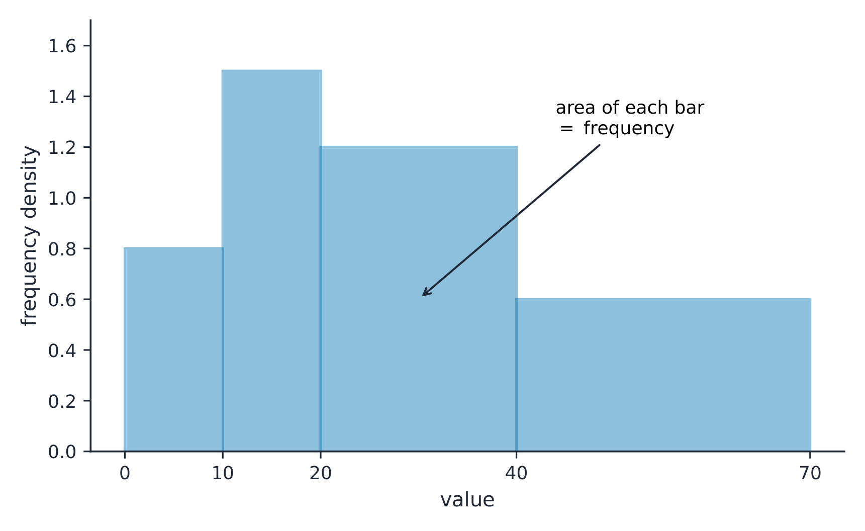
不均等なクラス幅を持つヒストグラムでは、棒の面積が頻度である
Explore · ⁨探索⁩

Explore how bin width shapes a histogram · ⁨ビン幅がヒストグラムの形状に与える影響を調べる⁩

A histogram groups data into equal-width bins and draws a bar over each. Change the bins and notice how the same data can look jagged (too narrow) or smooth (too wide) — the shape is a choice. · ⁨ヒストグラムはデータを等幅のビンに分類し、各ビンの上に棒を描きます。ビンを変更すると、同じデータでもギザギザ(ビンが狭すぎる場合)や滑らか(ビンが広すぎる場合)に見え方が変わり、形状は選択によるものです。⁩

Vocabulary · ⁨語彙⁩ Train · ⁨練習する⁩
English 日本語
Statistics/stəˈtɪstɪks/ 統計学
data/ˈdeɪtə/ データ
variation/ˌveərɪˈeɪʃn/ 変異
parameter/pəˈræmɪtə/ パラメータ
statistic/stəˈtɪstɪk/ 統計量
descriptive statistics/dɪˈskrɪptɪv stəˈtɪstɪks/ 記述統計
inferential statistics/ɪnfəˈrenʃl stəˈtɪstɪks/ 推定統計学
variable/ˈveərɪəbl/ 変数
Categorical/ˌkætɪˈɡɒrɪkl/ 範疇的
Quantitative/ˈkwɒntɪteɪtɪv/ 定量的
frequency table/ˈfriːkwənsi ˈteɪbl/ 頻度表
relative frequency/ˈrelətɪv ˈfriːkwənsi/ 相対周波数
proportion/prəˈpɔːʃn/ 比例
Bar charts/bɑː tʃɑːts/ 棒グラフ
dotplot/ˈdɒtplɒt/ ドットプロット
stem-and-leaf plot/stem ænd liːf plɒt/ 茎葉図
histogram/ˈhɪstəɡræm/ ヒストグラム
1.6

Describing the Distribution of a Quantitative Variable · ⁨定量変数の分布の記述⁩

Syllabus · ⁨シラバス⁩
English

Enduring Understanding (UNC-1): Graphical representations and statistics allow us to identify and represent key features of data.

Learning Objective UNC-1.H: Describe the characteristics of quantitative data distributions. [Skill 2.A]

  • UNC-1.H.1 Descriptions of the distribution of quantitative data include shape, center, and variability (spread), as well as any unusual features such as outliers, gaps, clusters, or multiple peaks.
  • UNC-1.H.2 Outliers for one-variable data are data points that are unusually small or large relative to the rest of the data.
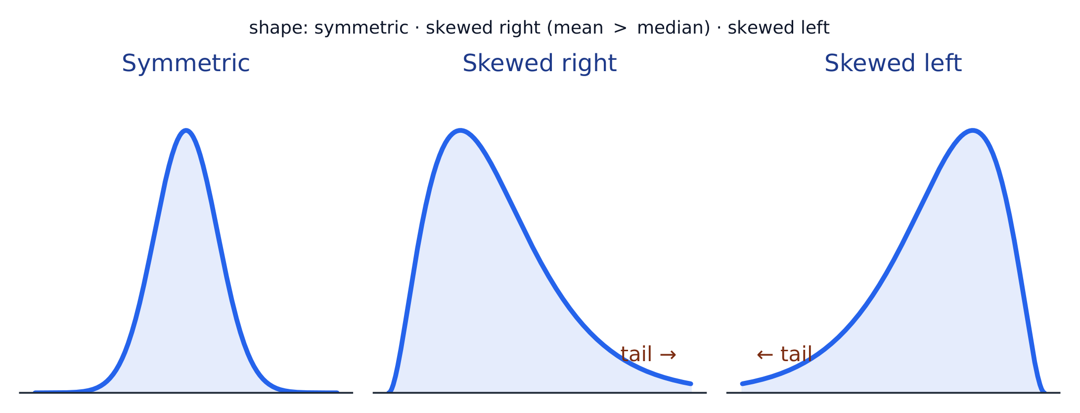
  • UNC-1.H.3 A distribution is skewed to the right (positive skew) if the right tail is longer than the left. A distribution is skewed to the left (negative skew) if the left tail is longer than the right. A distribution is symmetric if the left half is the mirror image of the right half.
  • UNC-1.H.4 Univariate graphs with one main peak are known as unimodal. Graphs with two prominent peaks are bimodal. A graph where each bar height is approximately the same (no prominent peaks) is approximately uniform.
  • UNC-1.H.5 A gap is a region of a distribution between two data values where there are no observed data.
  • UNC-1.H.6 Clusters are concentrations of data usually separated by gaps.
  • UNC-1.H.7 Descriptive statistics does not attribute properties of a data set to a larger population, but may provide the basis for conjectures for subsequent testing.
日本語

永続的理解 (UNC-1): グラフや統計は、データの主要な特徴を特定・表現するために用いられる。

学習目標 UNC-1.H: 定量的データの分布の特徴を説明する。[スキル 2.A]

  • UNC-1.H.1 定量的データの分布の説明には、形状、中心、ばらつき(spread)、および外れ値、ギャップ、クラスター、または複数の山などの異常な特徴が含まれる。
  • UNC-1.H.2 単一変数データの外れ値とは、他のデータに対して異常に小さいまたは大きいデータポイントである。
  • UNC-1.H.3 分布の右側尾が左側尾より長い場合、分布は右に歪んでいる(正の歪み)。左側尾が右側尾より長い場合、分布は左に歪んでいる(負の歪み)。左半分が右半分の鏡像である場合、分布は対称である。
  • UNC-1.H.4 単一の主要な山を持つ単一変数グラフは moda(一峰性)と呼ばれる。2つの目立つ山を持つグラフは bimodal(二峰性)である。各棒の高さがほぼ同じであり(目立つ山がない)、グラフがほぼ均等である場合は uniform(一様分布)である。
  • UNC-1.H.5 ギャップとは、2つのデータ値の間で観測されたデータが存在しない分布の領域である。
  • UNC-1.H.6 クラスターとは、通常ギャップによって分離されているデータの集中部である。
  • UNC-1.H.7 記述統計は、データセットの特性をより大きな母集団に帰属させるものではないが、後続の検定のための推論の基礎を提供することがある。

Source: College Board AP Course and Exam Description · ⁨出典: College Board AP コースおよび試験説明書⁩

English

Describe four things (remember SOCS):

  • Shape 形状: symmetric, or skewed 偏斜 left/right (a long tail on that side), and how many peaks - one main peak is unimodal 单峰, two prominent peaks bimodal 双峰, and roughly equal bars uniform 均匀.
  • Outliers 离群值: unusual values far from the rest.
  • Center: a typical value (mean or median).
  • Spread: how much the values vary (range, IQR, standard deviation).

Always describe shape/center/spread in context, with units.

日本語

4つの要素を記述する(SOCSを思い出す):

  • 形状:対称、または左/右に歪み(その側に長い尾がある)があること、ピークの数がいくつあるか。1つの主要なピークは単峰型、2つの目立つピークは二峰型、ほぼ等しい棒は一様分布である。
  • 外れ値:他の値から大きく離れた異常値。
  • 中心:典型的な値(平均値または中央値)。
  • ばらつき: 値のばらつきの程度(範囲、IQR、標準偏差)。

常に、単位を添えて、文脈の中で形状・中心・ばらつきを記述すること。

分布の形状:対称型、右に歪む(右側の長い尾)、または左に歪む
Vocabulary · ⁨語彙⁩ Train · ⁨練習する⁩
English 日本語
distribution/ˌdɪstrɪˈbjuːʃn/ 分配
Shape/ʃeɪp/ 形状(Shape)
skewed/skjuːd/ 歪んでいる
unimodal/ˌʌnɪˈmɒdl/ 単一ピーク分布
bimodal/baɪˈmɒdl/ 二峰分布
uniform/ˈjuːnɪfɔːm/ 均一
Outliers/ˈaʊtlaɪəz/ 外れ値
mean/miːn/ 平均
median/ˈmiːdiːən/ 中央値
interquartile range/ˌɪntəˈkwɔːtaɪl reɪndʒ/ 四分位範囲
1.7

Summary Statistics for a Quantitative Variable · ⁨数量変数の要約統計量⁩

Syllabus · ⁨シラバス⁩
Enduring UnderstandingLearning ObjectiveEssential Knowledge

UNC-1
Graphical representations and statistics allow us to identify and represent key features of data.

UNC-1.I
Calculate measures of center and position for quantitative data. [Skill 2.C]

  • UNC-1.I.1 A statistic is a numerical summary of sample data.
  • UNC-1.I.2 The mean is the sum of all the data values divided by the number of values. For a sample, the mean is denoted by $x$-bar: $\bar{x} = \dfrac{1}{n}\sum_{i=1}^{n} x_i$, where $x_i$ represents the $i^{\text{th}}$ data point in the sample and $n$ represents the number of data values in the sample.
  • UNC-1.I.3 The median of a data set is the middle value when data are ordered. When the number of data points is even, the median can take on any value between the two middle values. In AP Statistics, the most commonly used value for the median of a data set with an even number of values is the average of the two middle values.
  • UNC-1.I.4 The first quartile, Q1, is the median of the half of the ordered data set from the minimum to the position of the median. The third quartile, Q3, is the median of the half of the ordered data set from the position of the median to the maximum. Q1 and Q3 form the boundaries for the middle 50% of values in an ordered data set.
  • UNC-1.I.5 The $p^{\text{th}}$ percentile is interpreted as the value that has $p\%$ of the data less than or equal to it.

UNC-1.J
Calculate measures of variability for quantitative data. [Skill 2.C]

  • UNC-1.J.1 Three commonly used measures of variability (or spread) in a distribution are the range, interquartile range, and standard deviation.
  • UNC-1.J.2 The range is defined as the difference between the maximum data value and the minimum data value. The interquartile range (IQR) is defined as the difference between the third and first quartiles: $Q3 - Q1$. Both the range and the interquartile range are possible ways of measuring variability of the distribution of a quantitative variable.
  • UNC-1.J.3 Standard deviation is a way to measure variability of the distribution of a quantitative variable. For a sample, the standard deviation is denoted by $s$: $s_x = \sqrt{\dfrac{1}{n-1}\sum(x_i - \bar{x})^2}$. The square of the sample standard deviation, $s^2$, is called the sample variance.
  • UNC-1.J.4 Changing units of measurement affects the values of the calculated statistics.

UNC-1.K
Explain the selection of a particular measure of center and/or variability for describing a set of quantitative data. [Skill 4.B]

  • UNC-1.K.1 There are many methods for determining outliers. Two methods frequently used in this course are:
    • UNC-1.K.1.i An outlier is a value greater than $1.5 \times \text{IQR}$ above the third quartile or more than $1.5 \times \text{IQR}$ below the first quartile.
    • UNC-1.K.1.ii An outlier is a value located 2 or more standard deviations above, or below, the mean.
  • UNC-1.K.2 The mean, standard deviation, and range are considered nonresistant (or non-robust) because they are influenced by outliers. The median and IQR are considered resistant (or robust), because outliers do not greatly (if at all) affect their value.

Source: College Board AP Course and Exam Description · ⁨出典: College Board AP コースおよび試験説明書⁩

English
Standard deviation: spread about the mean
  • Center: the mean 均值 $\bar{x}=\dfrac{\sum x_i}{n}$ (average) and the median 中位数 (middle value). The median resists outliers; the mean is pulled toward a skew.
  • Spread: the range, the interquartile range 四分位距 $\text{IQR}=Q_3-Q_1$ (middle 50%), and the standard deviation 标准差 $s_x=\sqrt{\dfrac{\sum(x_i-\bar{x})^2}{n-1}}$ (typical distance from the mean; its square is the variance 方差).
  • The five-number summary 五数概括: min, $Q_1$, median, $Q_3$, max.

Use resistant measures (median, IQR) for skewed data; mean and standard deviation for roughly symmetric data.

The percentile 百分位数 of a value is the percent of the data at or below it – so the median is the 50th percentile and $Q_1$ the 25th. A cumulative relative frequency graph 累积相对频率图 makes percentiles easy to read: for each value it plots the proportion of the data at or below it, rising from 0 to 1. Go up from a value to the curve and across to its percentile, or reverse the steps to find the value at a given percentile (the same reading works from a cumulative-frequency table).

Worked example. For the data $4, 8, 6, 10, 7$: the mean is $\bar{x}=\dfrac{4+8+6+10+7}{5}=\dfrac{35}{5}=7$. Sorting to $4,6,7,8,10$, the median is the middle value, $7$. The mean and median agree here because the data are roughly symmetric.

日本語
標準偏差:平均まわりのばらつき
  • 中心: 平均 $\bar{x}=\dfrac{\sum x_i}{n}$(算術平均)と 中央値(真ん中の値)。中央値は外れ値の影響を受けにくく、平均は歪み方向へ引き寄せられる。
  • ばらつき: 範囲、四分位幅 $\text{IQR}=Q_3-Q_1$(中央の50%)、および 標準偏差 $s_x=\sqrt{\dfrac{\sum(x_i-\bar{x})^2}{n-1}}$(平均からの典型的な距離;その二乗が 分散)。
  • 5数要約:最小値、$Q_1$、中央値、$Q_3$、最大値。

歪んだデータには 抵抗性のある指標(中央値、IQR)を使用し、ほぼ対称的なデータには平均と標準偏差を使用する。

ある値の 百分位数 は、その値以下にあるデータの割合である。したがって、中央値は第50百分位数であり、$Q_1$は第25百分位数である。累積相対頻度グラフ を用いると百分位数を読み取りやすい。このグラフでは、各値に対してそれ以下のデータの比率をプロットし、0から1まで上昇する曲線を描く。値から垂直に上に進んで曲線に当たり、そこから水平に進んで対応する百分位数を見つけるか、逆に百分位数から値を求めることもできる(累積頻度表でも同様の読み取りが可能)。

** worked example.** データ $4, 8, 6, 10, 7$ において、平均は $\bar{x}=\dfrac{4+8+6+10+7}{5}=\dfrac{35}{5}=7$ である。昇順に並べた $4,6,7,8,10$ の中央の値が中央値 $7$ となる。ここではデータがほぼ対称的であるため、平均と中央値は一致している。

Vocabulary · ⁨語彙⁩ Train · ⁨練習する⁩
English 日本語
standard deviation/ˈstændəd ˌdiːvɪˈeɪʃn/ 標準偏差
variance/ˈveərɪəns/ 分散
five-number summary/faɪv ˈnʌmbə ˈsʌməri/ 5数要約
percentile/pəˈsentaɪl/ パーセンタイル
cumulative relative frequency graph/ˈkjuːmjʊlətɪv ˈrelətɪv ˈfriːkwənsi ɡræf/ 累積相対頻度グラフ
1.8

Graphical Representations of Summary Statistics · ⁨要約統計量の視覚的表現⁩

Syllabus · ⁨シラバス⁩
Enduring UnderstandingLearning ObjectiveEssential Knowledge

UNC-1
Graphical representations and statistics allow us to identify and represent key features of data.

UNC-1.L
Represent summary statistics for quantitative data graphically. [Skill 2.B]

  • UNC-1.L.1 Taken together, the minimum data value, the first quartile (Q1), the median, the third quartile (Q3), and the maximum data value make up the five-number summary.
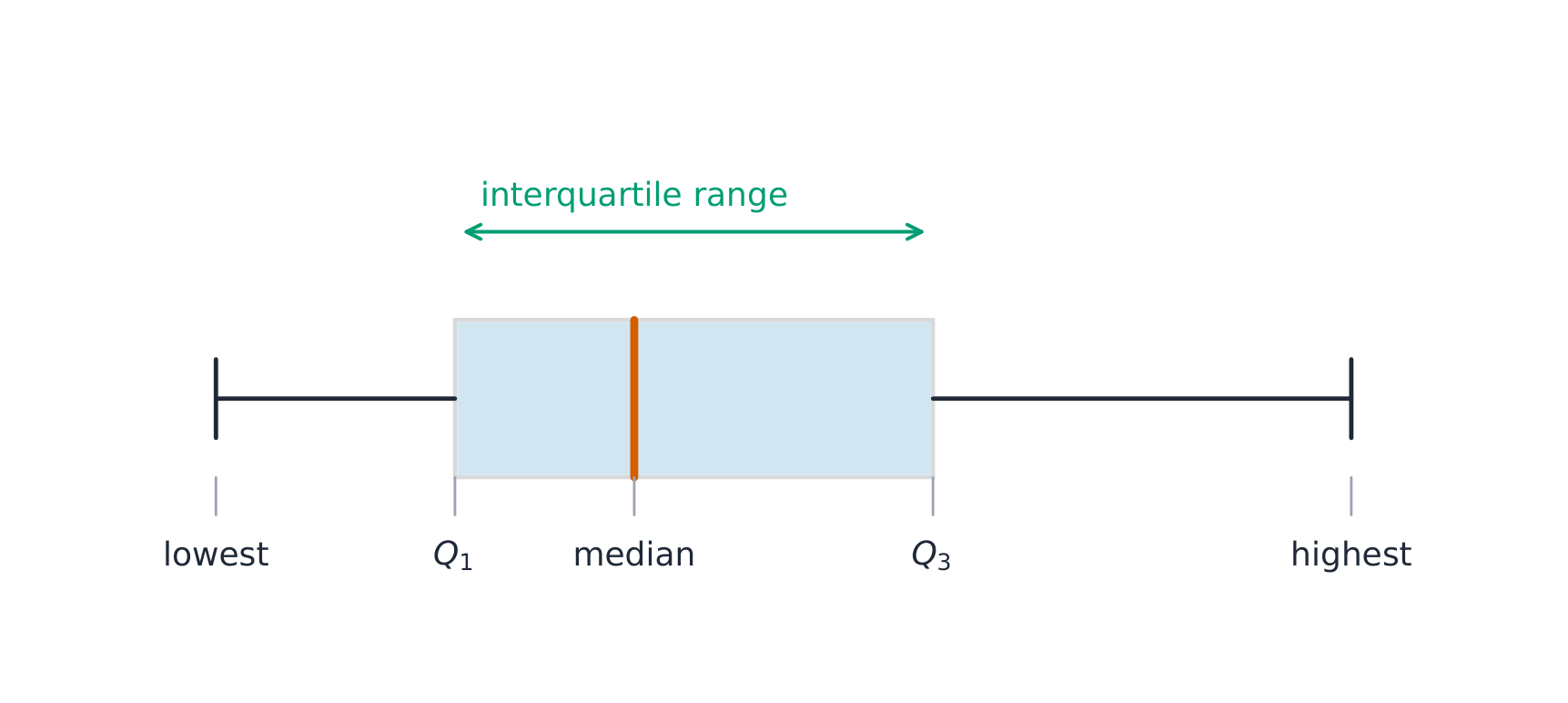
  • UNC-1.L.2 A boxplot is a graphical representation of the five-number summary (minimum, first quartile, median, third quartile, maximum). The box represents the middle 50% of data, with a line at the median and the ends of the box corresponding to the quartiles. Lines ("whiskers") extend from the quartiles to the most extreme point that is not an outlier, and outliers are indicated by their own symbol beyond this.

UNC-1.M
Describe summary statistics of quantitative data represented graphically. [Skill 2.A]

  • UNC-1.M.1 Summary statistics of quantitative data, or of sets of quantitative data, can be used to justify claims about the data in context.
  • UNC-1.M.2 If a distribution is relatively symmetric, then the mean and median are relatively close to one another. If a distribution is skewed right, then the mean is usually to the right of the median. If the distribution is skewed left, then the mean is usually to the left of the median.

Source: College Board AP Course and Exam Description · ⁨出典: College Board AP コースおよび試験説明書⁩

English

A boxplot 箱线图 draws the five-number summary: a box from $Q_1$ to $Q_3$ with the median inside, and whiskers to the most extreme non-outlier values. A point is an outlier if it lies more than $1.5\times\text{IQR}$ beyond a quartile – a rule you may be asked to apply. Boxplots are ideal for comparing several groups side by side.

Worked example. A dataset has $Q_1=20$ and $Q_3=32$, so $\text{IQR}=12$. The outlier fences are $Q_1-1.5(12)=2$ and $Q_3+1.5(12)=50$. Any value below $2$ or above $50$ is flagged as an outlier.

日本語

箱ひげ図 は5数要約を描く。$Q_1$ から $Q_3$ までの箱に中央値を含め、最も極端な外れ値ではない値までひげを伸ばす。ある点は四分位数から $1.5\times\text{IQR}$ 以上離れている場合、それは 外れ値 であり、このルールを適用するよう指示されることもある。箱ひげ図は複数のグループを横並びで比較するのに最適である。

** worked example.** データセットに $Q_1=20$ と $Q_3=32$ が含まれるため、$\text{IQR}=12$ となる。外れ値の境界値は $Q_1-1.5(12)=2$ と $Q_3+1.5(12)=50$ である。$2$ より小さい値や $50$ より大きい値はすべて外れ値としてフラグ付けされる。

箱ひげ図は四分位範囲と範囲を示す
箱ひげ図は四分位範囲と範囲を示す
箱ひげ図は5数要約を描き、箱はIQRにまたがる
Explore · ⁨探索⁩

Explore the five-number summary as a boxplot · ⁨5数要約を箱ひげ図として調べる⁩

Drag $Q_1$, the median, and $Q_3$ to see the box (its length is the IQR) and how the median's position inside the box reveals skew — a median close to $Q_1$ signals a right-skewed distribution. · ⁨$Q_1$、中央値、および$Q_3$をドラッグして、箱(その長さはIQR)を確認します。また、箱内の中央値の位置から歪みを見取ることができます。中央値が$Q_1$に近い場合、右に歪んだ分布を示しています。⁩

Vocabulary · ⁨語彙⁩ Train · ⁨練習する⁩
English 日本語
boxplot/ˈbɒksplɒt/ 箱ひげ図
normal distribution/ˈnɔːml ˌdɪstrɪˈbjuːʃn/ 正規分布
1.9

Comparing Distributions of a Quantitative Variable · ⁨数量変数の分布の比較⁩

Syllabus · ⁨シラバス⁩
English

Enduring Understanding (UNC-1): Graphical representations and statistics allow us to identify and represent key features of data.

Learning Objective UNC-1.N: Compare graphical representations for multiple sets of quantitative data. [Skill 2.D]

  • UNC-1.N.1 Any of the graphical representations, e.g., histograms, side-by-side boxplots, etc., can be used to compare two or more independent samples on center, variability, clusters, gaps, outliers, and other features.

Learning Objective UNC-1.O: Compare summary statistics for multiple sets of quantitative data. [Skill 2.D]

  • UNC-1.O.1 Any of the numerical summaries (e.g., mean, standard deviation, relative frequency, etc.) can be used to compare two or more independent samples.
日本語

永続的理解 (UNC-1): グラフや統計は、データの主要な特徴を特定・表現するために用いられる。

学習目標 UNC-1.N: 複数の定量データセットに対して、グラフによる表現を比較する。[スキル 2.D]

  • UNC-1.N.1 ヒストグラム、横並びボックスプロットなど、どのグラフ表現でも、中心、ばらつき、クラスター、ギャップ、外れ値、その他の特徴について、2つ以上の独立したサンプルを比較することができる。

学習目標 UNC-1.O: 複数の定量データセットの要約統計量を比較する。[スキル 2.D]

  • UNC-1.O.1 平均値、標準偏差、相対頻度などのいずれかの数値要約を用いて、2つ以上の独立したサンプルを比較することができる。

Source: College Board AP Course and Exam Description · ⁨出典: College Board AP コースおよび試験説明書⁩

English

To compare two or more groups, compare shape, center, and spread, and mention outliers – always with comparative words ("Group A has a higher median than Group B") and in context. Do not just describe each group separately; make the comparison explicit.

日本語

2つ以上のグループを比較するには、形状、中心、ばらつき を比較し、外れ値にも言及する。常に比較表現(「グループAの中央値はグループBよりも 高い」など)を用いて文脈の中で記述すること。各グループを個別に説明するだけでなく、明確に比較を行うこと。

Explore · ⁨探索⁩

Compare distributions with box plots · ⁨箱ひげ図による分布の比較⁩

A box plot draws the five-number summary. Placing two box plots on the same scale compares their centre (median), spread (IQR = box width) and skew at a glance — the fair way to compare groups. · ⁨箱ひげ図は5数要約を視覚化します。同じスケール上に2つの箱ひげ図を配置することで、中心(中央値)、ばらつき(IQR=箱の幅)、歪みを一目で比較でき、グループ間の公平な比較が可能になります。⁩

1.10

The Normal Distribution · ⁨正規分布⁩

Syllabus · ⁨シラバス⁩
English

Enduring Understanding (VAR-2): The normal distribution can be used to represent some population distributions.

Learning Objective VAR-2.A: Compare a data distribution to the normal distribution model. [Skill 2.D]

  • VAR-2.A.1 A parameter is a numerical summary of a population.
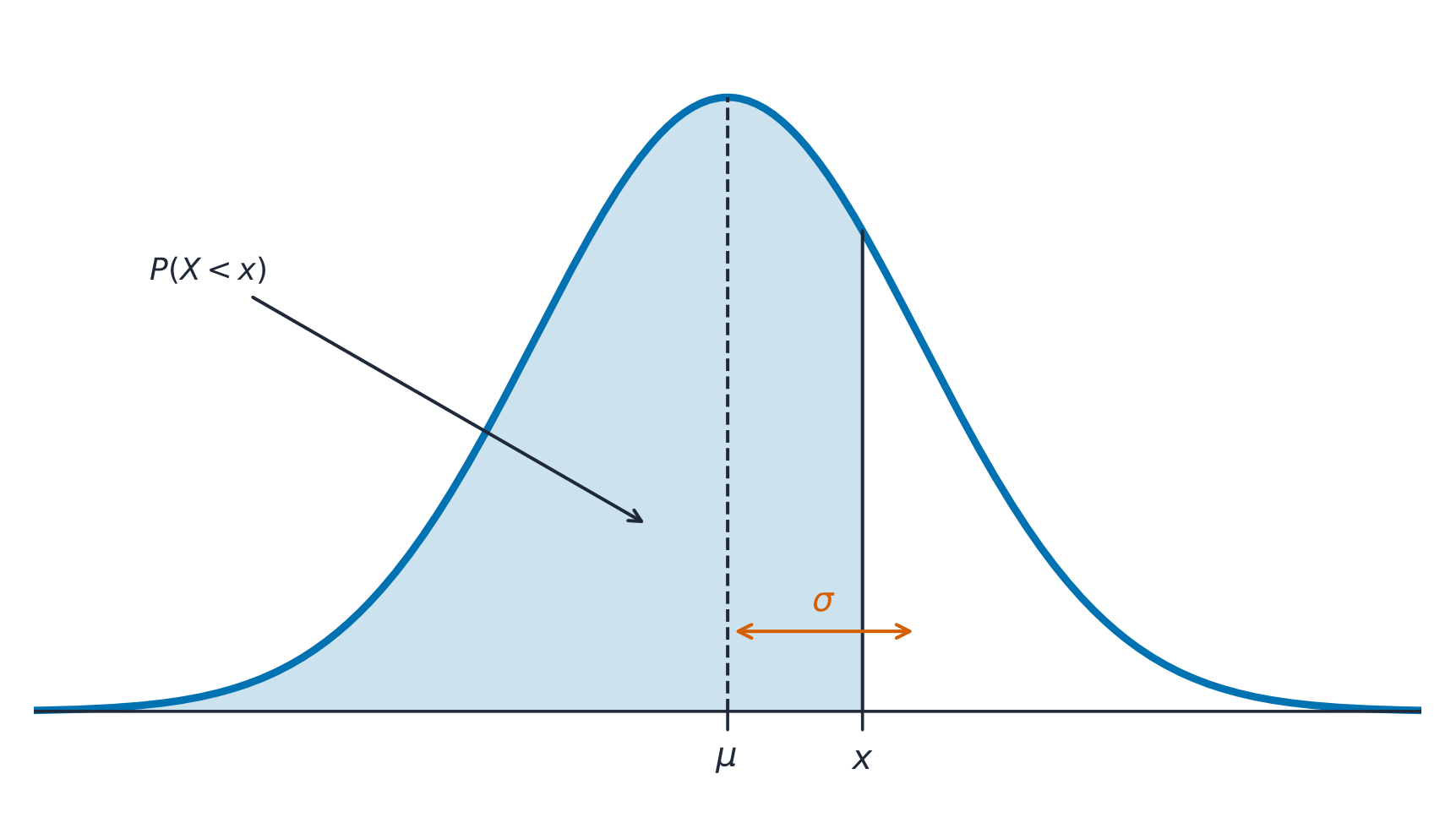
  • VAR-2.A.2 Some sets of data may be described as approximately normally distributed. A normal curve is mound-shaped and symmetric. The parameters of a normal distribution are the population mean, $\mu$, and the population standard deviation, $\sigma$.
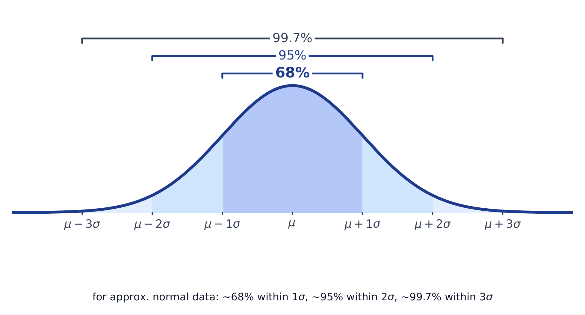
  • VAR-2.A.3 For a normal distribution, approximately 68% of the observations are within 1 standard deviation of the mean, approximately 95% of observations are within 2 standard deviations of the mean, and approximately 99.7% of observations are within 3 standard deviations of the mean. This is called the empirical rule.
  • VAR-2.A.4 Many variables can be modeled by a normal distribution.
    • Illustrative examples for VAR-2.A:
      • Variables that can be modeled by a normal distribution:
        • Body temperature
        • Weight of a loaf of bread

Learning Objective VAR-2.B: Determine proportions and percentiles from a normal distribution. [Skill 3.A]

  • VAR-2.B.1 A standardized score for a particular data value is calculated as (data value − mean)/(standard deviation), and measures the number of standard deviations a data value falls above or below the mean.
  • VAR-2.B.2 One example of a standardized score is a $z$-score, which is calculated as $z\text{-score} = \left(\dfrac{x_i - \mu}{\sigma}\right)$. A $z$-score measures how many standard deviations a data value is from the mean.
  • VAR-2.B.3 Technology, such as a calculator, a standard normal table, or computer-generated output, can be used to find the proportion of data values located on a given interval of a normally distributed random variable.
  • VAR-2.B.4 Given the area of a region under the graph of the normal distribution curve, it is possible to use technology, such as a calculator, a standard normal table, or computer-generated output, to estimate parameters for some populations.

Learning Objective VAR-2.C: Compare measures of relative position in data sets. [Skill 2.D]

  • VAR-2.C.1 Percentiles and $z$-scores may be used to compare relative positions of points within a data set or between data sets.
日本語

長期的理解(VAR-2): 正規分布は、ある集団の分布を表すために使用できる。

学習目標 VAR-2.A: データの分布を正規分布モデルと比較せよ。[スキル 2.D]

  • VAR-2.A.1 パラメータとは、集団の数的要約のことである。
  • VAR-2.A.2 一部のデータセットは、おおよそ正規分布すると描写されることがある。正規曲線は山型であり対称的である。正規分布のパラメータは、集団平均 $\mu$ および集団標準偏差 $\sigma$ である。
  • VAR-2.A.3 正規分布において、観測値のおよそ68%は平均から標準偏差1個分以内、およそ95%は平均から標準偏差2個分以内、およそ99.7%は平均から標準偏差3個分以内に位置する。これを経験則という。
  • VAR-2.A.4 多くの変数は正規分布によってモデル化できる。
    • *VAR-2.Aの例示:
      • 正規分布でモデル化できる変数:
        • 体温
        • パンの塊の重量

学習目標 VAR-2.B: 正規分布から割合とパーセンタイルを決定せよ。[スキル 3.A]

  • VAR-2.B.1 特定のデータ値の標準化スコアは、(データ値 − 平均) / (標準偏差) で計算され、そのデータ値が平均から標準偏差いくつ離れているかを示す。
  • VAR-2.B.2 標準化された点数の一例として、$z$-点がある。これは $z\text{-score} = \left(\dfrac{x_i - \mu}{\sigma}\right)$ によって計算される。$z$-点は、データ値が平均からどれだけ標準偏差離れているかを示す。
  • VAR-2.B.3 電卓、標準正規分布表、またはコンピュータ出力のような技術手段を用いて、正規分布する確率変数の与えられた区間に位置するデータ値の割合を求めることができる。
  • VAR-2.B.4 正規分布曲線の下の領域の面積が与えられた場合、電卓、標準正規分布表、またはコンピュータ出力のような技術手段を用いて、いくつかの集団のパラメータを推定することができる。

学習目標 VAR-2.C: データセット内の相対位置の尺度を比較せよ。[スキル 2.D]

  • VAR-2.C.1 パーセンタイルと$z$-スコアを用いて、データセット内またはデータセット間のポイントの相対位置を比較できる。

Source: College Board AP Course and Exam Description · ⁨出典: College Board AP コースおよび試験説明書⁩

English

A normal distribution 正态分布 is a symmetric, bell-shaped model described by its mean $\mu$ and standard deviation $\sigma$. The empirical rule 经验法则 (68–95–99.7): about 68% of values lie within $1\sigma$ of the mean, 95% within $2\sigma$, and 99.7% within $3\sigma$.

A $z$-score 标准分数 measures how many standard deviations a value is from the mean:

$$z=\frac{x-\mu}{\sigma}.$$
Convert to a $z$-score, then use the normal table or technology to find the proportion (area) below, above, or between values – and reverse the process to find a value from a given percentile.

Worked example. Test scores are normal with $\mu=500$ and $\sigma=100$. A score of $700$ has $z=\dfrac{700-500}{100}=2$. By the empirical rule, $95\%$ of scores lie within $2\sigma$, so $2.5\%$ lie above $700$ – meaning a $700$ is at about the $97.5$th percentile.

日本語

正規分布 は対称的で釣鐘型のモデルであり、平均 $\mu$ と標準偏差 $\sigma$ で記述される。経験則(68–95–99.7)によれば、値の約68%が $1\sigma$ 以内に、95%が $2\sigma$ 以内に、99.7%が $3\sigma$ 内にある。

正規曲線:確率は曲線下の面積であり、平均を中心に配置される

ある $z$-点 は、ある値が平均から何標準偏差離れているかを測る:

$$z=\frac{x-\mu}{\sigma}.$$
$z$-点に変換してから、正規分布表や技術的ツールを使って、値より下、上、または間の 割合(面積)を見つけ、逆の操作を行って特定の百分位数に対応する値を求める。

** worked example.** テスト点数は平均 $\mu=500$、標準偏差 $\sigma=100$ の正規分布に従います。得点 $700$ は $z=\dfrac{700-500}{100}=2$ に相当します。経験則により、得分の $95\%$ は $2\sigma$ の範囲内にあり、したがって $2.5\%$ は $700$ より上にあります。つまり、$700$ はおおよそ $97.5$ パーセンタイルに位置しています。

正規曲線と68-95-99.7の経験則
正規曲線と68-95-99.7の経験則
Explore · ⁨探索⁩

Explore area under the normal curve · ⁨正規曲線下の面積を調べる⁩

The proportion of data below a value equals the area under the curve to its left. Shade a tail or a central band to see the 68–95–99.7 empirical rule and read a $z$-score as an area. · ⁨ある値以下のデータの割合は、その左側の曲線下の面積に等しいため、尾部分または中央部を着色して68–95–99.7経験則を確認したり、$z$-点数を面積として読み取ったりできます。⁩

Vocabulary · ⁨語彙⁩ Train · ⁨練習する⁩
English 日本語
empirical rule/emˈpɪrɪkl ruːl/ 経験則
$z$-score/ˈzed skɔː/ $z$-スコア
1.10

Exam tips · ⁨試験対策⁩

English
  • Describe a distribution by shape, center, spread, and outliers (SOCS) — always in context.
  • The mean is pulled by outliers; the median resists them, so prefer the median for skewed data.
  • For a normal distribution use the 68–95–99.7 rule and z-scores $z=\tfrac{x-\mu}{\sigma}$.
  • Compare distributions with side-by-side boxplots and comment on center, spread, and shape.
  • Standard deviation measures a typical distance from the mean; the IQR pairs with the median.
日本語
  • 分布を 形状、中心、ばらつき、外れ値(SOCS)で記述する — 常に文脈の中で。
  • 平均は外れ値に引き寄せられ、中央値はそれらに抵抗するため、歪んだデータには中央値を好む。
  • 正規分布に対しては、68–95–99.7のルールと z-点 $z=\tfrac{x-\mu}{\sigma}$ を使用する。
  • 横並びの箱ひげ図を用いて分布を比較し、中心、ばらつき、形状についてコメントする。
  • 標準偏差は平均からの典型的な距離を測定し、IQRは中央値と組み合わせて使う。

Interactive lessons on this topic · ⁨このトピックのインタラクティブ授業⁩

Work through it step by step, with instant-check exercises. · ⁨一歩ずつ進め、即時チェック付きの問題で学習します。⁩

Past Papers · ⁨過去問⁩

More topics in AP Statistics · ⁨AP Statistics の他のトピック⁩

Log in or create account · ⁨ログインまたはアカウント作成⁩

IGCSE, A-Level & AP