Skip to content

Exploring Two-Variable Data

AP Statistics · Topic 2

Train
2.1

Are Two Variables Related?

Syllabus
Enduring UnderstandingLearning ObjectiveEssential Knowledge

VAR-1
Given that variation may be random or not, conclusions are uncertain.

VAR-1.D
Identify questions to be answered about possible relationships in data. [Skill 1.A]

  • VAR-1.D.1 Apparent patterns and associations in data may be random or not.

Source: College Board AP Course and Exam Description

Two-variable data let us ask whether two characteristics are associated 关联 – whether knowing one tells you something about the other. An explanatory variable 解释变量 (the "input") may help predict a response variable 响应变量 (the "output"). Association is not the same as causation.

Vocabulary Train
English Chinese Pinyin
associated 关联 guān lián
explanatory variable 解释变量 jiě shì biàn liàng
response variable 响应变量 xiǎng yìng biàn liàng
2.2

Two Categorical Variables

Syllabus
Enduring UnderstandingLearning ObjectiveEssential Knowledge

UNC-1
Graphical representations and statistics allow us to identify and represent key features of data.

UNC-1.P
Compare numerical and graphical representations for two categorical variables. [Skill 2.D]

  • UNC-1.P.1 Side-by-side bar graphs, segmented bar graphs, and mosaic plots are examples of bar graphs for one categorical variable, broken down by categories of another categorical variable.
  • UNC-1.P.2 Graphical representations of two categorical variables can be used to compare distributions and/or determine if variables are associated.
  • UNC-1.P.3 A two-way table, also called a contingency table, is used to summarize two categorical variables. The entries in the cells can be frequency counts or relative frequencies.
  • UNC-1.P.4 A joint relative frequency is a cell frequency divided by the total for the entire table.

Source: College Board AP Course and Exam Description

A two-way table 双向表 (contingency table) counts individuals by two categorical variables at once. The row and column totals are the marginal distributions 边缘分布. Comparing the inside cells shows whether the variables are related.

Vocabulary Train
English Chinese Pinyin
two-way table 双向表 shuāng xiàng biǎo
marginal distributions 边缘分布 biān yuán fēn bù
2.3

Comparing Groups with Conditional Distributions

Syllabus
Enduring UnderstandingLearning ObjectiveEssential Knowledge

UNC-1
Graphical representations and statistics allow us to identify and represent key features of data.

UNC-1.Q
Calculate statistics for two categorical variables. [Skill 2.C]

  • UNC-1.Q.1 The marginal relative frequencies are the row and column totals in a two-way table divided by the total for the entire table.
  • UNC-1.Q.2 A conditional relative frequency is a relative frequency for a specific part of the contingency table (e.g., cell frequencies in a row divided by the total for that row).

UNC-1.R
Compare statistics for two categorical variables. [Skill 2.D]

  • UNC-1.R.1 Summary statistics for two categorical variables can be used to compare distributions and/or determine if variables are associated.

Source: College Board AP Course and Exam Description

A conditional distribution 条件分布 is the distribution of one variable within a fixed category of the other (found by dividing each cell by its row or column total). If the conditional distributions differ across groups, the two variables are associated; if they are the same, there is no association. Segmented bar charts 分段条形图 or mosaic plots display them.

Vocabulary Train
English Chinese Pinyin
conditional distribution 条件分布 tiáo jiàn fēn bù
Segmented bar charts 分段条形图 fēn duàn tiáo xíng tú
2.4

Scatterplots for Two Quantitative Variables
Syllabus
Enduring UnderstandingLearning ObjectiveEssential Knowledge

UNC-1
Graphical representations and statistics allow us to identify and represent key features of data.

UNC-1.S
Represent bivariate quantitative data using scatterplots. [Skill 2.B]

  • UNC-1.S.1 A bivariate quantitative data set consists of observations of two different quantitative variables made on individuals in a sample or population.
  • UNC-1.S.2 A scatterplot shows two numeric values for each observation, one corresponding to the value on the $x$-axis and one corresponding to the value on the $y$-axis.
  • UNC-1.S.3 An explanatory variable is a variable whose values are used to explain or predict corresponding values for the response variable.

DAT-1
Regression models may allow us to predict responses to changes in an explanatory variable.

DAT-1.A
Describe the characteristics of a scatter plot. [Skill 2.A]

  • DAT-1.A.1 A description of a scatter plot includes form, direction, strength, and unusual features.
  • DAT-1.A.2 The direction of the association shown in a scatterplot, if any, can be described as positive or negative.
  • DAT-1.A.3 A positive association means that as values of one variable increase, the values of the other variable tend to increase. A negative association means that as values of one variable increase, values of the other variable tend to decrease.
  • DAT-1.A.4 The form of the association shown in a scatterplot, if any, can be described as linear or non-linear to varying degrees.
  • DAT-1.A.5 The strength of the association is how closely the individual points follow a specific pattern, e.g., linear, and can be shown in a scatterplot. Strength can be described as strong, moderate, or weak.
  • DAT-1.A.6 Unusual features of a scatter plot include clusters of points or points with relatively large discrepancies between the value of the response variable and a predicted value for the response variable.

Source: College Board AP Course and Exam Description

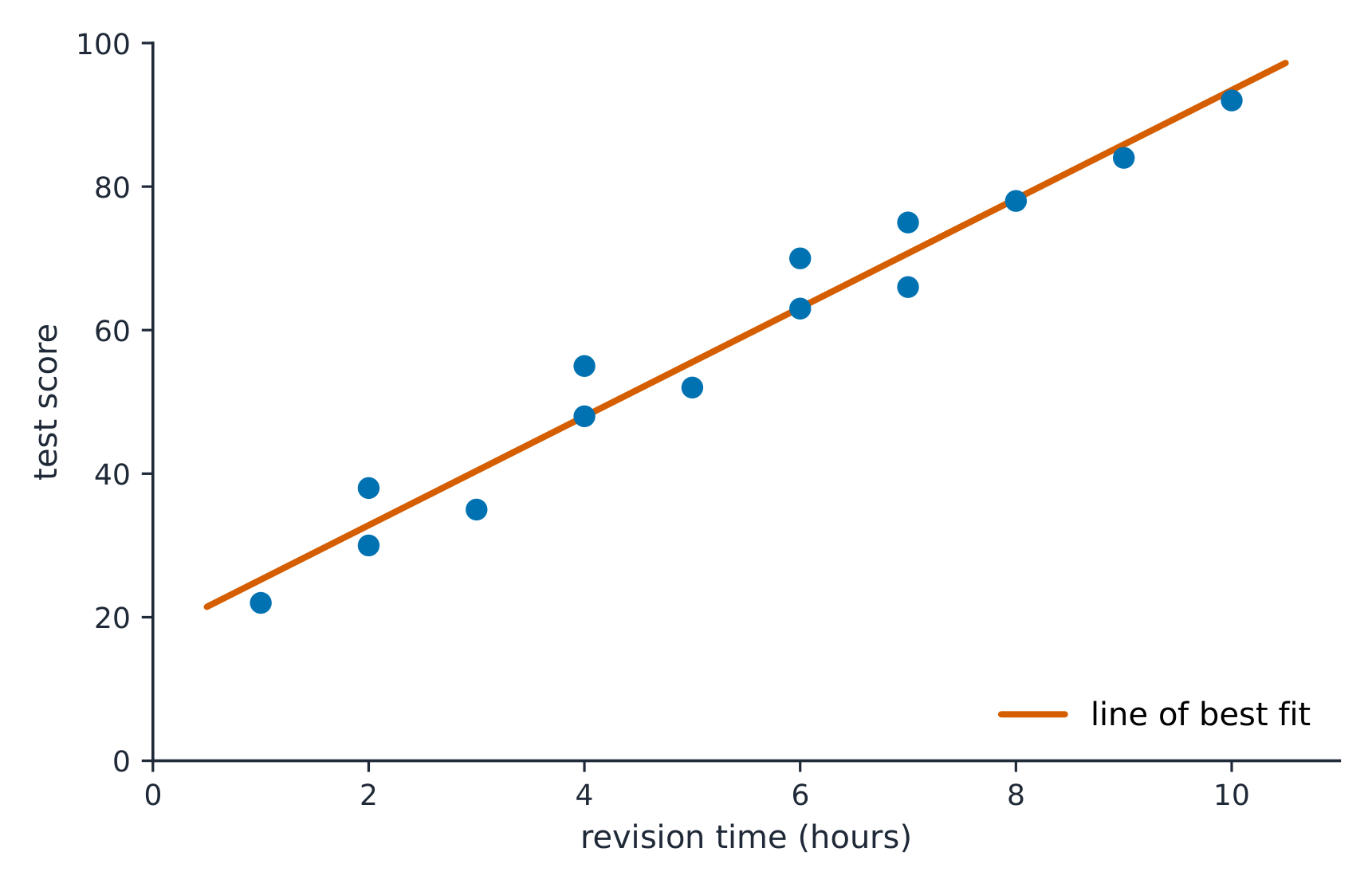
A scatterplot 散点图 plots each individual as a point, explanatory variable on the $x$-axis and response on the $y$-axis. Describe it with DUFS: Direction (positive/negative), Unusual features (outliers, clusters), Form (linear or curved), and Strength (how tightly the points follow the pattern) – always in context.

A line of best fit runs through the middle of the scattered points A line of best fit runs through the middle of the scattered points

Vocabulary Train
English Chinese Pinyin
scatterplot 散点图 sàn diǎn tú
2.5

Correlation

Syllabus
Enduring UnderstandingLearning ObjectiveEssential Knowledge

DAT-1
Regression models may allow us to predict responses to changes in an explanatory variable.

DAT-1.B
Determine the correlation for a linear relationship. [Skill 2.C]

  • DAT-1.B.1 The correlation, $r$, gives the direction and quantifies the strength of the linear association between two quantitative variables.
  • DAT-1.B.2 The correlation coefficient can be calculated by: $r = \dfrac{1}{n-1} \sum \left( \dfrac{x_i - \bar{x}}{s_x} \right) \left( \dfrac{y_i - \bar{y}}{s_y} \right)$. However, the most common way to determine $r$ is by using technology.
  • DAT-1.B.3 A correlation coefficient close to 1 or $-1$ does not necessarily mean that a linear model is appropriate.

DAT-1.C
Interpret the correlation for a linear relationship. [Skill 4.B]

  • DAT-1.C.1 The correlation, $r$, is unit-free, and always between $-1$ and 1, inclusive. A value of $r = 0$ indicates that there is no linear association. A value of $r = 1$ or $r = -1$ indicates that there is a perfect linear association.
  • DAT-1.C.2 A perceived or real relationship between two variables does not mean that changes in one variable cause changes in the other. That is, correlation does not necessarily imply causation.

Source: College Board AP Course and Exam Description

What r actually measures

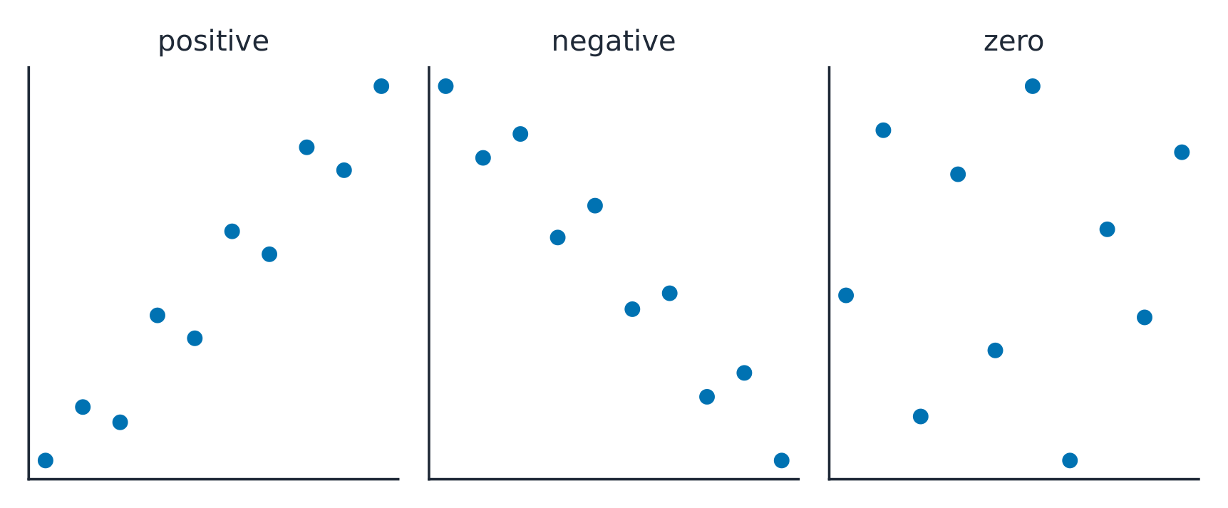
The correlation coefficient 相关系数 $r$ measures the strength and direction of a linear relationship. It runs from $-1$ to $1$: near $\pm 1$ is strong linear, near $0$ is weak linear. $r$ has no units and does not change if you swap the variables. Warnings: $r$ only measures linear strength, it is not resistant to outliers, and a strong $r$ does not prove causation.

Positive correlation rises together; negative correlation moves in opposite directions Positive correlation rises together; negative correlation moves in opposite directions

Explore

Strength of a linear relationship

Correlation $r$ runs from $-1$ to $1$: near $\pm1$ the points hug a line, near 0 they scatter. Change it and watch the cloud tighten or spread.

Vocabulary Train
English Chinese Pinyin
correlation coefficient 相关系数 xiāng guān xì shù
2.6

Linear Regression Models

Syllabus
Enduring UnderstandingLearning ObjectiveEssential Knowledge

DAT-1
Regression models may allow us to predict responses to changes in an explanatory variable.

DAT-1.D
Calculate a predicted response value using a linear regression model. [Skill 2.C]

  • DAT-1.D.1 A simple linear regression model is an equation that uses an explanatory variable, $x$, to predict the response variable, $y$.
  • DAT-1.D.2 The predicted response value, denoted by $\hat{y}$, is calculated as $\hat{y} = a + bx$, where $a$ is the $y$-intercept and $b$ is the slope of the regression line, and $x$ is the value of the explanatory variable.
  • DAT-1.D.3 Extrapolation is predicting a response value using a value for the explanatory variable that is beyond the interval of $x$-values used to determine the regression line. The predicted value is less reliable as an estimate the further we extrapolate.

Source: College Board AP Course and Exam Description

The least-squares regression line 最小二乘回归线 predicts the response: $\hat{y}=a+bx$, where $\hat{y}$ is the predicted response. The slope 斜率 $b$ is the predicted change in $y$ per one-unit increase in $x$; the $y$-intercept 截距 $a$ is the predicted $y$ when $x=0$. Interpret both in context and with units – a graded skill. Avoid extrapolation 外推 (predicting far outside the data).

Worked example. A study of hours studied ($x$) and test score ($y$) gives $\hat{y}=20+3x$. The slope means each extra hour of study is associated with a predicted $3$-point increase. A student who studies $5$ hours is predicted to score $\hat{y}=20+3(5)=35$.

Explore

Fit a least-squares line

A regression line is the best straight-line fit, minimising the squared vertical distances. Its slope predicts how $y$ changes per unit of $x$.

Vocabulary Train
English Chinese Pinyin
least-squares regression line 最小二乘回归线 zuì xiǎo èr chéng huí guī xiàn
slope 斜率 xié lǜ
y-intercept 截距 jié jù
extrapolation 外推 wài tuī
2.7

Residuals

Syllabus
Enduring UnderstandingLearning ObjectiveEssential Knowledge

DAT-1
Regression models may allow us to predict responses to changes in an explanatory variable.

DAT-1.E
Represent differences between measured and predicted responses using residual plots. [Skill 2.B]

  • DAT-1.E.1 The residual is the difference between the actual value and the predicted value: $\text{residual} = y - \hat{y}$.
  • DAT-1.E.2 A residual plot is a plot of residuals versus explanatory variable values or predicted response values.

DAT-1.F
Describe the form of association of bivariate data using residual plots. [Skill 2.A]

  • DAT-1.F.1 Apparent randomness in a residual plot for a linear model is evidence of a linear form to the association between the variables.
  • DAT-1.F.2 Residual plots can be used to investigate the appropriateness of a selected model.

Source: College Board AP Course and Exam Description

Least-squares regression

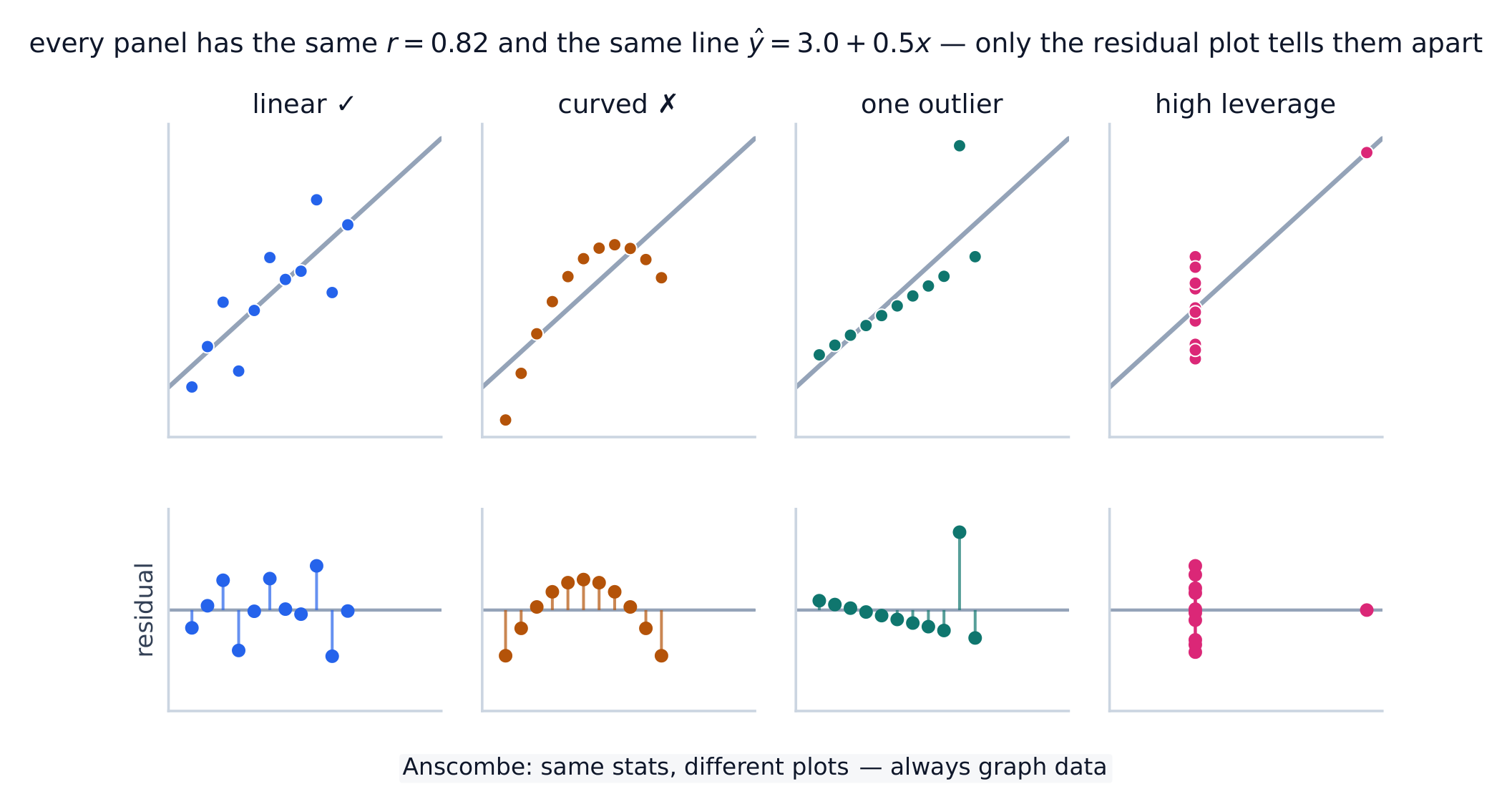
A residual 残差 is actual minus predicted, $y-\hat{y}$: how far a point sits above (+) or below (−) the line. A residual plot 残差图 graphs residuals against $x$. If it shows no pattern (random scatter), a linear model is appropriate; a curved or fanning pattern means the linear model is a poor fit.

Worked example. Continuing the study above, a student who studied $5$ hours actually scored $40$. The residual is $y-\hat{y}=40-35=+5$: the line under-predicted by $5$ points, so this point sits above the line.

Vocabulary Train
English Chinese Pinyin
residual 残差 cán chà
residual plot 残差图 cán chà tú
2.8

Least-Squares Regression and Its Fit
Syllabus
Enduring UnderstandingLearning ObjectiveEssential Knowledge

DAT-1
Regression models may allow us to predict responses to changes in an explanatory variable.

DAT-1.G
Estimate parameters for the least-squares regression line model. [Skill 2.C]

  • DAT-1.G.1 The least-squares regression model minimizes the sum of the squares of the residuals and contains the point $(\bar{x}, \bar{y})$.
  • DAT-1.G.2 The slope, $b$, of the regression line can be calculated as $b = r \left( \dfrac{s_y}{s_x} \right)$ where $r$ is the correlation between $x$ and $y$, $s_y$ is the sample standard deviation of the response variable, $y$, and $s_x$ is the sample standard deviation of the explanatory variable, $x$.
  • DAT-1.G.3 Sometimes, the $y$-intercept of the line does not have a logical interpretation in context.
  • DAT-1.G.4 In simple linear regression, $r^2$ is the square of the correlation, $r$. It is also called the coefficient of determination. $r^2$ is the proportion of variation in the response variable that is explained by the explanatory variable in the model.

DAT-1.H
Interpret coefficients for the least-squares regression line model. [Skill 4.B]

  • DAT-1.H.1 The coefficients of the least-squares regression model are the estimated slope and $y$-intercept.
  • DAT-1.H.2 The slope is the amount that the predicted $y$-value changes for every unit increase in $x$.
  • DAT-1.H.3 The $y$-intercept value is the predicted value of the response variable when the explanatory variable is equal to $0$. The formula for the $y$-intercept, $a$, is $a = \bar{y} - b\bar{x}$.

Source: College Board AP Course and Exam Description

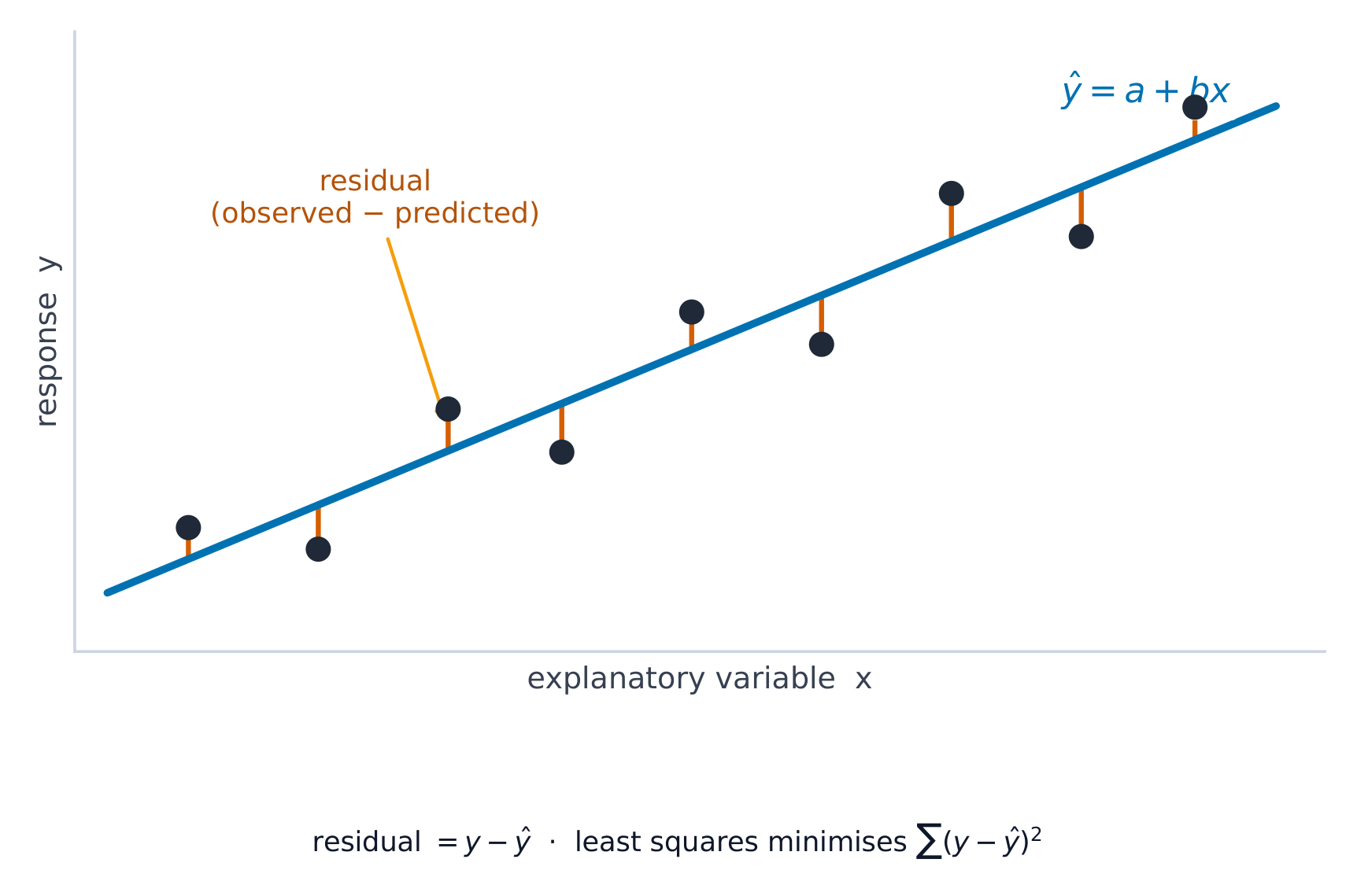
The least-squares line minimizes the sum of squared residuals The least-squares line minimizes the sum of squared residuals

The line minimizes the sum of squared residuals. Its fit is measured by:

  • $s$, the standard deviation of the residuals – the typical prediction error, in the response's units.
  • $r^2$, the coefficient of determination 决定系数 – the proportion (a percent) of the variation in $y$ that the linear model explains. Report it in context: "$r^2 = 0.81$ means 81% of the variation in $y$ is explained by the linear relationship with $x$."
Vocabulary Train
English Chinese Pinyin
coefficient of determination 决定系数 jué dìng xì shù
2.9

Departures from Linearity

Syllabus
Enduring UnderstandingLearning ObjectiveEssential Knowledge

DAT-1
Regression models may allow us to predict responses to changes in an explanatory variable.

DAT-1.I
Identify influential points in regression. [Skill 2.A]

  • DAT-1.I.1 An outlier in regression is a point that does not follow the general trend shown in the rest of the data and has a large residual when the Least Squares Regression Line (LSRL) is calculated.
  • DAT-1.I.2 A high-leverage point in regression has a substantially larger or smaller $x$-value than the other observations have.
  • DAT-1.I.3 An influential point in regression is any point that, if removed, changes the relationship substantially. Examples include much different slope, $y$-intercept, and/or correlation. Outliers and high leverage points are often influential.

DAT-1.J
Calculate a predicted response using a least-squares regression line for a transformed data set. [Skill 2.C]

  • DAT-1.J.1 Transformations of variables, such as evaluating the natural logarithm of each value of the response variable or squaring each value of the explanatory variable, can be used to create transformed data sets, which may be more linear in form than the untransformed data.
  • DAT-1.J.2 Increased randomness in residual plots after transformation of data and/or movement of $r^2$ to a value closer to 1 offers evidence that the least-squares regression line for the transformed data is a more appropriate model to use to predict responses to the explanatory variable than the regression line for the untransformed data.

Source: College Board AP Course and Exam Description

Some points strongly affect the line. A high-leverage 高杠杆 point has an extreme $x$-value; an influential 有影响的 point noticeably changes the slope or $r$ when removed; an outlier here is a point with a large residual. When the pattern is curved, transform a variable (e.g. take a log) to straighten it, then fit a line to the transformed data.

Vocabulary Train
English Chinese Pinyin
high-leverage 高杠杆 gāo gàng gǎn
influential 有影响的 yǒu yǐng xiǎng de
2.9

Exam tips

  • On a scatterplot describe direction, form, strength, and outliers; $r$ ranges $-1$ to $1$.
  • Correlation is not causation — a lurking variable can drive both.
  • Interpret the slope of the least-squares line in context ("per one unit of $x$, predicted $y$ changes by $b$").
  • Check a residual plot: no pattern means a line fits; a curve means it does not. Avoid extrapolation.
  • $r^2$ is the fraction of variation in $y$ explained by the model.

Log in or create account

IGCSE & A-Level