Skip to content

Exploring One-Variable Data

AP Statistics · Topic 1

Train
1.1

Introducing Statistics: What Can We Learn from Data?

Syllabus
Enduring UnderstandingLearning ObjectiveEssential Knowledge

VAR-1
Given that variation may be random or not, conclusions are uncertain.

VAR-1.A
Identify questions to be answered, based on variation in one-variable data. [Skill 1.A]

  • VAR-1.A.1 Numbers may convey meaningful information, when placed in context.

Source: College Board AP Course and Exam Description

Statistics 统计学 is the science of learning from data 数据 – numbers or labels collected from the real world. Data vary, so we describe patterns and account for the variation 变异 rather than expecting every value to match. A statistical question anticipates an answer based on data that vary.

Two distinctions run through the whole course. A parameter 参数 is a numerical summary of a whole population; a statistic 统计量 is a numerical summary of a sample - we use the statistic to estimate the parameter we cannot measure directly. And descriptive statistics 描述统计 only summarise the data set in hand, while inferential statistics 推断统计 use a sample to make and test claims about the larger population.

Vocabulary Train
English Chinese Pinyin
Statistics 统计学 tǒng jì xué
data 数据 shù jù
variation 变异 biàn yì
parameter 参数 cān shù
statistic 统计量 tǒng jì liàng
descriptive statistics 描述统计 miáo shù tǒng jì
inferential statistics 推断统计 tuī duàn tǒng jì
1.2

The Language of Variation: Variables

Syllabus
Enduring UnderstandingLearning ObjectiveEssential Knowledge

VAR-1
Given that variation may be random or not, conclusions are uncertain.

VAR-1.B
Identify variables in a set of data. [Skill 2.A]

  • VAR-1.B.1 A variable is a characteristic that changes from one individual to another.

VAR-1.C
Classify types of variables. [Skill 2.A]

  • VAR-1.C.1 A categorical variable takes on values that are category names or group labels.
  • VAR-1.C.2 A quantitative variable is one that takes on numerical values for a measured or counted quantity.
    • Illustrative examples for VAR-1.C:
      • Categorical variables:
        • Dominant hand
        • Age group (young or old)
        • Highest degree earned
      • Quantitative variables:
        • Age of a structure
        • Height of a child
        • Concentration of a sample

Source: College Board AP Course and Exam Description

A variable 变量 is a characteristic that can differ between individuals. Two kinds:

  • Categorical 分类 (qualitative): values are labels/groups (eye colour, brand).
  • Quantitative 定量: values are numbers you can do arithmetic on (height, age). Quantitative variables are discrete (countable) or continuous (measured).

Choosing the right graph and summary depends on which kind you have.

Explore

Categorical or quantitative?

Every variable is either categorical (it labels each unit with a group) or quantitative (a measured number you can average). Which kind it is decides the graphs and summaries you are allowed to use.

Vocabulary Train
English Chinese Pinyin
variable 变量 biàn liàng
Categorical 分类 fēn lèi
Quantitative 定量 dìng liàng
1.3

Representing a Categorical Variable with Tables

Syllabus
Enduring UnderstandingLearning ObjectiveEssential Knowledge

UNC-1
Graphical representations and statistics allow us to identify and represent key features of data.

UNC-1.A
Represent categorical data using frequency or relative frequency tables. [Skill 2.B]

  • UNC-1.A.1 A frequency table gives the number of cases falling into each category. A relative frequency table gives the proportion of cases falling into each category.

UNC-1.B
Describe categorical data represented in frequency or relative tables. [Skill 2.A]

  • UNC-1.B.1 Percentages, relative frequencies, and rates all provide the same information as proportions.
  • UNC-1.B.2 Counts and relative frequencies of categorical data reveal information that can be used to justify claims about the data in context.

Source: College Board AP Course and Exam Description

A frequency table 频数表 lists each category's count (frequency); a relative frequency 相对频率 table lists each category's proportion 比例 (count ÷ total). Relative frequencies let you compare groups of different sizes fairly.

Vocabulary Train
English Chinese Pinyin
frequency table 频数表 pín shuò biǎo
relative frequency 相对频率 xiāng duì pín lǜ
proportion 比例 bǐ lì
1.4

Representing a Categorical Variable with Graphs

Syllabus
Enduring UnderstandingLearning ObjectiveEssential Knowledge

UNC-1
Graphical representations and statistics allow us to identify and represent key features of data.

UNC-1.C
Represent categorical data graphically. [Skill 2.B]

  • UNC-1.C.1 Bar charts (or bar graphs) are used to display frequencies (counts) or relative frequencies (proportions) for categorical data.
  • UNC-1.C.2 The height or length of each bar in a bar graph corresponds to either the number or proportion of observations falling within each category.
  • UNC-1.C.3 There are many additional ways to represent frequencies (counts) or relative frequencies (proportions) for categorical data.

UNC-1.D
Describe categorical data represented graphically. [Skill 2.A]

  • UNC-1.D.1 Graphical representations of a categorical variable reveal information that can be used to justify claims about the data in context.

UNC-1.E
Compare multiple sets of categorical data. [Skill 2.D]

  • UNC-1.E.1 Frequency tables, bar graphs, or other representations can be used to compare two or more data sets in terms of the same categorical variable.

Source: College Board AP Course and Exam Description

Bar charts 条形图 show the count or proportion of each category as separated bars; a pie chart shows each category's share of the whole. The bar heights (or slices) let you compare categories at a glance. Bars may be ordered by size or by a natural category order.

Explore

Show a categorical variable as a pie chart

A pie chart turns each category's share of the whole into a slice: a bigger share is a bigger slice, and every slice together makes 100%. It is a picture of a relative-frequency table.

Vocabulary Train
English Chinese Pinyin
Bar charts 条形图 tiáo xíng tú
1.5

Representing a Quantitative Variable with Graphs
Syllabus
Enduring UnderstandingLearning ObjectiveEssential Knowledge

UNC-1
Graphical representations and statistics allow us to identify and represent key features of data.

UNC-1.F
Classify types of quantitative variables. [Skill 2.A]

  • UNC-1.F.1 A discrete variable can take on a countable number of values. The number of values may be finite or countably infinite, as with the counting numbers.
  • UNC-1.F.2 A continuous variable can take on infinitely many values, but those values cannot be counted. No matter how small the interval between two values of a continuous variable, it is always possible to determine another value between them.
    • Illustrative examples for UNC-1.F:
      • A discrete variable:
        • Number of students in a class
      • A continuous variable:
        • Height of a child

UNC-1.G
Represent quantitative data graphically. [Skill 2.B]

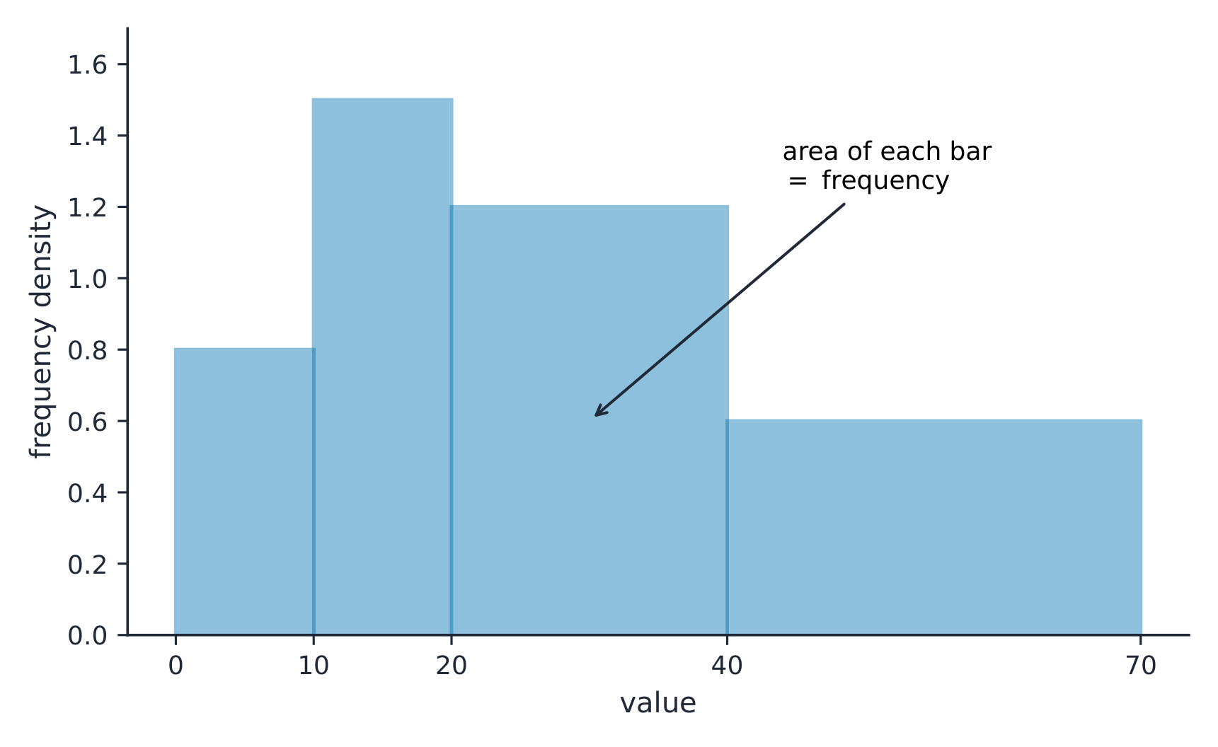
  • UNC-1.G.1 In a histogram, the height of each bar shows the number or proportion of observations that fall within the interval corresponding to that bar. Altering the interval widths can change the appearance of the histogram.
  • UNC-1.G.2 In a stem and leaf plot, each data value is split into a "stem" (the first digit or digits) and a "leaf" (usually the last digit).
  • UNC-1.G.3 A dotplot represents each observation by a dot, with the position on the horizontal axis corresponding to the data value of that observation, with nearly identical values stacked on top of each other.
  • UNC-1.G.4 A cumulative graph represents the number or proportion of a data set less than or equal to a given number.
  • UNC-1.G.5 There are many additional ways to graphically represent distributions of quantitative data.

Source: College Board AP Course and Exam Description

For numbers, use a dotplot 点图, stem-and-leaf plot 茎叶图, or histogram 直方图 (bars over value intervals called bins). These show the distribution 分布 – how the values spread out. A histogram's bin width changes the picture, so choose it to reveal the shape.

On a histogram with unequal class widths the bar area is the frequency On a histogram with unequal class widths the bar area is the frequency

Explore

Explore how bin width shapes a histogram

A histogram groups data into equal-width bins and draws a bar over each. Change the bins and notice how the same data can look jagged (too narrow) or smooth (too wide) — the shape is a choice.

Vocabulary Train
English Chinese Pinyin
dotplot 点图 diǎn tú
stem-and-leaf plot 茎叶图 jīng yè tú
histogram 直方图 zhí fāng tú
distribution 分布 fēn bù
1.6

Describing the Distribution of a Quantitative Variable
Syllabus
Enduring UnderstandingLearning ObjectiveEssential Knowledge

UNC-1
Graphical representations and statistics allow us to identify and represent key features of data.

UNC-1.H
Describe the characteristics of quantitative data distributions. [Skill 2.A]

  • UNC-1.H.1 Descriptions of the distribution of quantitative data include shape, center, and variability (spread), as well as any unusual features such as outliers, gaps, clusters, or multiple peaks.
  • UNC-1.H.2 Outliers for one-variable data are data points that are unusually small or large relative to the rest of the data.
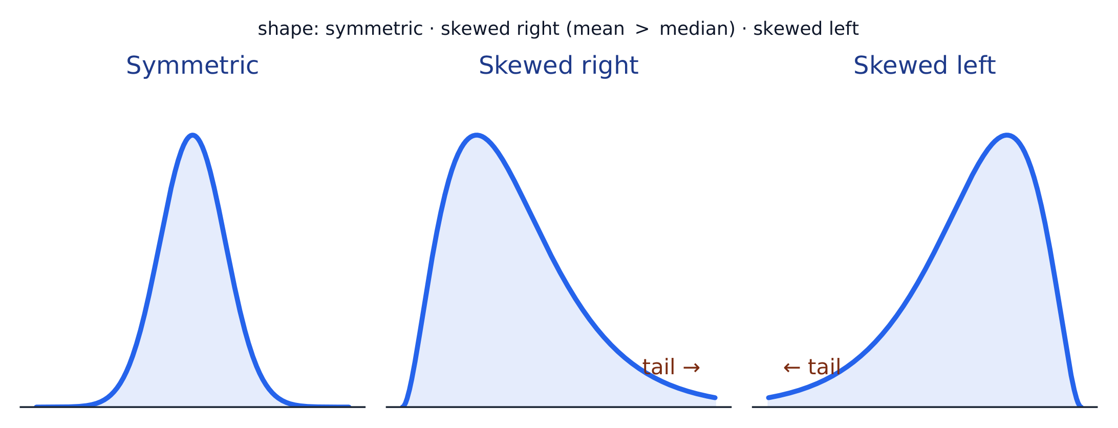
  • UNC-1.H.3 A distribution is skewed to the right (positive skew) if the right tail is longer than the left. A distribution is skewed to the left (negative skew) if the left tail is longer than the right. A distribution is symmetric if the left half is the mirror image of the right half.
  • UNC-1.H.4 Univariate graphs with one main peak are known as unimodal. Graphs with two prominent peaks are bimodal. A graph where each bar height is approximately the same (no prominent peaks) is approximately uniform.
  • UNC-1.H.5 A gap is a region of a distribution between two data values where there are no observed data.
  • UNC-1.H.6 Clusters are concentrations of data usually separated by gaps.
  • UNC-1.H.7 Descriptive statistics does not attribute properties of a data set to a larger population, but may provide the basis for conjectures for subsequent testing.

Source: College Board AP Course and Exam Description

Describe four things (remember SOCS):

  • Shape 形状: symmetric, or skewed 偏斜 left/right (a long tail on that side), and how many peaks - one main peak is unimodal 单峰, two prominent peaks bimodal 双峰, and roughly equal bars uniform 均匀.
  • Outliers 离群值: unusual values far from the rest.
  • Center: a typical value (mean or median).
  • Spread: how much the values vary (range, IQR, standard deviation).

Always describe shape/center/spread in context, with units.

The shape of a distribution: symmetric, skewed right (long right tail), or skewed left The shape of a distribution: symmetric, skewed right (long right tail), or skewed left

Vocabulary Train
English Chinese Pinyin
Shape 形状 xíng zhuàng
skewed 偏斜 piān xié
unimodal 单峰 dān fēng
bimodal 双峰 shuāng fēng
uniform 均匀 jūn yún
Outliers 离群值 lí qún zhí
1.7

Summary Statistics for a Quantitative Variable

Syllabus
Enduring UnderstandingLearning ObjectiveEssential Knowledge

UNC-1
Graphical representations and statistics allow us to identify and represent key features of data.

UNC-1.I
Calculate measures of center and position for quantitative data. [Skill 2.C]

  • UNC-1.I.1 A statistic is a numerical summary of sample data.
  • UNC-1.I.2 The mean is the sum of all the data values divided by the number of values. For a sample, the mean is denoted by $x$-bar: $\bar{x} = \dfrac{1}{n}\sum_{i=1}^{n} x_i$, where $x_i$ represents the $i^{\text{th}}$ data point in the sample and $n$ represents the number of data values in the sample.
  • UNC-1.I.3 The median of a data set is the middle value when data are ordered. When the number of data points is even, the median can take on any value between the two middle values. In AP Statistics, the most commonly used value for the median of a data set with an even number of values is the average of the two middle values.
  • UNC-1.I.4 The first quartile, Q1, is the median of the half of the ordered data set from the minimum to the position of the median. The third quartile, Q3, is the median of the half of the ordered data set from the position of the median to the maximum. Q1 and Q3 form the boundaries for the middle 50% of values in an ordered data set.
  • UNC-1.I.5 The $p^{\text{th}}$ percentile is interpreted as the value that has $p\%$ of the data less than or equal to it.

UNC-1.J
Calculate measures of variability for quantitative data. [Skill 2.C]

  • UNC-1.J.1 Three commonly used measures of variability (or spread) in a distribution are the range, interquartile range, and standard deviation.
  • UNC-1.J.2 The range is defined as the difference between the maximum data value and the minimum data value. The interquartile range (IQR) is defined as the difference between the third and first quartiles: $Q3 - Q1$. Both the range and the interquartile range are possible ways of measuring variability of the distribution of a quantitative variable.
  • UNC-1.J.3 Standard deviation is a way to measure variability of the distribution of a quantitative variable. For a sample, the standard deviation is denoted by $s$: $s_x = \sqrt{\dfrac{1}{n-1}\sum(x_i - \bar{x})^2}$. The square of the sample standard deviation, $s^2$, is called the sample variance.
  • UNC-1.J.4 Changing units of measurement affects the values of the calculated statistics.

UNC-1.K
Explain the selection of a particular measure of center and/or variability for describing a set of quantitative data. [Skill 4.B]

  • UNC-1.K.1 There are many methods for determining outliers. Two methods frequently used in this course are:
    • UNC-1.K.1.i An outlier is a value greater than $1.5 \times \text{IQR}$ above the third quartile or more than $1.5 \times \text{IQR}$ below the first quartile.
    • UNC-1.K.1.ii An outlier is a value located 2 or more standard deviations above, or below, the mean.
  • UNC-1.K.2 The mean, standard deviation, and range are considered nonresistant (or non-robust) because they are influenced by outliers. The median and IQR are considered resistant (or robust), because outliers do not greatly (if at all) affect their value.

Source: College Board AP Course and Exam Description

Standard deviation: spread about the mean
  • Center: the mean 均值 $\bar{x}=\dfrac{\sum x_i}{n}$ (average) and the median 中位数 (middle value). The median resists outliers; the mean is pulled toward a skew.
  • Spread: the range, the interquartile range 四分位距 $\text{IQR}=Q_3-Q_1$ (middle 50%), and the standard deviation 标准差 $s_x=\sqrt{\dfrac{\sum(x_i-\bar{x})^2}{n-1}}$ (typical distance from the mean; its square is the variance 方差).
  • The five-number summary 五数概括: min, $Q_1$, median, $Q_3$, max.

Use resistant measures (median, IQR) for skewed data; mean and standard deviation for roughly symmetric data.

The percentile 百分位数 of a value is the percent of the data at or below it – so the median is the 50th percentile and $Q_1$ the 25th. A cumulative relative frequency graph 累积相对频率图 makes percentiles easy to read: for each value it plots the proportion of the data at or below it, rising from 0 to 1. Go up from a value to the curve and across to its percentile, or reverse the steps to find the value at a given percentile (the same reading works from a cumulative-frequency table).

Worked example. For the data $4, 8, 6, 10, 7$: the mean is $\bar{x}=\dfrac{4+8+6+10+7}{5}=\dfrac{35}{5}=7$. Sorting to $4,6,7,8,10$, the median is the middle value, $7$. The mean and median agree here because the data are roughly symmetric.

Vocabulary Train
English Chinese Pinyin
mean 均值 jūn zhí
median 中位数 zhōng wèi shù
interquartile range 四分位距 sì fēn wèi jù
standard deviation 标准差 biāo zhǔn chà
variance 方差 fāng chà
five-number summary 五数概括 wǔ shù gài kuò
percentile 百分位数 bǎi fēn wèi shù
cumulative relative frequency graph 累积相对频率图 lěi jī xiāng duì pín lǜ tú
Exercise sheet
1.8

Graphical Representations of Summary Statistics
Syllabus
Enduring UnderstandingLearning ObjectiveEssential Knowledge

UNC-1
Graphical representations and statistics allow us to identify and represent key features of data.

UNC-1.L
Represent summary statistics for quantitative data graphically. [Skill 2.B]

  • UNC-1.L.1 Taken together, the minimum data value, the first quartile (Q1), the median, the third quartile (Q3), and the maximum data value make up the five-number summary.
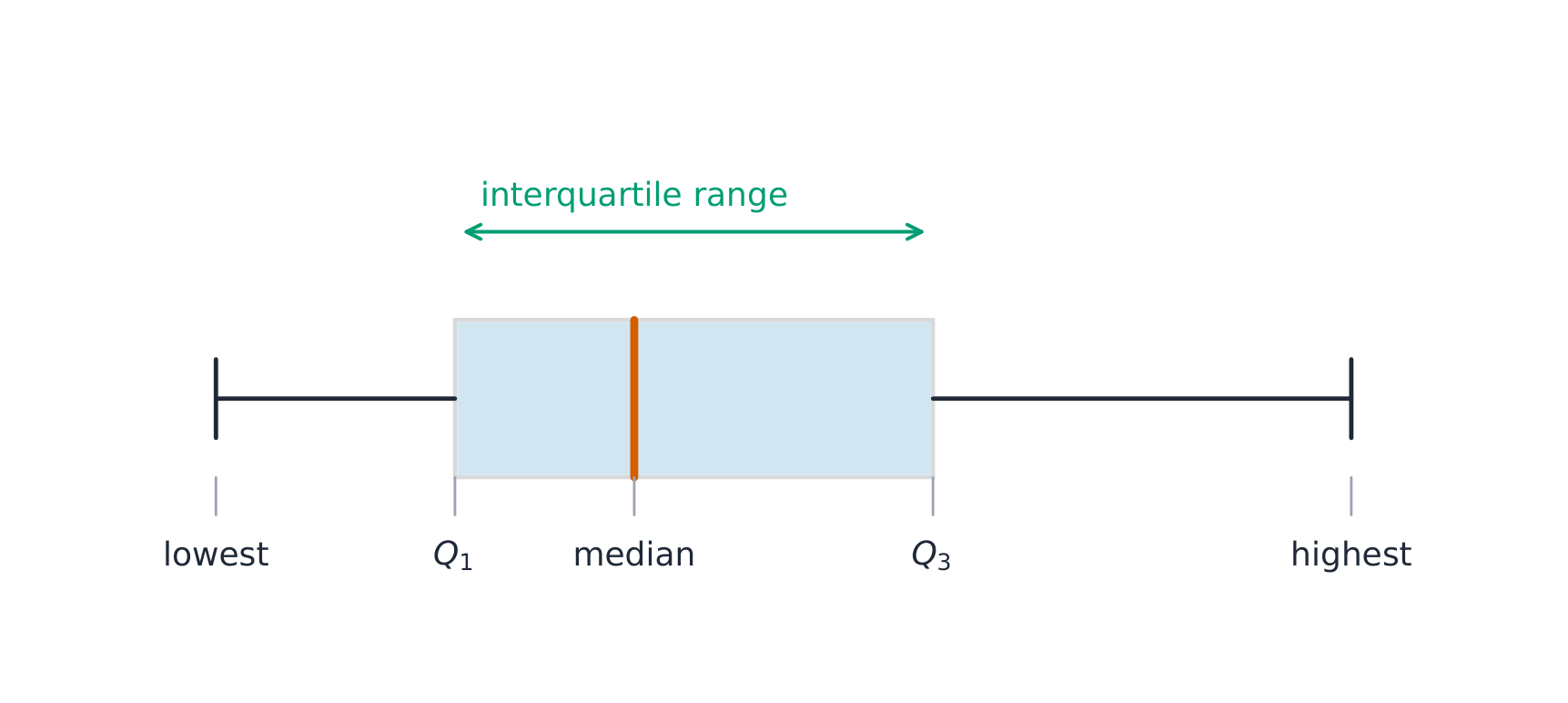
  • UNC-1.L.2 A boxplot is a graphical representation of the five-number summary (minimum, first quartile, median, third quartile, maximum). The box represents the middle 50% of data, with a line at the median and the ends of the box corresponding to the quartiles. Lines ("whiskers") extend from the quartiles to the most extreme point that is not an outlier, and outliers are indicated by their own symbol beyond this.

UNC-1.M
Describe summary statistics of quantitative data represented graphically. [Skill 2.A]

  • UNC-1.M.1 Summary statistics of quantitative data, or of sets of quantitative data, can be used to justify claims about the data in context.
  • UNC-1.M.2 If a distribution is relatively symmetric, then the mean and median are relatively close to one another. If a distribution is skewed right, then the mean is usually to the right of the median. If the distribution is skewed left, then the mean is usually to the left of the median.

Source: College Board AP Course and Exam Description

A boxplot 箱线图 draws the five-number summary: a box from $Q_1$ to $Q_3$ with the median inside, and whiskers to the most extreme non-outlier values. A point is an outlier if it lies more than $1.5\times\text{IQR}$ beyond a quartile – a rule you may be asked to apply. Boxplots are ideal for comparing several groups side by side.

Worked example. A dataset has $Q_1=20$ and $Q_3=32$, so $\text{IQR}=12$. The outlier fences are $Q_1-1.5(12)=2$ and $Q_3+1.5(12)=50$. Any value below $2$ or above $50$ is flagged as an outlier.

A box-and-whisker plot shows the quartiles and the range A box-and-whisker plot shows the quartiles and the range

A boxplot draws the five-number summary; the box spans the IQR A boxplot draws the five-number summary; the box spans the IQR

Explore

Explore the five-number summary as a boxplot

Drag $Q_1$, the median, and $Q_3$ to see the box (its length is the IQR) and how the median's position inside the box reveals skew — a median close to $Q_1$ signals a right-skewed distribution.

Vocabulary Train
English Chinese Pinyin
boxplot 箱线图 xiāng xiàn tú
1.9

Comparing Distributions of a Quantitative Variable

Syllabus
Enduring UnderstandingLearning ObjectiveEssential Knowledge

UNC-1
Graphical representations and statistics allow us to identify and represent key features of data.

UNC-1.N
Compare graphical representations for multiple sets of quantitative data. [Skill 2.D]

  • UNC-1.N.1 Any of the graphical representations, e.g., histograms, side-by-side boxplots, etc., can be used to compare two or more independent samples on center, variability, clusters, gaps, outliers, and other features.

UNC-1.O
Compare summary statistics for multiple sets of quantitative data. [Skill 2.D]

  • UNC-1.O.1 Any of the numerical summaries (e.g., mean, standard deviation, relative frequency, etc.) can be used to compare two or more independent samples.

Source: College Board AP Course and Exam Description

To compare two or more groups, compare shape, center, and spread, and mention outliers – always with comparative words ("Group A has a higher median than Group B") and in context. Do not just describe each group separately; make the comparison explicit.

Explore

Compare distributions with box plots

A box plot draws the five-number summary. Placing two box plots on the same scale compares their centre (median), spread (IQR = box width) and skew at a glance — the fair way to compare groups.

1.10

The Normal Distribution
Syllabus
Enduring UnderstandingLearning ObjectiveEssential Knowledge

VAR-2
The normal distribution can be used to represent some population distributions.

VAR-2.A
Compare a data distribution to the normal distribution model. [Skill 2.D]

  • VAR-2.A.1 A parameter is a numerical summary of a population.
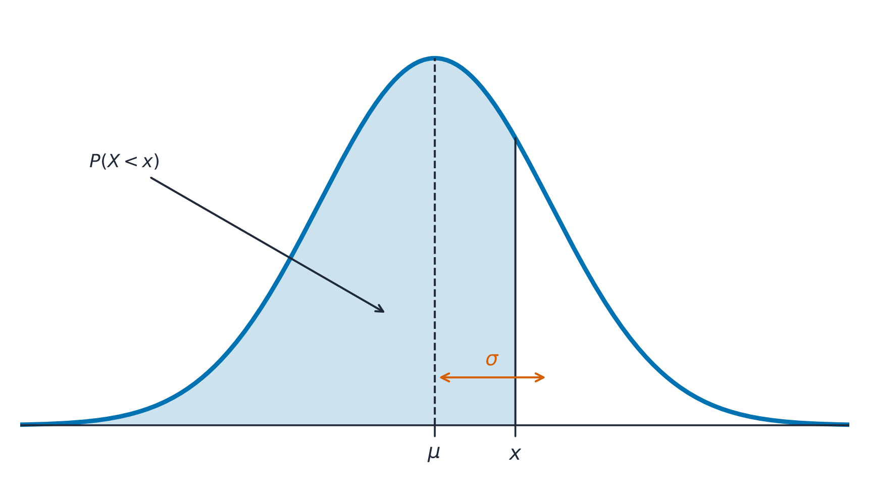
  • VAR-2.A.2 Some sets of data may be described as approximately normally distributed. A normal curve is mound-shaped and symmetric. The parameters of a normal distribution are the population mean, $\mu$, and the population standard deviation, $\sigma$.
  • VAR-2.A.3 For a normal distribution, approximately 68% of the observations are within 1 standard deviation of the mean, approximately 95% of observations are within 2 standard deviations of the mean, and approximately 99.7% of observations are within 3 standard deviations of the mean. This is called the empirical rule.
  • VAR-2.A.4 Many variables can be modeled by a normal distribution.
    • Illustrative examples for VAR-2.A:
      • Variables that can be modeled by a normal distribution:
        • Body temperature
        • Weight of a loaf of bread

VAR-2.B
Determine proportions and percentiles from a normal distribution. [Skill 3.A]

  • VAR-2.B.1 A standardized score for a particular data value is calculated as (data value − mean)/(standard deviation), and measures the number of standard deviations a data value falls above or below the mean.
  • VAR-2.B.2 One example of a standardized score is a $z$-score, which is calculated as $z\text{-score} = \left(\dfrac{x_i - \mu}{\sigma}\right)$. A $z$-score measures how many standard deviations a data value is from the mean.
  • VAR-2.B.3 Technology, such as a calculator, a standard normal table, or computer-generated output, can be used to find the proportion of data values located on a given interval of a normally distributed random variable.
  • VAR-2.B.4 Given the area of a region under the graph of the normal distribution curve, it is possible to use technology, such as a calculator, a standard normal table, or computer-generated output, to estimate parameters for some populations.

VAR-2.C
Compare measures of relative position in data sets. [Skill 2.D]

  • VAR-2.C.1 Percentiles and $z$-scores may be used to compare relative positions of points within a data set or between data sets.

Source: College Board AP Course and Exam Description

A normal distribution 正态分布 is a symmetric, bell-shaped model described by its mean $\mu$ and standard deviation $\sigma$. The empirical rule 经验法则 (68–95–99.7): about 68% of values lie within $1\sigma$ of the mean, 95% within $2\sigma$, and 99.7% within $3\sigma$.

The normal curve: a probability is the area under it, centred on the mean The normal curve: a probability is the area under it, centred on the mean

A $z$-score 标准分数 measures how many standard deviations a value is from the mean:

$$z=\frac{x-\mu}{\sigma}.$$
Convert to a $z$-score, then use the normal table or technology to find the proportion (area) below, above, or between values – and reverse the process to find a value from a given percentile.

Worked example. Test scores are normal with $\mu=500$ and $\sigma=100$. A score of $700$ has $z=\dfrac{700-500}{100}=2$. By the empirical rule, $95\%$ of scores lie within $2\sigma$, so $2.5\%$ lie above $700$ – meaning a $700$ is at about the $97.5$th percentile.
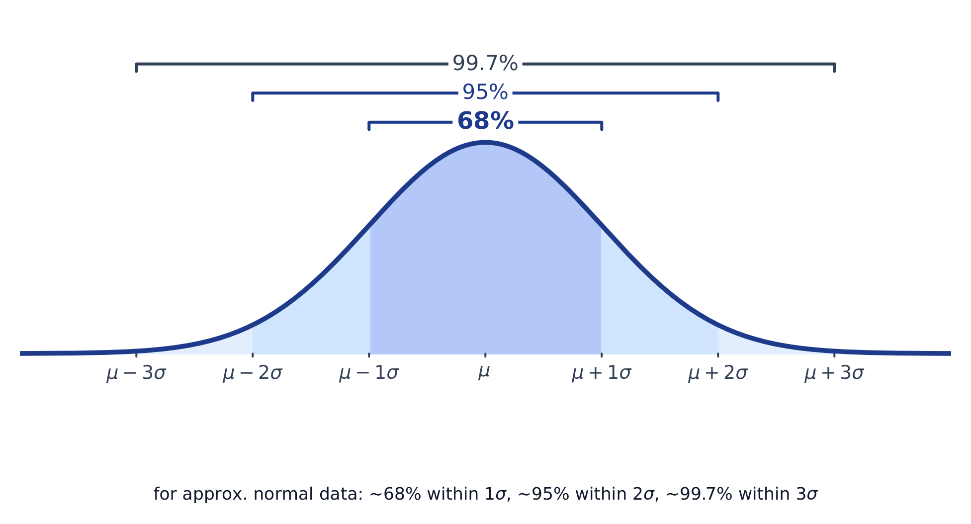
The normal curve and the 68-95-99.7 empirical rule The normal curve and the 68-95-99.7 empirical rule

Explore

Explore area under the normal curve

The proportion of data below a value equals the area under the curve to its left. Shade a tail or a central band to see the 68–95–99.7 empirical rule and read a $z$-score as an area.

Vocabulary Train
English Chinese Pinyin
normal distribution 正态分布 zhèng tài fēn bù
empirical rule 经验法则 jīng yàn fǎ zé
$z$-score 标准分数 biāo zhǔn fēn shù
1.10

Exam tips

  • Describe a distribution by shape, center, spread, and outliers (SOCS) — always in context.
  • The mean is pulled by outliers; the median resists them, so prefer the median for skewed data.
  • For a normal distribution use the 68–95–99.7 rule and z-scores $z=\tfrac{x-\mu}{\sigma}$.
  • Compare distributions with side-by-side boxplots and comment on center, spread, and shape.
  • Standard deviation measures a typical distance from the mean; the IQR pairs with the median.

Log in or create account

IGCSE & A-Level