跳到主要内容

线条与笔触

AP 绘画 · 第 1 主题

训练
讲义 词汇表
1.1

线条质感

大纲

Focus: Line quality is how a line looks and feels — the first drawing skill the AP rubric names is mark-making.

  • A line can be thick or thin, dark or light, smooth or rough, fast or slow.
  • Weighted line changes thickness along its length: press harder where a form turns away or carries weight.
  • Confident lines are drawn from the shoulder and elbow, not only the fingers.
  • Lost-and-found lines fade out and reappear — the viewer's eye completes the edge.
  • Line direction carries feeling: horizontal is calm, vertical is firm, diagonal is active.
  • Examiners read line quality instantly — scratchy, timid lines and one confident stroke tell different stories.

来源:美国大学理事会 AP 课程与考试说明

线条质感(line quality)指一条线看起来和给人的感觉。AP绘画评分标准把笔触(mark-making)列在绘画技能清单的第一位,而线条是最基本的笔触。

  • 线条可以粗或细、深或浅、光滑或粗糙、快或慢。
  • 轻重线条(weighted line)沿着长度改变粗细。在形体转向背光处或承受重量处下笔更重。
  • 虚实线条(lost-and-found lines)时隐时现。观者的眼睛会自动补全消失的边缘。
  • 自信的线条来自肩膀和手肘,而不只是手指。
线条质感比较:均匀线、轻重线、虚实线与表现性线条
同一条边缘的四种画法:均匀线、轻重线、虚实线和快速的表现性线条

线条方向传递情绪:水平线平静,垂直线坚定,对角线充满动感。评卷人一眼就能读出线条质感,所以要练到线条果断、不犹豫。

词汇表 训练
英文 中文 拼音
line quality 线条质感 xiàn tiáo zhì gǎn
mark-making 笔触 bǐ chù
weighted line 轻重线条 qīng zhòng xiàn tiáo
lost-and-found lines 虚实线条 xū shí xiàn tiáo
1.2

轮廓素描

大纲

Focus: Contour drawing follows the edges of a form slowly and carefully — it trains eye-hand coordination.

  • A contour line traces the outer edge and the inner edges (folds, creases, overlaps) of a subject.
  • In blind contour you draw without looking at the paper — pure observation practice.
  • Cross-contour lines travel across the surface of a form, like latitude lines on a globe, and describe volume.
  • Draw slowly: match the speed of your eye moving along the edge with the speed of your pencil.
  • Overlapping contours (one edge passing in front of another) create instant depth.
  • Contour studies make strong Sustained Investigation process pages — they show observation skill.

来源:美国大学理事会 AP 课程与考试说明

轮廓线(contour line)沿着形体的边缘走——外边缘,以及褶皱、折痕和遮挡形成的内边缘。轮廓素描是缓慢、仔细的观察。

  • 让眼睛沿边缘移动的速度与铅笔移动的速度保持一致。
  • 盲画轮廓(blind contour)是指画的时候不看纸面。感觉很奇怪,但它训练纯粹的观察力。
  • 横截轮廓线(cross-contour lines)横穿形体表面,像地球仪上的纬线。它们描述体积,而不是边缘。
  • 轮廓的遮挡立刻产生纵深:一条边缘在另一条前面,就是在说"这个更近"。

轮廓练习是持续探究里很好的过程页,因为它们展示真实的观察能力。

Gesture and contour from a master study: line records form in one continuous look
词汇表 训练
英文 中文 拼音
contour line 轮廓线 lún kuò xiàn
blind contour 盲画轮廓 máng huà lún kuò
cross-contour lines 横截轮廓线 héng jié lún kuò xiàn
1.3

动态速写

大纲

Focus: Gesture drawing captures the energy, movement, and weight of a subject in seconds — before any detail.

  • A gesture drawing takes 30 seconds to 3 minutes; it looks for the action line running through the pose.
  • Draw the whole subject at once — big loose lines from the shoulder — never one polished corner.
  • Look for the line of action first: one curve that summarises the pose's movement.
  • Gesture is about what the subject is doing, not what it looks like.
  • Daily gesture pages build speed and confidence, and they photograph well as process evidence.
  • Long drawings usually start as a gesture: energy first, structure second, detail last.

来源:美国大学理事会 AP 课程与考试说明

动态速写(gesture drawing)在几秒钟内抓住对象的能量、动势和重量——先于任何细节。

  • 一张动态速写用30秒到3分钟。用大而放松的线条一次画出整个对象。
  • 先找动势线(line of action):一条概括姿势运动的曲线。
  • 动态速写问的是对象在做什么,而不是它长什么样。
  • 长时间的素描通常从动态速写开始:先有能量,再有结构,最后才是细节。

每天画动态速写能提高速度和信心,拍下来也是很好的练习证据。

Gesture captures action in a few lines before detail begins
词汇表 训练
英文 中文 拼音
gesture drawing 动态速写 dòng tài sù xiě
line of action 动势线 dòng shì xiàn
1.4

排线与交叉排线

大纲

Focus: Hatching builds value with parallel lines; cross-hatching layers a second direction on top.

  • Closer, darker lines read as darker value; wider spacing reads as lighter value.
  • Cross-hatching adds layers at new angles — each layer deepens the tone step by step.
  • Curve the hatch lines around the form (cross-contour hatching) so the shading also describes volume.
  • Keep a consistent angle inside one plane; change angle when the plane changes — edges stay crisp.
  • Pen-and-ink drawing depends on hatching because ink has no grey — value comes only from line density.
  • Hatching shows control of mark-making and light and shade, two named AP drawing skills, in one technique.

来源:美国大学理事会 AP 课程与考试说明

用笔触塑造明暗

排线(hatching)用平行线画出色调。交叉排线(cross-hatching)在上面以新的角度再叠一层线。

一幅精细的古典大师素描,一双合拢的手,在蓝灰色纸上用密集的细墨线塑造
丢勒用细密的平行排线和交叉排线画出这双手;线条越靠近、越交叉的地方色调越深,平面的笔迹就变成了立体的形体
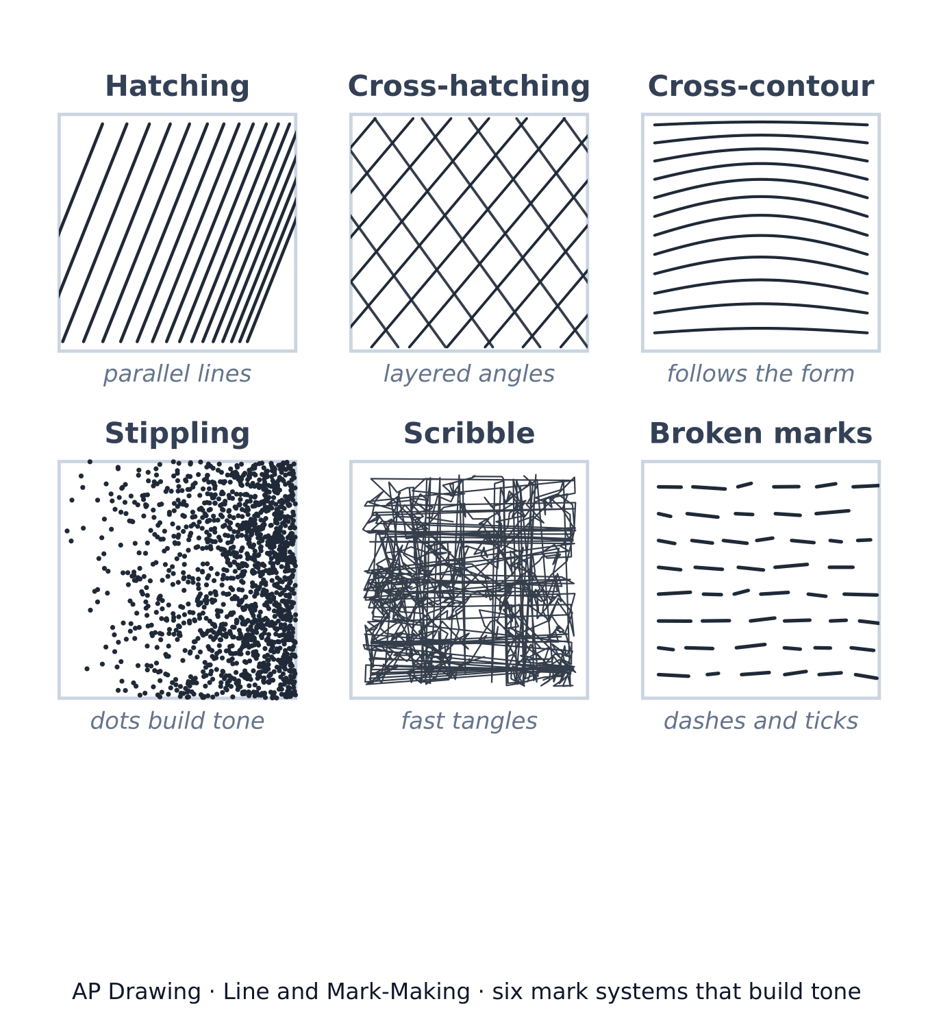
六种笔触系统:排线、交叉排线、横截排线、点画、乱线与断续笔触
用笔触画出色调的六种方式;更密、更近的笔触读起来明度更深
  • 更近、更深的线条读作更深的明度(value);间距更宽读作更浅的明度。
  • 每叠一层交叉排线,色调就加深一步——逐渐建立暗部。
  • 让线条顺着形体弯曲(横截排线),这样明暗同时也在描述体积。
  • 同一个面里保持一个角度;面改变时才改变角度,边缘就会清晰。
  • 钢笔画完全依靠排线,因为墨水没有灰色:明度只来自线条的密度。
探索

Which mark system is it?

Hatching uses parallel lines, cross-hatching layers a second angle, stippling builds tone from dots, and scribble uses fast tangles. Naming mark systems helps you choose and describe your own.

词汇表 训练
英文 中文 拼音
hatching 排线 pái xiàn
cross-hatching 交叉排线 jiāo chā pái xiàn
value 明度 míng dù
1.5

点画、乱线与其他笔触

大纲

Focus: Beyond hatching there is a whole vocabulary of marks — dots, scribbles, dashes, smears — each with its own texture and speed.

  • Stippling builds tone from dots: dense dots read dark, sparse dots read light — slow but very controllable.
  • Scribble (or scumbled) marks are fast tangles of line — lively, good for fur, foliage, and energy.
  • Dashes, ticks, and broken marks suggest texture without outlining every detail.
  • Marks can be additive (adding material) or subtractive (lifting material out with an eraser).
  • Try one subject rendered in four different mark systems — a classic experimentation page.
  • A personal mark vocabulary is part of your artistic voice — examiners look for it across the portfolio.

来源:美国大学理事会 AP 课程与考试说明

除了排线,还有一整套笔触词汇——点、缠绕的线团、短划、涂抹——每种都有自己的质感和速度。

  • 点画(stippling)用点建立色调:密集的点读作深色,稀疏的点读作浅色。慢,但非常可控。
  • 乱线(scribble)是快速缠绕的线团——生动,适合皮毛、树叶和能量感。
  • 短划、勾线和断续的笔触暗示质感,而不必勾出每个细节。
  • 笔触可以是加法(additive)(往上加材料)或减法(subtractive)(用橡皮把材料提走)。
  • 经典的实验页:同一个对象用四种不同的笔触系统各画一遍。
词汇表 训练
英文 中文 拼音
stippling 点画 diǎn huà
scribble 乱线 luàn xiàn
additive 加法 jiā fǎ
subtractive 减法 jiǎn fǎ
1.6

肌理与画面质感

大纲

Focus: Surface is a named AP drawing skill: how the drawing's physical texture and the depicted texture work together.

  • Actual texture is the real surface of the work (rough paper, layered charcoal, collage); implied texture is drawn illusion.
  • Frottage (rubbing over a textured surface) transfers real texture into a drawing.
  • Paper tooth (roughness) changes every mark: the same pencil reads differently on smooth and rough paper.
  • Contrast of textures — smooth skin against rough cloth — makes both read more strongly.
  • Build texture with the logic of the material: short strokes for fur, long strokes for hair, broken marks for stone.
  • Describing texture convincingly is visual evidence of observation and material control.

来源:美国大学理事会 AP 课程与考试说明

画面质感(surface)是AP点名的绘画技能之一:作品实际的物理质感与画出来的质感幻觉共同起作用。

  • 实际肌理(actual texture)是作品真实的表面——粗糙的纸、层层的木炭、拼贴。视觉肌理(implied texture)是画出来的幻觉。
  • 拓印法(frottage)(在有纹理的表面上摩擦)把真实的肌理转移到画面里。
  • 纸纹(tooth)改变每一个笔触:同一支铅笔在光滑和粗糙的纸上效果完全不同。
  • 质感的对比——光滑的皮肤衬着粗糙的布料——让两者都更强烈。
  • 按材料的逻辑画质感:短笔触画皮毛,长笔触画头发,断续笔触画石头。
词汇表 训练
英文 中文 拼音
surface 画面质感 huà miàn zhì gǎn
actual texture 实际肌理 shí jì jī lǐ
implied texture 视觉肌理 shì jué jī lǐ
frottage 拓印法 tà yìn fǎ
tooth 纸纹 zhǐ wén
1.7

表现性笔触

大纲

Focus: Marks carry emotion: the same subject drawn with angry, calm, or nervous marks tells three different stories.

  • Expressive lines exaggerate speed, pressure, and direction to communicate feeling, not just describe form.
  • Käthe Kollwitz's heavy charcoal and Egon Schiele's tense contours show how marks are the meaning.
  • Choose the mark to match the idea: soft graphite for quiet subjects, aggressive ink for conflict.
  • Distortion and exaggeration are legitimate drawing decisions when they serve intent — 'accurate' is not the only goal.
  • The AP rubric rewards ideas made visual: expressive marks link technique to meaning.
  • Test the same composition in two mark styles and write one sentence on which supports your inquiry better.

来源:美国大学理事会 AP 课程与考试说明

笔触承载情绪。同一个对象用愤怒的、平静的或紧张的笔触画出来,讲的是三个不同的故事。

  • 表现性线条(expressive lines)夸大速度、压力和方向,为了传达感受,而不只是描述形体。
  • 珂勒惠支(Käthe Kollwitz)厚重的木炭和席勒(Egon Schiele)紧绷的轮廓表明:笔触本身就是意义。
  • 让笔触配合想法:安静的主题用柔和的石墨,冲突的主题用激烈的墨线。
  • 变形(distortion)和夸张服务于你的意图时,它们是正当的绘画决定——"画得准"不是唯一的目标。
  • 个人的笔触词汇是你艺术个人风格(voice)的一部分。评卷人会在整个作品集里寻找它。
词汇表 训练
英文 中文 拼音
expressive lines 表现性线条 biǎo xiàn xìng xiàn tiáo
distortion 变形 biàn xíng
voice 个人风格 gè rén fēng gé
1.7

考试技巧

  • 线条质感一眼定高下——一页自信、多变的笔触,比一小时胆怯的刻画更能说服评卷人。每次正式作画前先热身。
  • 展示系统,而不只是结果:一张包含排线、点画和横截排线练习的作品集图像,就是评分标准点名的笔触技能的直接视觉证据。
  • **近距离拍摄笔触。**你最好的一段笔触的特写,能证明全景图只能暗示的技能。
  • 盲画轮廓和动态速写页应放进过程图像——它们展示观察与练习,正是持续探究评分标准想看到的。
  • 在书面材料里把笔触和意义连起来:一句"毛糙的石墨线条呼应考试季的焦虑",把技法和想法连接起来,这正是评分所奖励的。

本主题的互动课程

逐步学习,并即时检测练习。

AP 绘画的更多主题

登录或创建账号

IGCSE, A-Level & AP