Skip to content · ⁨コンテンツへスキップ⁩

Elements of Art · ⁨芸術の要素⁩

AP 2-D Art and Design · ⁨AP 2Dアート&デザイン⁩ · Topic 1 · ⁨トピック 1⁩

View Slides · ⁨查看幻灯片⁩ Train · ⁨練習する⁩
Video lesson for this topic · ⁨このトピックのビデオレッスン⁩ Open the video page · ⁨動画ページを開く⁩
8:02

芸術の要素

三枚の名作を見てください。日本からの波。イギリスのろうそく明かりの部屋。フランスのひまわりの花瓶。異なる国、異なる世紀…

English narration · English + 中文 subtitles burned in · ⁨英語ナレーション・英語+中文字幕 burning-in⁩

1.1

Line · ⁨ライン⁩

Syllabus · ⁨シラバス⁩
English

Focus: Line is the most basic element of art — a moving point that the eye follows across a surface.

  • A line is a mark with length and direction: straight, curved, angular, or freeform.
  • Lines vary in quality — thick or thin, smooth or rough, continuous or broken, dark or light.
  • Contour lines trace the edges of a form; gesture lines quickly capture movement and energy.
  • Implied lines are suggested, not drawn — by a row of objects, a pointing arm, or a gaze.
  • Direction carries feeling: horizontal reads as calm, vertical as strength, diagonal as action.
  • Artists use line to build shape, shade value (hatching, cross-hatching), imply texture, and lead the eye.
日本語

焦点: 線は芸術の最も基本的な要素であり、目が表面を横切って追跡する動点である。

  • 線とは、長さおよび方向を持つ印であり、直線、曲線、角のある形、あるいはフリーハンドである。
  • 線の品質は厚いまたは薄い、滑らかまたは粗い、連続的または断続的、暗いまたは明るいなどで異なる。
  • 輪郭線は形の縁をたどり、ジェスチャー線は素早く動きとエネルギーを捉える。
  • 暗示された線は描かれていないが、一列の物体、指さしの腕、または視線によって示唆される。
  • 方向には感情が込められている:水平は静けさ、垂直は力強さ、斜線はアクションとして読まれる。
  • アーティストは形状を構築し、影の値(ハッチング、クロスハッチング)、質感の暗示、目の誘導のために線を使用する。
Source: College Board AP Course and Exam Description · ⁨出典: College Board AP コースおよび試験説明書⁩

English

The elements of art 艺术元素 are the visual "building blocks" every artist uses. The first is line 线条 — a moving point that the eye follows.

  • A line has length and direction; it can be straight, curved, angular, or freeform.
  • Lines have quality: thick or thin, smooth or rough, continuous or broken, dark or light.
  • Contour 轮廓 lines trace the edges of a form; gesture 动态速写 lines capture movement quickly.
  • Implied lines 隐含线 are not drawn but suggested — by a row of objects or a person's gaze.

Direction carries feeling: horizontal lines feel calm, vertical lines feel strong, and diagonal lines feel active. Artists use line to build shape, shade value (hatching), imply texture, and lead the viewer's eye.

日本語

芸術の要素とは、すべてのアーティストが使用する視覚的な「構成要素」のことです。最初の要素はライン——目が見て追う、動く点です。

  • ラインには「長さ」と「方向」があります。直線、曲線、角ばった線、または自由線可以是其中一种。
  • ラインには「質感」があります。太い・細い、滑らか・粗い、連続・断続、濃い・薄いなど。
  • 「輪郭線」は形のエッジを追跡し、「ジェスチャー線」は動きを素早く捉えます。
  • 「暗示されたライン」は描かれていませんが、一列の物体や人物の視線によって示唆されます。
巨浪が小舟の上にかぶろうとする葛飾北斎の浮世絵、遠景に富士山が小さく見える
葛飾北斎の『神奈川沖浪裏』:力強い曲線の輪郭が視線を波の上へ導き、泡の爪のような線が動きを生み出している
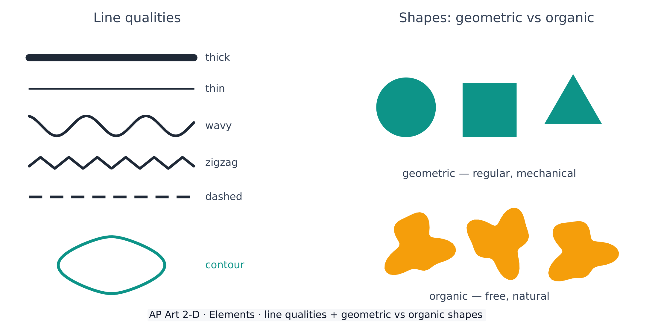
線の質感と幾何学形状と有機形状の違い
線は太さや性格が異なり、形状は幾何学的(規則的)か有機的(自然的)かのいずれかである

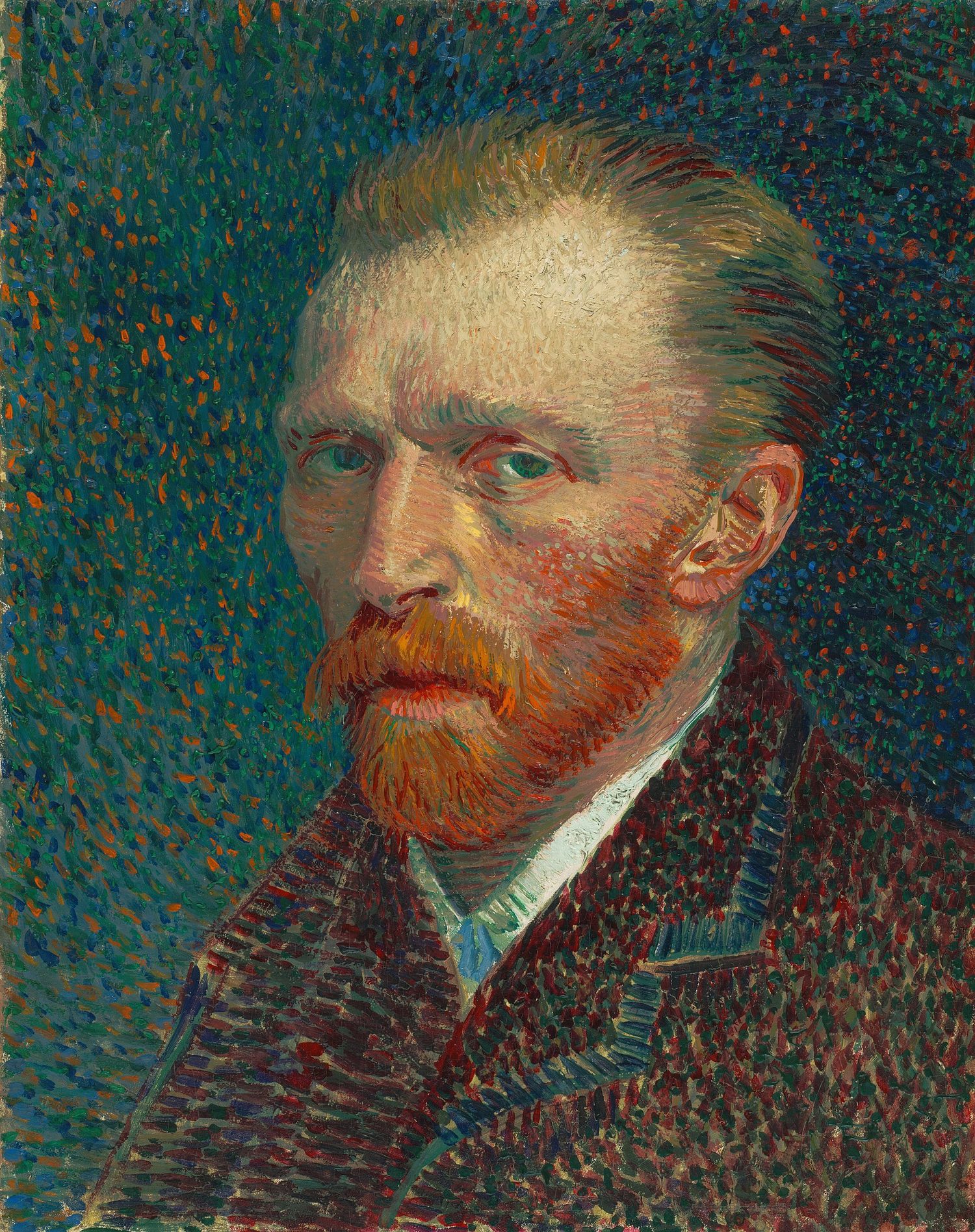
方向には感情が込められます:水平線は静けさを、垂直線は強さを、斜線は活発さを表現します。芸術家は線を用いて形を構築し、陰影の値(ハッチング)、質感の暗示、および鑑賞者の視線を誘導します。

ヴァン・ゴッホの自画像:背景には短く不穏な斜めの筆触が描かれ、肩元や襟元は広く穏やかに表現されている
ヴァン・ゴッホの自画像:穏やかな水平の肩の後ろに不穏な斜めの筆触 — 一枚の絵の中で同じ2つの方向が正反対の役割を果たしている
Vocabulary · ⁨語彙⁩ Train · ⁨練習する⁩
English 日本語
elements of art/ˈelɪmənts ɒv ɑːt/ 芸術の要素
line/laɪn/ ライン
Contour/ˈkɒntʊə/ Contour
gesture/ˈdʒestʃə/ ジェスチャー
Implied lines/ɪmˈplaɪd laɪnz/ 暗線
shape/ʃeɪp/ 形
form/fɔːm/ フォルム
Geometric/ˌdʒiːəʊˈmetrɪk/ 幾何学的
organic/ɔːˈɡænɪk/ 有機的
Positive shape/ˈpɒzɪtɪv ʃeɪp/ 正の形状
negative shape/ˈneɡətɪv ʃeɪp/ ネガティブな形状
1.2

Shape and Form · ⁨形状と立体⁩

Syllabus · ⁨シラバス⁩
English

Focus: Shape is a flat, enclosed area; form is the illusion of a three-dimensional object on a 2-D surface.

  • A shape is a two-dimensional area with a boundary; form appears three-dimensional (height, width, depth).
  • Geometric shapes (circle, square, triangle) are regular and mechanical; organic shapes are free and natural.
  • Positive shapes are the objects; negative shapes are the empty spaces around and between them.
  • Form is created on a flat surface through value (shading), overlapping, and perspective.
  • Recognising negative space helps an artist see and compose more accurately.
日本語

焦点: 形状(Shape)は平面的な閉じた領域であり、形(Form)とは 2D の面上における三次元物体の錯覚のことである。

  • 形状是有边界的二维区域;立体感呈现出三维效果(高度、宽度、深度)。
  • 幾何学的な形状(円、四角、三角形)は規則的で機械的です。有機的な形状は自由で自然です。
  • 正形是被描绘的对象;负形是对象周围及之间的空白空间。
  • 通过在平坦表面上运用明度(阴影)、重叠和透视,可以创造出立体感。
  • 识别负空间有助于艺术家更准确地进行观察和构图。

Source: College Board AP Course and Exam Description · ⁨出典: College Board AP コースおよび試験説明書⁩

English

A shape 形状 is a flat, enclosed area; a form 形体 has the illusion of three dimensions (height, width, and depth).

  • Geometric 几何 shapes (circle, square, triangle) are regular and mechanical; organic 有机 shapes are free and natural.
  • Positive shape 正形 is the object; negative shape 负形 is the empty space around and between objects — learning to see it makes drawing far more accurate.
  • Form is created on a flat surface with value (shading), overlapping, and perspective.
日本語

形状とは平面的で閉じた領域であり、立体とは3次元(高さ、幅、奥行き)の錯覚を持つものです。

  • 幾何学的な形状(円、四角、三角形)は規則的で機械的です。有機的な形状は自由で自然です。
  • ポジティブな形状とは対象そのものであり、ネガティブな形状とは対象を取り囲むまたは挟む余白の空間です。これを見ることができるようになることは、描画の正確性を大幅に高めます。
  • 立体は、平面の上に値(陰影)、重なり合い、遠近法を用いて表現されます。
1.3

Value · ⁨値(トーン)⁩

Syllabus · ⁨シラバス⁩
English

Focus: Value is the lightness or darkness of a colour or tone — the key to showing form and depth.

  • Value runs from white through greys to black; a value scale shows the gradual steps.
  • Highlight, midtone, core shadow, reflected light, and cast shadow describe light on a form.
  • Strong value contrast creates drama and a clear focal point; close values feel soft and calm.
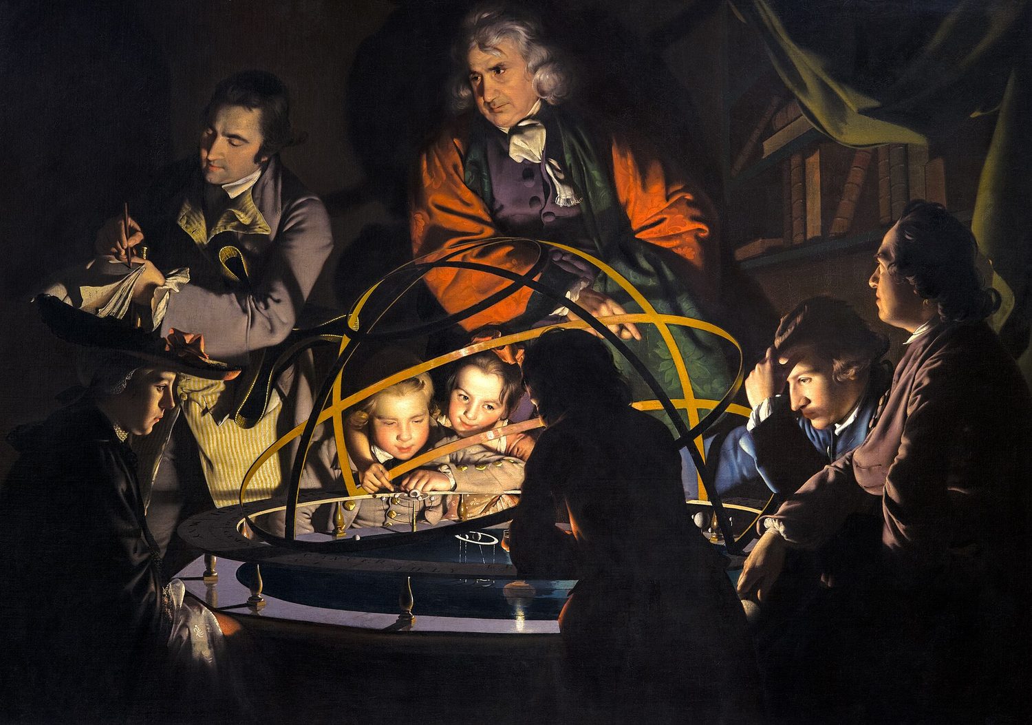
  • Chiaroscuro is the bold use of light and dark to model three-dimensional form.
  • Squinting removes colour and helps an artist judge value relationships.
日本語

**焦点:**明度指颜色或色调的深浅程度——这是表现立体感和深度的关键。

  • 明度从白色经灰色过渡到黑色;明度阶调表展示了这种渐进的变化步骤。
  • 高光、中间调、固有色暗部、反射光和投影描述了光照在物体上的表现。
  • 强烈的明度对比能营造戏剧性并确立清晰的视觉中心;相近的明度则感觉柔和宁静。
  • 明暗对照法是通过大胆运用明暗来塑造三维立体的技法。
  • 眯起眼睛可以消除色彩干扰,帮助艺术家判断明度关系。

Source: College Board AP Course and Exam Description · ⁨出典: College Board AP コースおよび試験説明書⁩

English
Light logic: how light describes form
The value scale

Value 明度 is the lightness or darkness of a tone — the single most powerful tool for showing three-dimensional form.

  • A value scale 明度阶 runs from white through greys to black.
  • Light on a form has a highlight 高光, midtones 中间调, a core shadow 明暗交界线, reflected light 反光, and a cast shadow 投影.
  • Chiaroscuro 明暗对照法 is the bold use of light and dark to model form. Squinting removes colour and helps you judge value.
日本語
光の論理:光が立体をどう描写するか
値スケール

値とはトーンの明るさや暗さのことであり、3次元の立体を表現するための最も強力なツールです。

値スケールは白から黒まで均等な段階で並んでいる
値スケールは白から黒まで均等に刻んでおり、強い値のコントラストはドラマと焦点を生み出します
  • 明度スケールは白から灰色を経て黒まで連続しています。
  • 立体への光には、ハイライト、ミッドトーン、コアシャドウ、リフレクトedライト、そしてキャストシャドウが含まれます。
  • シャルロスコとは、明暗の強い対比を用いて立体感を表現する技法です。目を細めると色が消えて、明度(値)の判断がしやすくなります。
ろうそくの光に照らされた 18 世紀の絵画で、人々が太陽系の模型を取り囲み、顔が暗い背景に対して輝いています
ジョセフ・ライトの『オルレリーを講義する哲学者』:中央の隠れた光源が強い明暗のコントラスト(シャルロスコ)を生み出し、各顔を闇から浮き上がらせています。
Vocabulary · ⁨語彙⁩ Train · ⁨練習する⁩
English 日本語
Value/ˈvæljuː/ 明暗(Value)
value scale/ˈvæljuː skeɪl/ バリュースケール
highlight/ˈhaɪlaɪt/ ハイライト
midtones/ˈmɪdtəʊnz/ ミッドトーン
core shadow/kɔː ˈʃædəʊ/ コア・シャドウ
reflected light/rɪˈflektɪd laɪt/ 反射光
cast shadow/kæst ˈʃædəʊ/ キャストシャドウ
Chiaroscuro/ˌtʃaɪərəˈskjʊərəʊ/ キアロスクuro
Colour/ˈkʌlə/ 色
colour wheel/ˈkʌlə wiːl/ カラーホイール
hue/hjuː/ 色相
saturation/ˌsætʃəˈreɪʃn/ 彩度
Primary/ˈpraɪməri/ 一次
secondary/ˈsekəndəri/ 第二級
Complementary/ˌkɒmplɪˈmentəri/ 補色
neutralise/ˈnjuːtrəlaɪz/ 中和する
Analogous/əˈnæləɡəs/ 類似色
1.4

Color · ⁨色⁩

Syllabus · ⁨シラバス⁩
English

Focus: Colour is light reflected from a surface; it has three properties and follows the logic of the colour wheel.

  • Colour has three properties: hue (its name), value (light/dark), and saturation/intensity (dull to vivid).
  • Primary colours (red, yellow, blue) mix to make secondary (orange, green, violet) and tertiary colours.
  • Colour schemes: complementary, analogous, monochromatic, triadic, warm, and cool.
  • Warm colours (red, orange, yellow) advance and energise; cool colours (blue, green, violet) recede and calm.
  • Adding white makes a tint, black makes a shade, grey makes a tone.
  • Complementary colours placed side by side intensify each other; mixed together they dull (neutralise).
日本語

**焦点:**色彩是表面反射的光;它具有三个属性,并遵循色轮的逻辑。

  • 色彩有三个属性:色相(名称)、明度(深浅)和饱和度/强度(灰暗至鲜艳)。
  • 原色(红、黄、蓝)混合可生成间色(橙、绿、紫)和复色。
  • 配色方案包括:互补色、类似色、单色系、三色组、暖色调和冷色调。
  • 暖色(红、橙、黄)具有前进感和活力;冷色(蓝、绿、紫)具有后退感和镇静感。
  • 加入白色形成浅色,加入黑色形成深色,加入灰色形成中色调。
  • 互补色并置会互相增强;混合在一起则会变暗(中和)。

Source: College Board AP Course and Exam Description · ⁨出典: College Board AP コースおよび試験説明書⁩

English
The colour wheel and its schemes

Colour 色彩 is light reflected from a surface. It has three properties and follows the logic of the colour wheel 色轮.

  • Colour's three properties: hue 色相 (its name), value (light/dark), and saturation 饱和度 (dull to vivid).
  • Primary 三原色 (red, yellow, blue) mix to make secondary 间色 and tertiary colours.
  • Complementary 互补色 colours sit opposite on the wheel: placed side by side they intensify each other, but mixed together they neutralise 中和 into a dull grey-brown. Analogous 邻近色 colours sit next to each other and harmonise.
  • Warm 暖色 colours (red, orange, yellow) advance; cool 冷色 colours (blue, green, violet) recede. A tint adds white, a shade adds black.
日本語
カラーホイールとその配色

色とは、表面から反射された光のことです。3つの性質を持ち、**カラーホイール(色彩環)**の論理に従います。

カラーホイール:一次色、二次色、三次色、および暖色・寒色の半分
一次色が混ざり合って二次色や三次色となり、補色は互いに反対側に位置します
  • 色の3つの性質:色相(その名称)、明度(明るさ・暗さ)、彩度(くすんだものから鮮やかなものまで)。
  • 一次色(赤、黄、青)を混ぜると、二次色と三次色が作られます。
  • 補色はホイール上で反対側に位置し、隣り合わせにすると相互に強調されますが、混ぜると中性化されてくすんだ灰色~茶色になります。類似色は隣接しており、調和します。
  • 暖色(赤、橙、黄)は前進し、寒色(青、緑、紫)は後退します。トイントは白を加えたもの、シェードは黒を加えたものです。
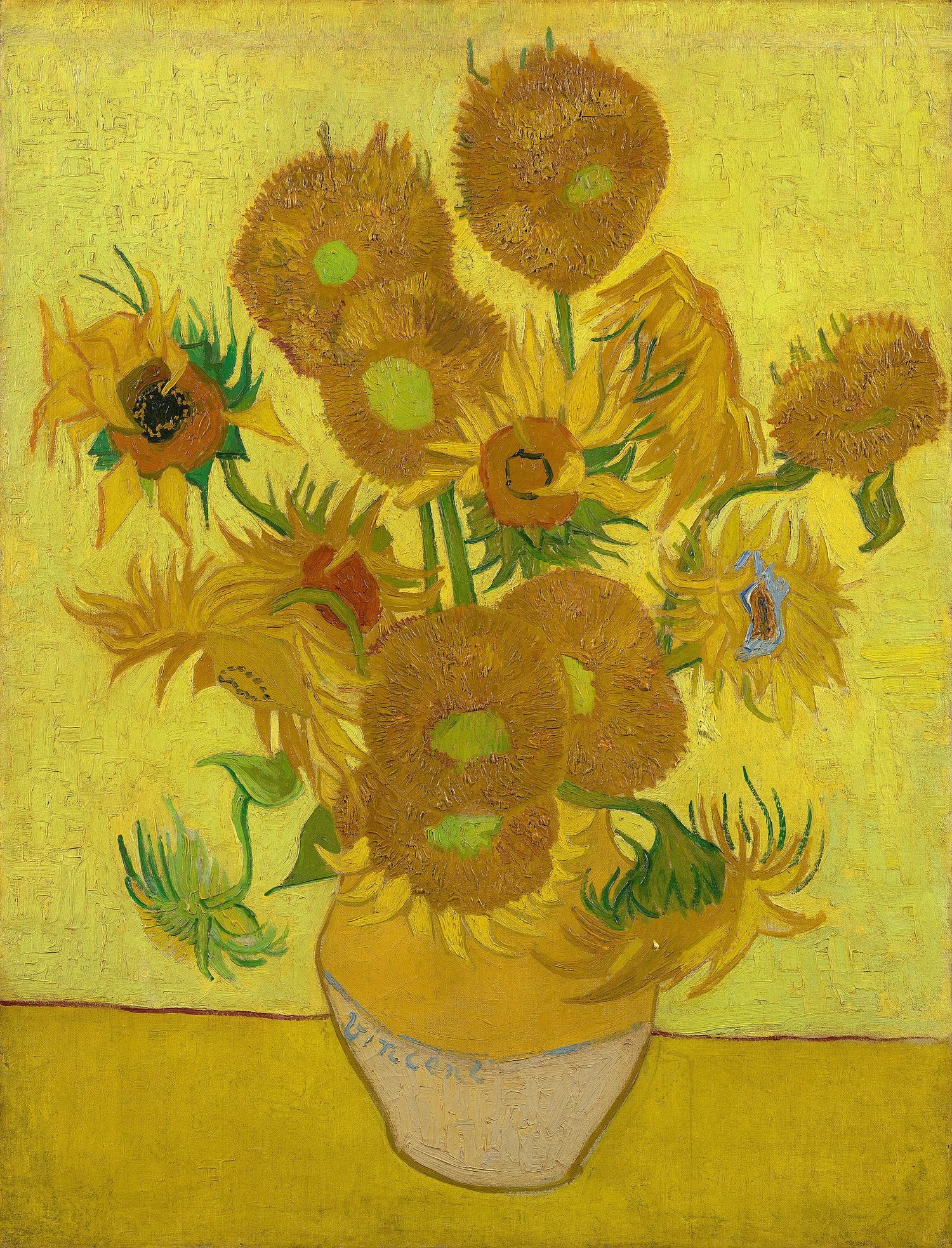
ヴァン・ゴッホの静物画「ひまわり」、ほぼすべて黄色と金色のトーンで描かれた花瓶に挿されたひまわり
ヴァン・ゴッホの『ひまわり』は、ほぼすべて暖かい黄色と橙色で構成されており、類似色の配色によって明るく統一感のある印象を与えます
Explore · ⁨探索⁩

Warm or cool colour? · ⁨暖色系か寒色系か?⁩

Warm colours (red, orange, yellow) feel energetic and seem to advance; cool colours (blue, green, violet) feel calm and seem to recede. · ⁨暖色(赤、橙、黄)は活発で前に進んで見える;寒色(青、緑、紫)は穏やかで後退して見える。⁩

Vocabulary · ⁨語彙⁩ Train · ⁨練習する⁩
English 日本語
Warm/wɔːm/ 暖色系
cool/kuːl/ 寒色系
1.5

Texture · ⁨質感⁩

Syllabus · ⁨シラバス⁩
English

Focus: Texture is the surface quality of a work — how it feels or how it appears to feel.

  • Actual (tactile) texture can be physically touched (thick paint, collage, rough paper).
  • Implied (visual) texture is the illusion of a surface, created with marks, value, and pattern.
  • Texture is built through mark-making: stippling, hatching, dry-brush, impasto, and frottage (rubbing).
  • Contrasting smooth and rough areas adds interest and can direct attention.
  • In photography and digital work, texture comes from light, focus, and surface detail.
日本語

**焦点:**质感是作品的表面品质——即触感或视觉上的触觉感受。

  • 真实(触觉)质感可以被物理触摸到(如厚涂颜料、拼贴画、粗糙纸张)。
  • 暗示(视觉)质感是通过笔触、明度和图案营造的表面错觉。
  • 质感通过运笔方式建立:点画法、排线法、干笔法、厚涂法和刮擦法(拓印)。
  • 光滑与粗糙区域的对比能增加趣味性并引导视线。
  • 在摄影和数字艺术中,质感来源于光线、对焦和表面细节。

Source: College Board AP Course and Exam Description · ⁨出典: College Board AP コースおよび試験説明書⁩

English

Texture 肌理 is the surface quality of a work — how it feels, or how it appears to feel.

  • Actual (tactile) texture 实际肌理 can be physically touched (thick paint, collage, rough paper).
  • Implied (visual) texture 视觉肌理 is the illusion of a surface, made with marks, value, and pattern.
  • Techniques include stippling, hatching, impasto 厚涂 (thick paint), and dry-brush. Contrasting smooth and rough areas adds interest and can direct the eye.
日本語

質感とは、作品の表面の質であり、実際に触れる感覚や、目に見えて感じる触感のことです。

  • 実在(触覚的)質感は、物理的に触れることができます(厚い絵具、コラージュ、粗い紙など)。
  • 暗示(視覚的)質感は、線、明度、パターンを用いて作られる表面の錯覚です。
  • 技法には、ステッピング、ハッチング、インパスト(厚い絵具)、ドライブラシが含まれます。滑らかな部分と粗い部分を対比させることで、興味を惹きつけ、視線を誘導できます。
織り布地デニムのクローズアップ:質感とは、目で見たり、手触りで感じたりできる表面の質であり、実在または暗示のどちらかです
Vocabulary · ⁨語彙⁩ Train · ⁨練習する⁩
English 日本語
Texture/ˈtekstʃə/ 質感(Texture)
Actual (tactile) texture/ˈæktʃuːəl ˈtekstʃə/ 実質(触覚的)質感
Implied (visual) texture/ɪmˈplaɪd ˈtekstʃə/ 暗示的(視覚的)質感
impasto/ɪmˈpæstəʊ/ インパスト
Space/speɪs/ 空間(Space)
overlapping/ˌəʊvəˈlæpɪŋ/ 重なり
foreground/ˈfɔːɡraʊnd/ 前景
middle ground/ˈmɪdl ɡraʊnd/ 中景
background/ˈbækɡraʊnd/ 背景
Linear perspective/ˈlɪnɪə pəˈspektɪv/ 線遠近法
vanishing point/ˈvænɪʃɪŋ pɔɪnt/ 消失点
1.6

Space · ⁨空間⁩

Syllabus · ⁨シラバス⁩
English

Focus: Space is the area within, around, and between the parts of a work, including the illusion of depth.

  • Positive space is filled by the subject; negative space is the empty area around it.
  • Artists create the illusion of depth with overlapping, size, placement, and detail.
  • Linear perspective uses a horizon line and vanishing point(s) so parallel lines converge.
  • Atmospheric (aerial) perspective makes distant objects paler, bluer, and less detailed.
  • Foreground, middle ground, and background organise a scene from near to far.
  • The format and cropping of the picture plane shape how space is read.
日本語

**焦点:**空间是作品内部、外部及部件之间的区域,包括深度的错觉。

  • 正空间由主体填充;负空间是其周围的空白区域。
  • 艺术家通过重叠、大小、位置和细节来创造深度的错觉。
  • 线性透视利用地平线和消失点使平行线汇聚。
  • 空气(大气)透视使远处的物体显得更淡、更蓝且细节减少。
  • 前景、中景和背景将场景按远近进行组织。
  • 画面的格式和裁剪决定了空间的阅读方式。

Source: College Board AP Course and Exam Description · ⁨出典: College Board AP コースおよび試験説明書⁩

English
Atmospheric perspective
One-point perspective

Space 空间 is the area within, around, and between the parts of a work, including the illusion of depth on a flat surface.

  • Positive space is filled by the subject; negative space is the empty area around it.
  • Depth is created with overlapping 重叠, size, placement, and detail.
  • A scene organises into three depth planes: foreground 前景 (nearest), middle ground 中景, and background 背景 (farthest). The nearest plane usually carries the most detail and contrast, the farthest the least.
  • Linear perspective 线性透视 uses a horizon line and vanishing point 灭点 so parallel lines converge; atmospheric perspective 空气透视 makes distant things paler, bluer, and less detailed.
  • The format and cropping of the picture plane shape how the space is read.

Worked example (applying the concept). Asked to describe how line creates meaning in a portrait, a strong answer names the element, its quality, and its effect: "The artist uses thick, jagged diagonal lines in the background, and their restless, active direction makes the calm horizontal lines of the sitter's shoulders feel even more still." Naming the element and linking it to a feeling is what portfolio written evidence and analysis questions both reward.

日本語
大気遠近法
一点透視図法

空間とは、作品の内部、周囲、要素間の領域を指し、平坦な面上における奥行きへの錯覚も含まれます。

  • 正空間は被写体で埋め尽くされ、負空間はその周囲の余白です。
  • 奥行きは重なり合い、大きさ、配置、詳細さによって作られます。
  • 風景は3つの奥行き面として組織されます:手前(最も近い)、中景、背景(最も遠い)。最も近い面は通常、最も詳細とコントラストを含み、最も遠い面は最も少ない含みます。
  • 直線透視図法は地平線と消失点を用いて平行線を収束させます。大気遠近法は遠くのものを薄く、青く、詳細を減らして見せます。
  • ピクチャープレーンのフォーマットとクロッピングが、空間の読み方を形作ります。

** worked example (概念の適用) :ポートレートにおいてラインが意味を生み出す方法を説明するよう求められた際、強い回答は要素、その性質、効果の名前を挙げます:「画家は背景に太く、ギザギザした斜めのラインを使用しており、その不安定で活発な方向性が、被写体の肩の穏やかな水平なラインをさらに静止しているように感じさせます。」 要素を名指ししかつ**感情と結びつけることが、ポートフォリオの記述問題と分析問題の両方で評価されます。

Vocabulary · ⁨語彙⁩ Train · ⁨練習する⁩
English 日本語
atmospheric perspective/ˌætməsˈferɪk pəˈspektɪv/ 大気透視法
1.6

Exam tips · ⁨試験対策⁩

English
  • Name the element precisely — line, shape or form, value, colour, texture, space — in any analysis.
  • Justify how form is modelled with a value scale and a single light source.
  • Read the colour wheel: identify complementary versus analogous schemes and warm or cool temperature.
  • Separate shape (2-D) from form (3-D) and actual from implied texture.
  • Explain depth with overlap, size, linear perspective, and atmospheric perspective.
日本語
  • どの分析においても、要素を正確に名指してください——ライン、形状または形、明度、色、質感、空間。
  • 明度スケールと単一の光源を使って、形がどのように造形されているかを正当化してください。
  • カラーホイールを読み解き、補色と類似色の配色、および暖色または寒色の温度感を特定してください。
  • 形状(2次元)と形(3次元)、および実在と暗示の質感を区別してください。
  • 重なり、大きさ、直線透視図法、大気遠近法を用いて奥行きを説明してください。

Interactive lessons on this topic · ⁨このトピックのインタラクティブ授業⁩

Work through it step by step, with instant-check exercises. · ⁨一歩ずつ進め、即時チェック付きの問題で学習します。⁩

More topics in AP 2-D Art and Design · ⁨AP 2Dアート&デザイン⁩ · ⁨AP 2-D Art and Design · ⁨AP 2Dアート&デザイン⁩ の他のトピック⁩

Log in or create account · ⁨ログインまたはアカウント作成⁩

IGCSE, A-Level & AP