Representation of data · 数据的表示
| English | 中文 | Pinyin · 拼音 |
|---|---|---|
| stem-and-leaf/stem ænd liːf/ | 茎叶图 | jīng yè tú |
| box-and-whisker/bɒks ænd ˈwɪskə/ | 箱线图 | xiāng xiàn tú |
| quartile/ˈkwɔːtaɪl/ | 四分位数 | sì fēn wèi shù |
| histogram/ˈhɪstəɡræm/ | 直方图 | zhí fāng tú |
| cumulative frequency/ˈkjuːmjʊlətɪv ˈfriːkwənsi/ | 累积频数 | lěi jī pín shuò |
| median/ˈmiːdiːən/ | 中位数 | zhōng wèi shù |
| interquartile range/ˌɪntəˈkwɔːtaɪl reɪndʒ/ | 四分位距 | sì fēn wèi jù |
| frequency density/ˈfriːkwənsi ˈdensɪti/ | 频率密度 | pín lǜ mì dù |
| mean/miːn/ | 平均数 | píng jūn shù |
| mode/məʊd/ | 众数 | zhòng shù |
| standard deviation/ˈstændəd ˌdiːvɪˈeɪʃn/ | 标准差 | biāo zhǔn chà |
| variance/ˈveərɪəns/ | 方差 | fāng chà |
| outlier/ˈaʊtlaɪə/ | 离群值 | lí qún zhí |
The diagram that changed history
- In 1854, John Snow mapped cholera deaths in London and spotted a cluster around one water pump. That diagram saved lives.
- Choosing the right statistical diagram is a skill — it reveals patterns that raw numbers hide.
改变历史的图
- 1854 年,约翰·斯诺把伦敦的霍乱死亡画在地图上,发现一个水泵周围有一个聚集。那张图拯救了生命。
- 选择正确的统计图是一项技能——它揭示原始数字隐藏的模式。
Statistical diagrams
- Choose a diagram to suit the data:
- Stem-and-leaf 茎叶图 (keeps the values, shows shape),
- Box-and-whisker 箱线图 (lowest, three quartiles 四分位数, highest),
- Histogram 直方图 (grouped data — bar area = frequency),
- Cumulative frequency 累积频数 (running totals → median 中位数 and quartiles).
A cumulative frequency curve: read the median across from half the total, and the quartiles from a quarter and three-quarters
A box plot shows the five-number summary; the box spans the interquartile range 四分位距, IQR = Q₃ − Q₁.
Histogram vs bar chart. In a histogram, bars can have different widths and the area (not height) represents frequency. Frequency density 频率密度 $= \dfrac{\text{frequency}}{\text{class width}}$.
Histogram area = frequency, not height. When class widths are unequal, the vertical axis shows frequency density, not frequency. A tall narrow bar may represent fewer data points than a short wide one.
统计图
- 选一种适合数据的图:
- 茎叶图(stem-and-leaf,保留值,显示形状),
- 箱线图(box-and-whisker,最低、三个四分位数、最高),
- 直方图(histogram,分组数据——条形的面积 = 频数),
- 累积频数图(cumulative frequency,累计总数 → 中位数和四分位数)。

一条累积频数曲线:从总数的一半横读出中位数,从四分之一和四分之三读出四分位数
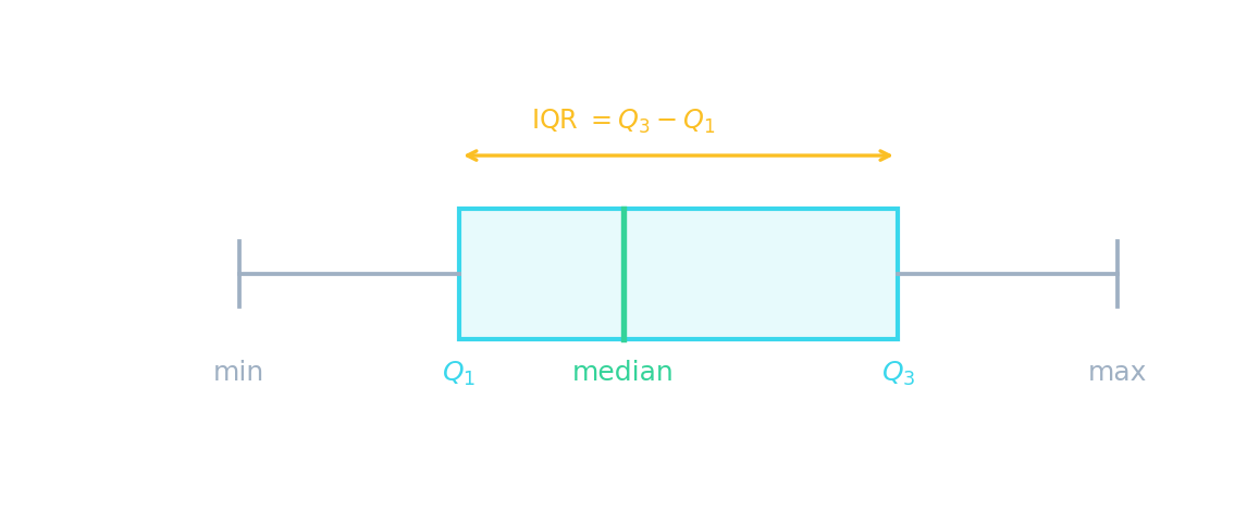
一张箱线图显示五数概括;箱子跨越四分位距,IQR = Q₃ − Q₁。
直方图对条形图。 在一张直方图中,条形可以有不同的宽度,而面积(不是高度)代表频数。频数密度 $= \dfrac{\text{frequency}}{\text{class width}}$。
直方图面积 = 频数,不是高度。 当组宽不相等时,纵轴显示频数密度,不是频数。一个高而窄的条形可能代表比一个矮而宽的更少的数据点。
Spread and the bell · 离散程度与钟形曲线
P(−k < Z < k)
Spread · 离散程度 is measured in standard deviations — about 68% of data lies within 1 sd, 95% within 2. · 离散程度用标准差测量——约 68% 的数据在 1 个标准差以内,95% 在 2 个以内。
In a histogram of grouped data, the frequency is shown by each bar's: · 在一张分组数据的直方图中,频数由每个条形的什么显示:
In a histogram, the area of each bar represents the frequency. · 在一张直方图中,每个条形的面积代表频数。
In a histogram with unequal class widths, the height of each bar equals the frequency. · 在一张组宽不相等的直方图中,每个条形的高度等于频数。
With unequal widths, the height shows frequency density (frequency/width), not frequency. The area represents frequency. · 宽度不相等时,高度显示频数密度(频数/宽度),不是频数。面积代表频数。
Match each statistical diagram to what it best shows. · 把每种统计图与它最好地显示的东西配对。
A box plot shows quartiles and spread; a histogram uses bar area for frequency; cumulative frequency gives the median/quartiles; stem-and-leaf keeps the data values. · 箱线图显示四分位数和离散程度;直方图用条形面积表示频数;累积频数图给出中位数/四分位数;茎叶图保留数据值。
Averages and spread
- Central tendency: mean 平均数 $\bar{x} = \dfrac{\sum x}{n}$, median (middle), mode 众数 (most common).
- Spread: range, interquartile range, and standard deviation 标准差 $\sigma = \sqrt{\dfrac{\sum x^2}{n} - \bar{x}^2}$.
- Variance 方差 = $\sigma^2$.
A Venn diagram: the overlap is the intersection of two events
平均数与离散程度
- 集中趋势:平均数(mean)$\bar{x} = \dfrac{\sum x}{n}$,中位数(median,中间的),众数(mode,最常见的)。
- 离散程度:极差(range)、四分位距(interquartile range)和标准差(standard deviation)$\sigma = \sqrt{\dfrac{\sum x^2}{n} - \bar{x}^2}$。
- 方差(variance)= $\sigma^2$。

一张维恩图:重叠是两个事件的交集
For 10 values with Σx = 50, what is the mean? · 对 Σx = 50 的 10 个值,平均数是多少?
Mean = Σx / n = 50 / 10 = 5. · 平均数 = Σx / n = 50 / 10 = 5。
For 10 values, Σx = 50 and Σx² = 300. What is the standard deviation? (√(Σx²/n − x̄²)) · 对 10 个值,Σx = 50 而 Σx² = 300。标准差是多少?(√(Σx²/n − x̄²))
σ = √(300/10 − 5²) = √(30 − 25) = √5 ≈ 2.24. · σ = √(300/10 − 5²) = √(30 − 25) = √5 ≈ 2.24。
For the data 2, 4, 4, 4, 5, 5, 7, 9, what is the median? · 对数据 2, 4, 4, 4, 5, 5, 7, 9,中位数是多少?
With 8 values, the median is the average of the 4th and 5th: (4 + 5)/2 = 4.5. · 有 8 个值,中位数是第 4 个和第 5 个的平均:(4 + 5)/2 = 4.5。
If the standard deviation is 3, what is the variance? · 如果标准差是 3,方差是多少?
Variance = σ² = 3² = 9. · 方差 = σ² = 3² = 9。
Worked example — standard deviation
- Data: 2, 4, 4, 4, 5, 5, 7, 9. $n = 8$, $\sum x = 40$, $\sum x^2 = 232$.
- Mean $\bar{x} = \dfrac{40}{8} = 5$.
- Variance $= \dfrac{232}{8} - 5^2 = 29 - 25 = 4$.
- Standard deviation $\sigma = \sqrt{4} = 2$.
算例——标准差
- 数据:2, 4, 4, 4, 5, 5, 7, 9。$n = 8$,$\sum x = 40$,$\sum x^2 = 232$。
- 平均数 $\bar{x} = \dfrac{40}{8} = 5$。
- 方差 $= \dfrac{232}{8} - 5^2 = 29 - 25 = 4$。
- 标准差 $\sigma = \sqrt{4} = 2$。
Choosing the right average
- Mean: uses all data, but affected by outliers 离群值.
- Median: not affected by outliers — good for skewed data (like salaries).
- Mode: useful for categorical data (most popular colour, most common shoe size).
- Display data with stem-and-leaf diagrams, box-and-whisker plots and cumulative frequency graphs, and measure its variation (spread).
选择正确的平均数
- 平均数:用所有数据,但受离群值影响。
- 中位数:不受离群值影响——对偏斜的数据好(像工资)。
- 众数:对分类数据有用(最受欢迎的颜色、最常见的鞋码)。
- 用茎叶图(stem-and-leaf diagrams)、箱线图(box-and-whisker plots)和累积频率图(cumulative frequency graphs)展示数据,并度量其变异(variation,离散程度)。
You've got it
- diagrams: stem-and-leaf, box plot, histogram (area = frequency), cumulative frequency
- averages: mean, median, mode; spread: range, IQR, standard deviation
- $\sigma = \sqrt{\dfrac{\sum x^2}{n} - \bar{x}^2}$, and variance $= \sigma^2$
你掌握了
- 图:茎叶图、箱线图、直方图(面积 = 频数)、累积频数图
- 平均:平均数、中位数、众数;离散:极差、IQR、标准差
- $\sigma = \sqrt{\dfrac{\sum x^2}{n} - \bar{x}^2}$,而方差 $= \sigma^2$