Charts and diagrams · 图表与图示
| English | 中文 | Pinyin · 拼音 |
|---|---|---|
| bar chart/bɑː tʃɑːt/ | 条形图 | tiáo xíng tú |
| pictogram/ˈpɪktəɡræm/ | 象形图 | xiàng xíng tú |
| pie chart/paɪ tʃɑːt/ | 饼图 | bǐng tú |
| stem-and-leaf/stem ænd liːf/ | 茎叶图 | jīng yè tú |
A picture is worth a thousand numbers
- The right chart makes patterns leap out. The wrong one hides them — or creates illusions.
- Choosing the right chart is a skill, not just a presentation trick.
一张图胜过一千个数字
- 正确的图表使模式跃然而出。错误的图表隐藏它们——或制造错觉。
- 选择正确的图表是一项技能,不只是一个演示技巧。
Pie-chart angles · 饼图角度
Each slice's angle is its share of the whole turned into degrees — frequency ÷ total × 360 — and the slices always add to 360°. · 每个扇形的角度等于其占整体的份额转换为度数——频数 ÷ 总数 × 360——且所有扇形角度之和恒为 360°。
Chart choice lab · 图表选择实验
Choose the chart that fits the kind of data. · 选择适合数据类型特征的图表。
Bar charts 条形图 and pictograms 象形图
- Bar chart: one bar per category; height $=$ frequency. Bars don't touch.
- Pictogram: a symbol stands for a number of items (e.g. one smiley $= 10$ people).
A bar chart of favourite colours: red bar reaches $15$, blue reaches $22$, green reaches $8$. The heights tell you the frequencies directly.
Each slice is its fraction of $360^\circ$: tea is $\tfrac{30}{120}\times360^\circ=90^\circ$
条形图和象形图
- 条形图(bar chart):每个类别一个条;高度 $=$ 频数。条不接触。
- 象形图(pictogram):一个符号代表一定数量的项目(例如一个笑脸 $= 10$ 个人)。
一个最喜欢颜色的条形图:红条达到 $15$,蓝达到 $22$,绿达到 $8$。高度直接告诉你频数。
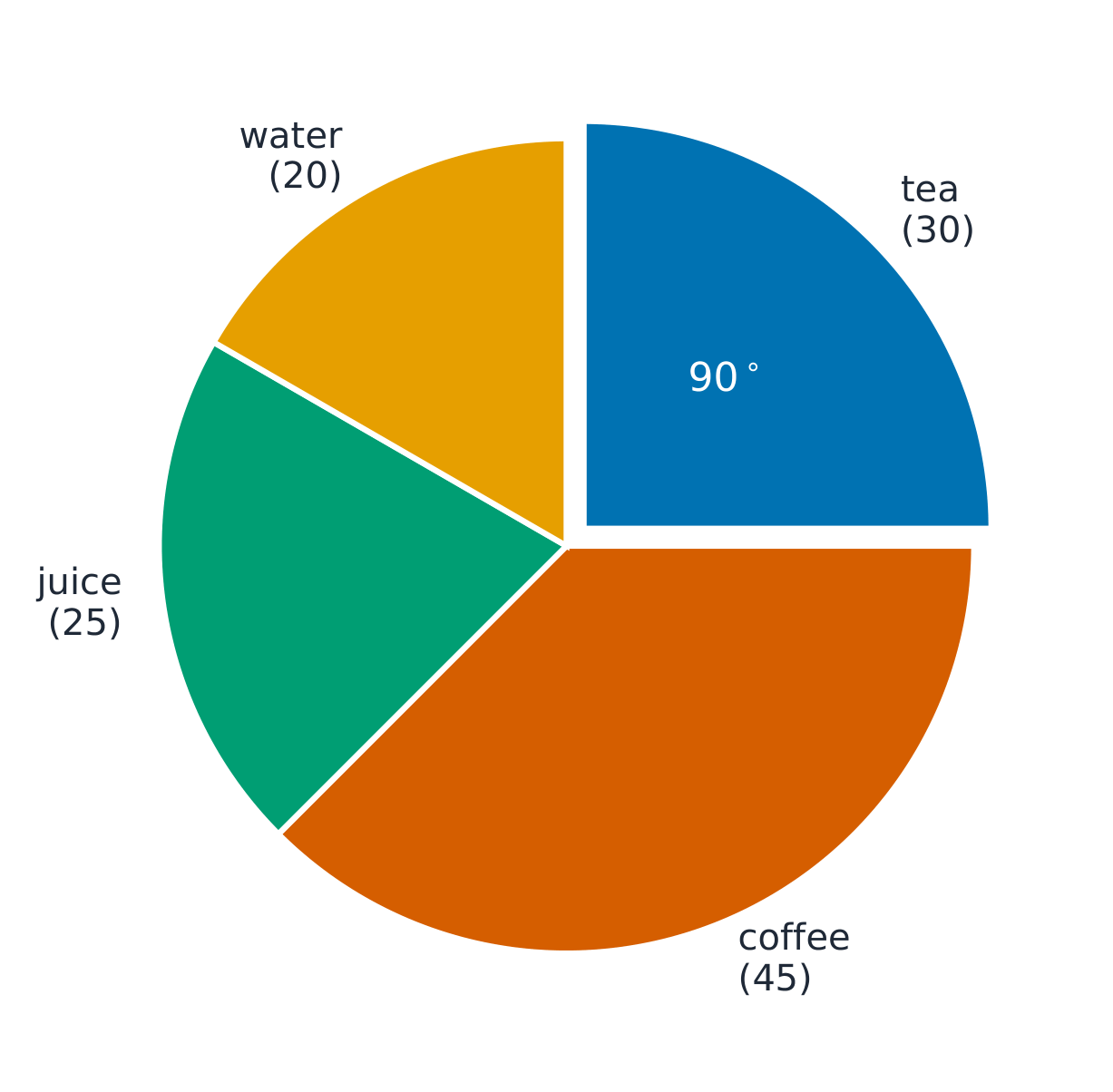
每个切片是它占 $360^\circ$ 的分数:茶是 $\tfrac{30}{120}\times360^\circ=90^\circ$
On a bar chart, the height of each bar shows the: · 在条形图中,每个条形的高度表示:
Bar height represents the frequency of that category. · 条形高度代表该类别的频数。
Pie charts 饼图
- A circle split into slices. Each slice is a fraction of $360^{\circ}$.
Pie charts show proportions, not counts. A bigger pie doesn't mean more data — it might just show a bigger fraction of a smaller total.
饼图
- 一个被分成切片的圆。每个切片是 $360^{\circ}$ 的一个分数。
饼图显示比例,不是计数。 一个更大的饼不意味着更多的数据——它可能只是显示一个更小总数的一个更大的分数。
Out of 120 people, 30 chose tea. Find the angle of the tea slice on a pie chart (degrees). · 120 人中有 30 人选了茶。求饼图中茶对应的扇形角度(度)。
(30/120) × 360 = 90°.
Out of 160 people, 40 chose juice. Find the angle of the juice slice (degrees). · 160 人中有 40 人选了果汁。求果汁对应的扇形角度(度)。
(40/160) × 360 = 90°.
A bigger pie chart always means more data than a smaller one. · 更大的饼图总是意味着比更小的饼图更多的数据。
Pie charts show proportions, not absolute counts. A bigger pie might just show a bigger fraction of a smaller total. · 饼图显示的是比例而非绝对数量。更大的饼图可能只是较小总数的更大占比。
Out of 200 people, 50 chose coffee. Find the pie-chart angle for coffee (degrees). · 200 人中有 50 人选了咖啡。求饼图中咖啡对应的角度(度)。
(50/200) × 360 = 90°.
Stem-and-leaf 茎叶图 diagrams
- Keeps the digits of ordered data, with a key.
- Example: $23, 25, 31, 34, 37$ → stem $2$: $3, 5$; stem $3$: $1, 4, 7$.
- Advantage: you can read every individual value AND see the shape of the data.
茎叶图
- 保留排序数据的数字,带一个图例。
- 例子:$23, 25, 31, 34, 37$ → 茎 $2$:$3, 5$;茎 $3$:$1, 4, 7$。
- 优点:你能读每个个别的值并看到数据的形状。
A stem-and-leaf diagram keeps every individual ______ while showing the shape of the data. · 茎叶图在展示数据形状的同时保留了每个个体的______。
Unlike grouped data, a stem-and-leaf preserves each original data point. · 与分组数据不同,茎叶图保留了每一个原始数据点。
Worked example — pie chart
- Of $120$ people, $30$ chose tea. Slice $= \dfrac{30}{120} \times 360^{\circ} = 90^{\circ}$.
- Of $160$ people, $40$ chose juice. Slice $= \dfrac{40}{160} \times 360^{\circ} = 90^{\circ}$.
Charts use scales just like number lines — always check what each unit represents.
例题——饼图
- 在 $120$ 个人中,$30$ 个选茶。切片 $= \dfrac{30}{120} \times 360^{\circ} = 90^{\circ}$。
- 在 $160$ 个人中,$40$ 个选果汁。切片 $= \dfrac{40}{160} \times 360^{\circ} = 90^{\circ}$。
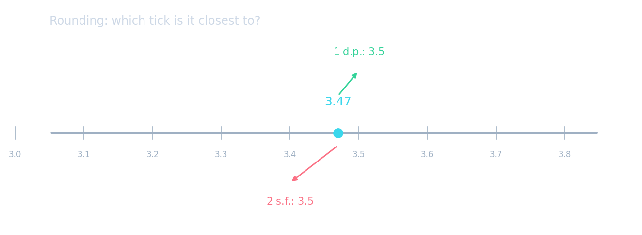
图表像数轴一样使用刻度——总是检查每个单位代表什么。
Paired bars, stacked bars and keys
- Classes A and B record walkers 12,10 and cyclists 8,14. A dual chart has adjacent A and B bars for each travel method; a stacked chart has total height 22 for walkers and 22 for cyclists, with each class labelled in the key.
- A pictogram key of one symbol = 8 items makes half a symbol worth 4. For stem-and-leaf data $14,17,17,21,23$, write stem 1 with leaves 4,7,7 and stem 2 with 1,3; include key $1|4=14$.
并列条形图、堆叠条形图和图例
- A 班和 B 班记录了步行者 12,10 和骑行者 8,14。双图例图表中,每种出行方式对应相邻的 A 和 B 条形;堆叠图表中,步行者的总高度为 22,骑行者的总高度为 22,并在图例中标注各班别。
- 象形图图例若规定一个符号代表 8 个物品,则半个符号代表 4。对于茎叶图数据 $14,17,17,21,23$,写出茎 1 及其叶 4,7,7,以及茎 2 及其叶 1,3;并包含图例 $1|4=14$。
A stacked bar contains 12 class-A walkers and 10 class-B walkers. Find its total frequency. · 一个堆叠条形图中包含 12 名 A 类步行者和 10 名 B 类步行者。求其总频数。
Stacked components add: 12 + 10 = 22. · 堆叠部分相加:12 + 10 = 22。
You've got it
- bar chart: height $=$ frequency; pictogram: symbol $=$ several items
- pie chart: each slice $= \dfrac{\text{part}}{\text{total}} \times 360^{\circ}$
- stem-and-leaf: keeps every individual value while showing the shape
你掌握了
- 条形图:高度 $=$ 频数;象形图:符号 $=$ 若干项目
- 饼图:每个切片 $= \dfrac{\text{part}}{\text{total}} \times 360^{\circ}$
- 茎叶图:在显示形状的同时保留每个个别的值