This handout covers Topic 9, Statistics. Parts marked (Extended) are only tested on the Extended papers; everything else is for both levels.
Statistics
IGCSE Mathematics · Topic 9
 8:09
8:09
Statistics
Every day the world collects numbers about you: how far you travel, how long you sleep, what you score in a test. A long list of numbers tells you almost…
English narration · English + 中文 subtitles burned in
9.1 9.2
Collecting and showing data

Syllabus
| Subject content | Notes and examples |
|---|---|
| Classify and tabulate statistical data. | e.g. tally tables, two-way tables. |
| Subject content | Notes and examples |
|---|---|
| 1 Read, interpret and draw inferences from tables and statistical diagrams. | |
| 2 Compare sets of data using tables, graphs and statistical measures. | e.g. compare averages and ranges between two data sets. |
| 3 Appreciate restrictions on drawing conclusions from given data. |
| Subject content | Notes and examples |
|---|---|
| 1 Read, interpret and draw inferences from tables and statistical diagrams. | |
| 2 Compare sets of data using tables, graphs and statistical measures. | e.g. compare averages and measures of spread between two data sets. |
| 3 Appreciate restrictions on drawing conclusions from given data. |
Source: Cambridge International syllabus
To organise statistical 统计 data 数据, use:
- a tally table 计数表 — make a mark for each value, then count.
- a two-way table 双向表 — sorts data by two features at once (for example, boys/girls against walk/bus).
When you read a diagram, only draw conclusions the data really supports.
Explore
Data handling cycle
Follow a statistical question from collection to display.
Vocabulary
Train
| English |
|---|
| statistical/stəˈtɪstɪkl/ |
| data/ˈdeɪtə/ |
| tally table/ˈtælɪ ˈteɪbl/ |
| two-way table/tuː weɪ ˈteɪbl/ |
9.3
Averages and range

Syllabus
| Subject content | Notes and examples |
|---|---|
| Calculate the mean, median, mode and range for individual data and distinguish between the purposes for which these are used. | Data may be in a list or frequency table, but will not be grouped. |
| Subject content | Notes and examples |
|---|---|
| 1 Calculate the mean, median, mode, quartiles, range and interquartile range for individual data and distinguish between the purposes for which these are used. | |
| 2 Calculate an estimate of the mean for grouped discrete or grouped continuous data. | |
| 3 Identify the modal class from a grouped frequency distribution. |
Source: Cambridge International syllabus
Three averages describe a typical value of the data, and the range shows how spread out it is. Each is used for a different purpose:
- mean 平均数 $= \dfrac{\text{sum of all values}}{\text{how many values}}$.
- median 中位数 $=$ the middle value when the data is put in order.
- mode 众数 $=$ the value that appears most often.
- range 极差 $=$ largest value $-$ smallest value (it shows how spread out the data is).
Worked example. Find the mean, median, mode and range of $4, 7, 7, 2, 5$.
Order the data: $2, 4, 5, 7, 7$.
$$\text{mean} = \frac{4 + 7 + 7 + 2 + 5}{5} = \frac{25}{5} = 5, \quad \text{median} = 5, \quad \text{mode} = 7, \quad \text{range} = 7 - 2 = 5.$$
Explore
Average choice lab
Choose the average that fits the data situation.
Vocabulary
Train
| English |
|---|
| mean/miːn/ |
| median/ˈmiːdiːən/ |
| mode/məʊd/ |
| range/reɪndʒ/ |
9.3
Averages from a frequency table
Syllabus
| Subject content | Notes and examples |
|---|---|
| Calculate the mean, median, mode and range for individual data and distinguish between the purposes for which these are used. | Data may be in a list or frequency table, but will not be grouped. |
| Subject content | Notes and examples |
|---|---|
| 1 Calculate the mean, median, mode, quartiles, range and interquartile range for individual data and distinguish between the purposes for which these are used. | |
| 2 Calculate an estimate of the mean for grouped discrete or grouped continuous data. | |
| 3 Identify the modal class from a grouped frequency distribution. |
Source: Cambridge International syllabus
When data is listed with its frequency 频数 (how many times each value occurs), the mean is
$$\text{mean} = \frac{\sum (\text{value} \times \text{frequency})}{\sum \text{frequency}}.$$
Worked example. Values $1, 2, 3$ occur with frequencies $4, 5, 1$. Find the mean.
$$\text{mean} = \frac{1(4) + 2(5) + 3(1)}{4 + 5 + 1} = \frac{17}{10} = 1.7.$$
Grouped data (Extended)
For grouped data 分组数据, you cannot find the exact mean, so estimate it using the midpoint of each group as the value. The modal class 众数组 is simply the group with the highest frequency.
Vocabulary
Train
| English |
|---|
| frequency/ˈfriːkwənsi/ |
| grouped data/ɡruːpt ˈdeɪtə/ |
| modal class/ˈməʊdl klæs/ |
9.3
Measures of spread (Extended)
Syllabus
| Subject content | Notes and examples |
|---|---|
| 1 Calculate the mean, median, mode, quartiles, range and interquartile range for individual data and distinguish between the purposes for which these are used. | |
| 2 Calculate an estimate of the mean for grouped discrete or grouped continuous data. | |
| 3 Identify the modal class from a grouped frequency distribution. |
Source: Cambridge International syllabus
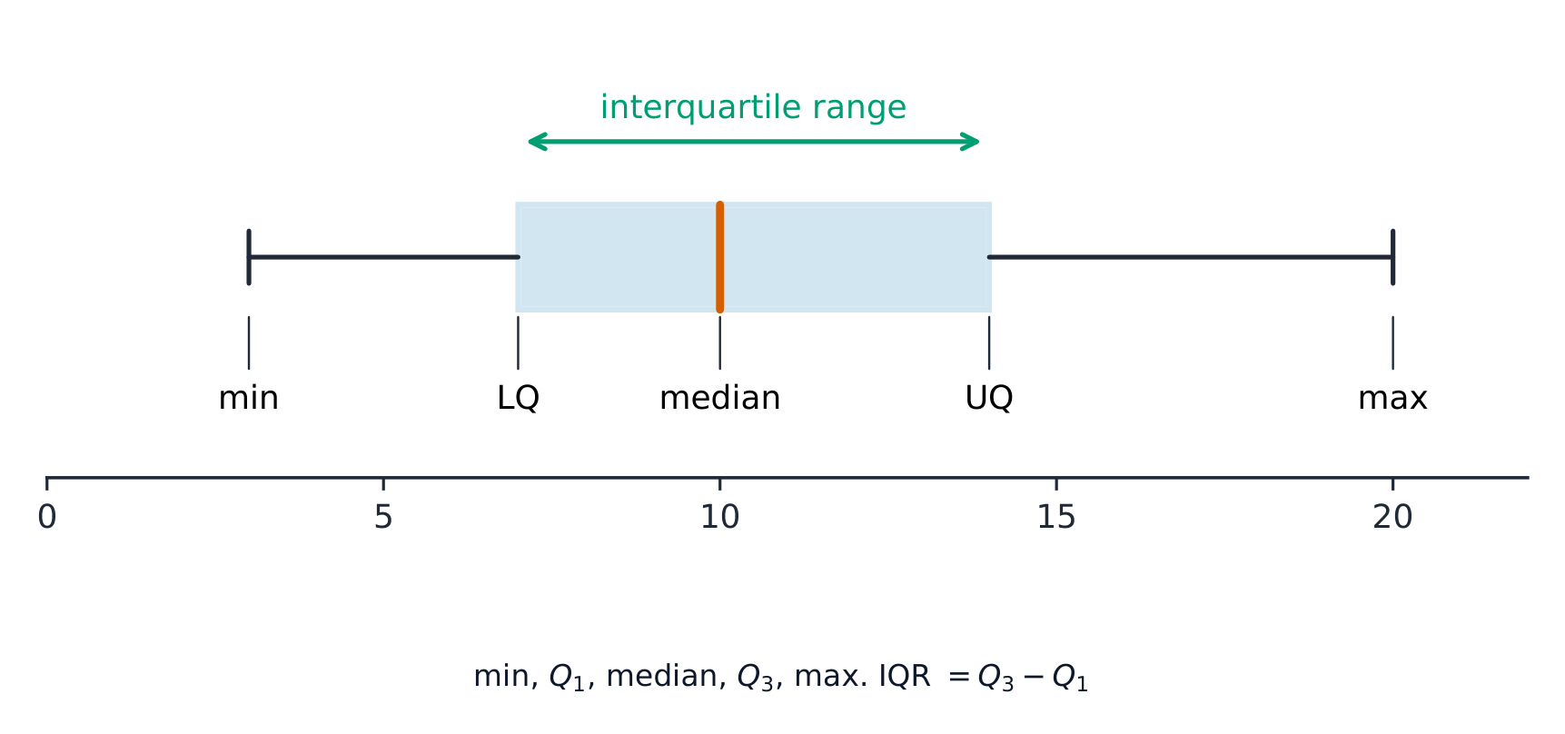
When data is in order, the quartiles 四分位数 cut it into four equal parts. The lower quartile (LQ) is one quarter of the way up; the upper quartile (UQ) is three quarters of the way up. The interquartile range 四分位距 measures the spread of the middle half:
$$\text{interquartile range} = \text{UQ} - \text{LQ}.$$
The interquartile range is useful because, unlike the range, it ignores extreme values.
Explore
Box-and-whisker plot
Build a box plot from the five-number summary: the box is the middle 50% (the interquartile range) and the median's position shows the skew.
Vocabulary
Train
| English |
|---|
| quartile/ˈkwɔːtaɪl/ |
| interquartile range/ˌɪntəˈkwɔːtaɪl reɪndʒ/ |
9.4
Charts and diagrams

Syllabus
| Subject content | Notes and examples |
|---|---|
| Draw and interpret: (a) bar charts (b) pie charts (c) pictograms (d) stem-and-leaf diagrams (e) simple frequency distributions. | Includes composite (stacked) and dual (side-by-side) bar charts. Stem-and-leaf diagrams should have ordered data with a key. |
Source: Cambridge International syllabus


| Chart | What it shows |
|---|---|
| bar chart 条形图 | a bar for each category; height is the frequency |
| pie chart 饼图 | a circle split into slices, each a fraction of $360^{\circ}$ |
| pictogram 象形图 | uses a symbol to stand for a number of items |
| stem-and-leaf diagram 茎叶图 | keeps the digits of ordered data, with a key |
| frequency distribution 频数分布 | a table of values and their frequencies |
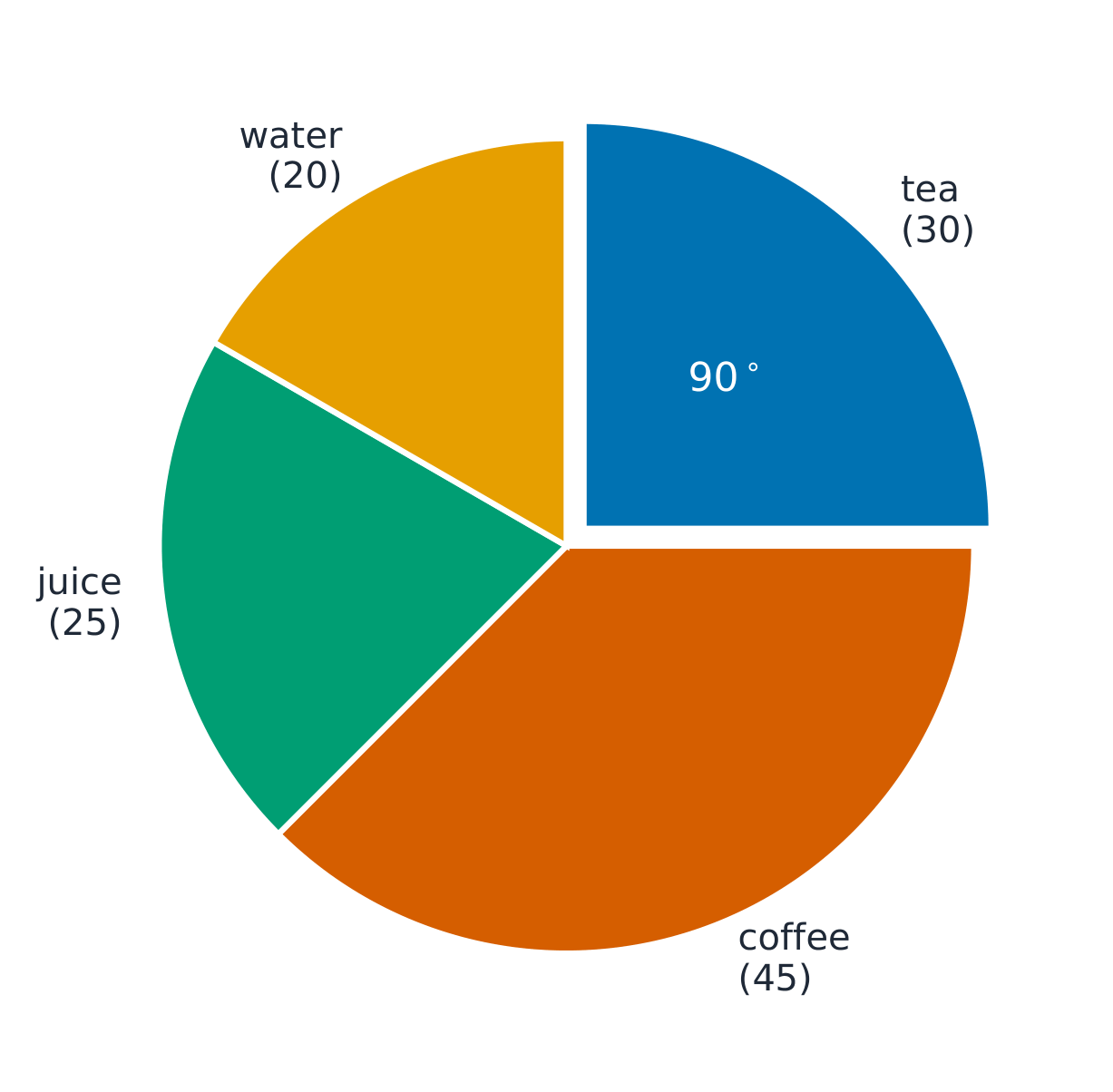
Worked example (pie chart). Out of $120$ people, $30$ chose tea. Find the angle of the tea slice.
$$\frac{30}{120} \times 360^{\circ} = 90^{\circ}.$$
Explore
Pie-chart angles
Each slice's angle is its share of the whole turned into degrees — frequency ÷ total × 360 — and the slices always add to 360°.
Explore
Chart choice lab
Choose the chart that fits the kind of data.
Vocabulary
Train
| English |
|---|
| bar chart/bɑː tʃɑːt/ |
| pie chart/paɪ tʃɑːt/ |
| pictogram/ˈpɪktəɡræm/ |
| stem-and-leaf diagram/stem ænd liːf ˈdaɪəɡræm/ |
| frequency distribution/ˈfriːkwənsi ˌdɪstrɪˈbjuːʃn/ |
9.5
Scatter diagrams and correlation

Syllabus
| Subject content | Notes and examples |
|---|---|
| 1 Draw and interpret scatter diagrams. | Plotted points should be clearly marked, for example as small crosses (×). |
| 2 Understand what is meant by positive, negative and zero correlation. | |
| 3 Draw by eye, interpret and use a straight line of best fit. | A line of best fit: • should be a single ruled line drawn by inspection • should extend across the full data set • does not need to coincide exactly with any of the points but there should be a roughly even distribution of points either side of the line over its entire length. |
| Subject content | Notes and examples |
|---|---|
| 1 Draw and interpret scatter diagrams. | Plotted points should be clearly marked, for example as small crosses (x). |
| 2 Understand what is meant by positive, negative and zero correlation. | |
| 3 Draw by eye, interpret and use a straight line of best fit. | A line of best fit: • should be a single ruled line drawn by inspection • should extend across the full data set • does not need to coincide exactly with any of the points but there should be a roughly even distribution of points either side of the line over its entire length. |
Source: Cambridge International syllabus
A scatter diagram 散点图 plots pairs of values as points to show whether two things are linked. The link is the correlation 相关性:
- positive correlation 正相关 — as one goes up, the other goes up.
- negative correlation 负相关 — as one goes up, the other goes down.
- zero correlation 零相关 — no clear link.
If there is correlation, draw a line of best fit 最佳拟合线: one straight ruled line through the middle of the points, with about the same number of points on each side. Use it to predict values.

Explore
Scatter and correlation
Change the strength of the relationship and add a line of best fit to spot the trend.
Vocabulary
Train
| English |
|---|
| scatter diagram/ˈskætə ˈdaɪəɡræm/ |
| correlation/ˌkɒrɪˈleɪʃn/ |
| positive correlation/ˈpɒzɪtɪv ˌkɒrɪˈleɪʃn/ |
| negative correlation/ˈneɡətɪv ˌkɒrɪˈleɪʃn/ |
| zero correlation/ˈzɪərəʊ ˌkɒrɪˈleɪʃn/ |
| line of best fit/laɪn ɒv best fɪt/ |
9.6
Cumulative frequency diagrams (Extended)
Syllabus
| Subject content | Notes and examples |
|---|---|
| 1 Draw and interpret cumulative frequency tables and diagrams. | Plotted points on a cumulative frequency diagram should be clearly marked, for example as small crosses (x), and be joined with a smooth curve. |
| 2 Estimate and interpret the median, percentiles, quartiles and interquartile range from cumulative frequency diagrams. |
Source: Cambridge International syllabus
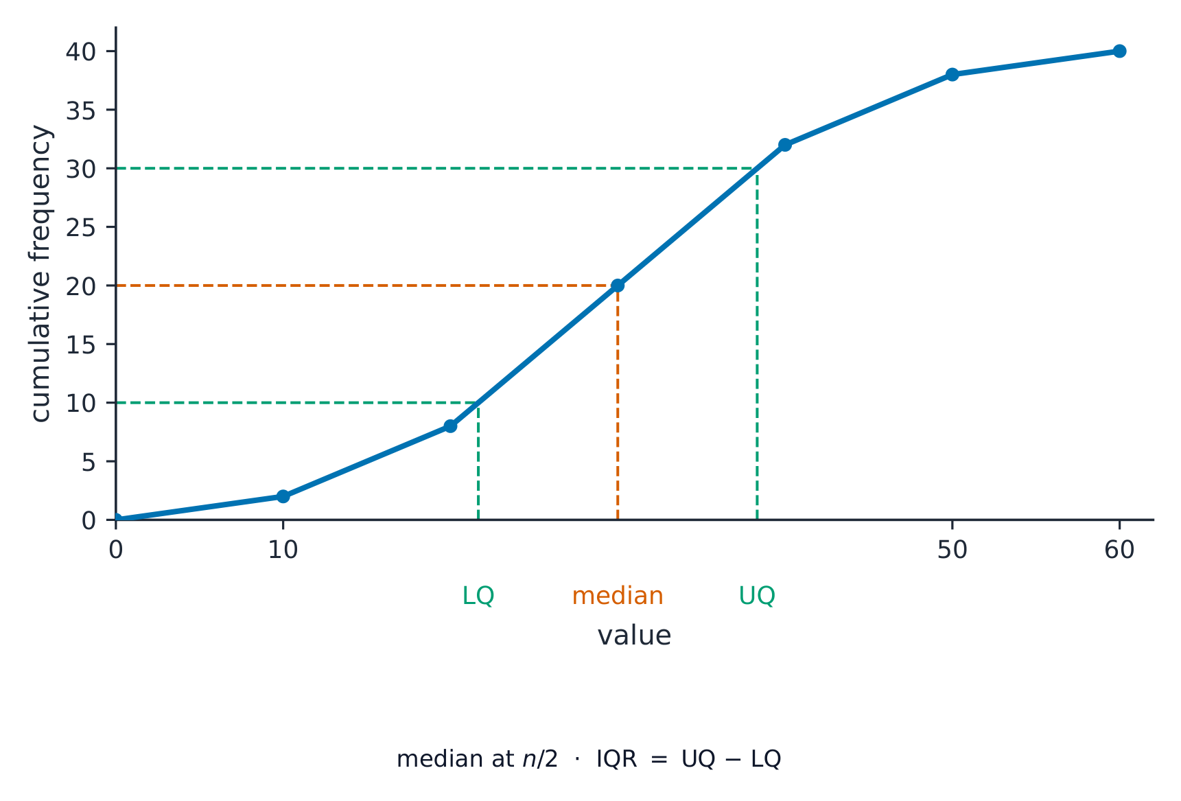
The cumulative frequency 累积频数 is a running total of the frequencies. Plot it against the upper end of each class and join the points with a smooth curve.
From the curve you can read the median (at half the total), the quartiles (at one quarter and three quarters), and any percentile 百分位数 (for example, the $90$th percentile is at $90\%$ of the total).
Explore
Cumulative frequency route
Follow raw data into a cumulative frequency curve and percentile reading.
Vocabulary
Train
| English |
|---|
| cumulative frequency/ˈkjuːmjʊlətɪv ˈfriːkwənsi/ |
| percentile/pəˈsentaɪl/ |
9.7
Histograms (Extended)
Syllabus
| Subject content | Notes and examples |
|---|---|
| 1 Draw and interpret histograms. | On histograms, the vertical axis is labelled 'Frequency density'. |
| 2 Calculate with frequency density. | Frequency density is defined as $\text{frequency density} = \text{frequency} \div \text{class width}$. |
Source: Cambridge International syllabus
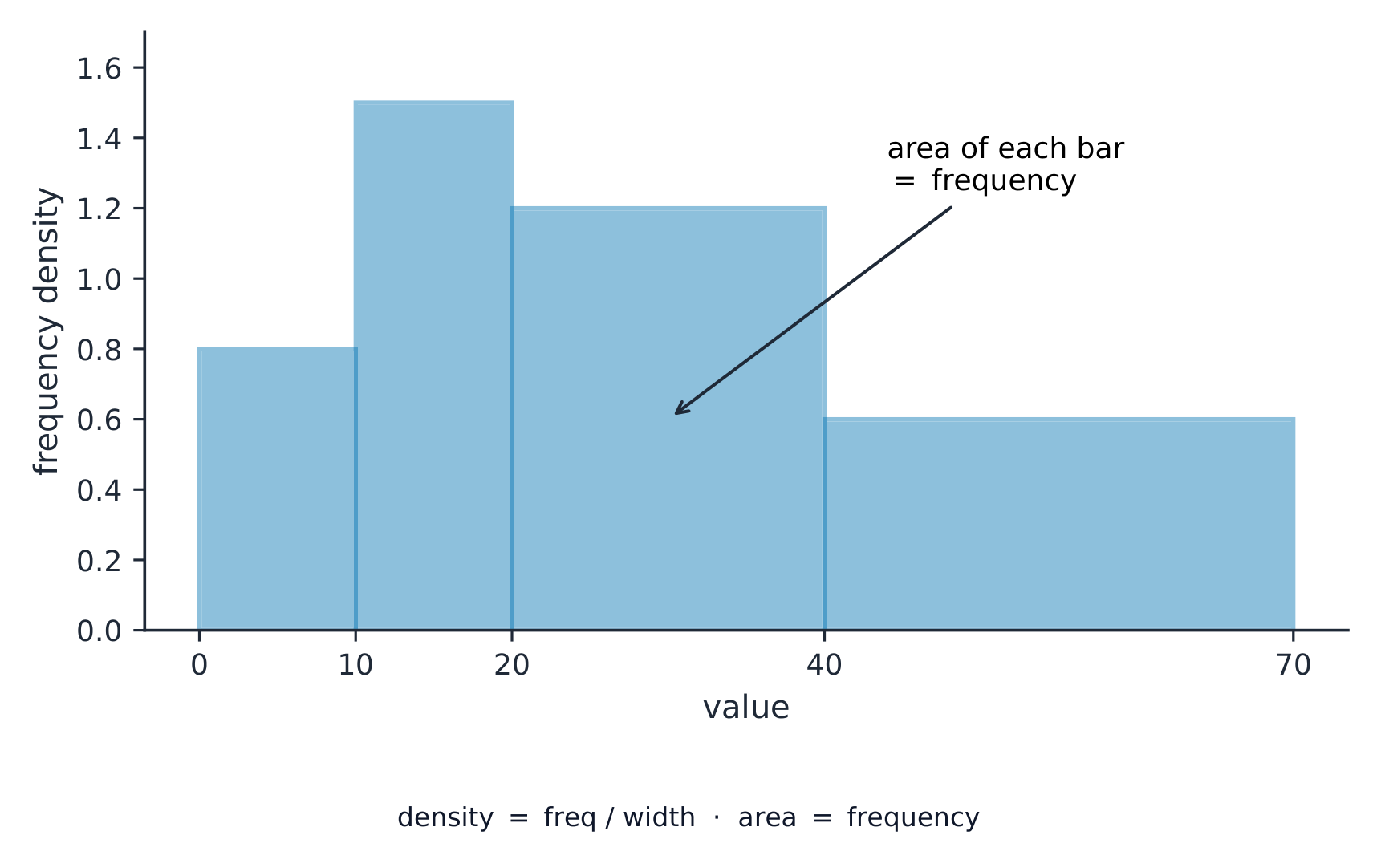
A histogram 直方图 looks like a bar chart, but the bars can have different widths and the area of each bar (not its height) shows the frequency. The vertical axis is the frequency density 频数密度:
$$\text{frequency density} = \frac{\text{frequency}}{\text{class width}}.$$
Worked example. A class has class width 组距 $10$ and frequency $25$. Find the frequency density.
$$\text{frequency density} = \frac{25}{10} = 2.5.$$
Explore
Frequency-density histogram
With unequal class widths the bar height is frequency density, so the area (not the height) represents the frequency.
Vocabulary
Train
| English |
|---|
| histogram/ˈhɪstəɡræm/ |
| frequency density/ˈfriːkwənsi ˈdensɪti/ |
| class width/klæs wɪtθ/ |
9.7
Exam tips
- Know the three averages: mean (add up ÷ how many), median (the middle value when in order), mode (the most common). The range is highest − lowest.
- From a frequency table the mean is $\frac{\sum fx}{\sum f}$ — divide by the total frequency, not the number of rows.
- On a scatter diagram, describe the correlation as positive, negative or none, and draw the line of best fit through the mean point.
- For a histogram with unequal class widths, the height is the frequency density (frequency ÷ class width), not the frequency.
Interactive lessons on this topic
Work through it step by step, with instant-check exercises.